Telecom Brand Identity Design
- Client
- Maple.tv
- Year
- 2024
- Country
- Canada

- Type of Project
- Visual Identity
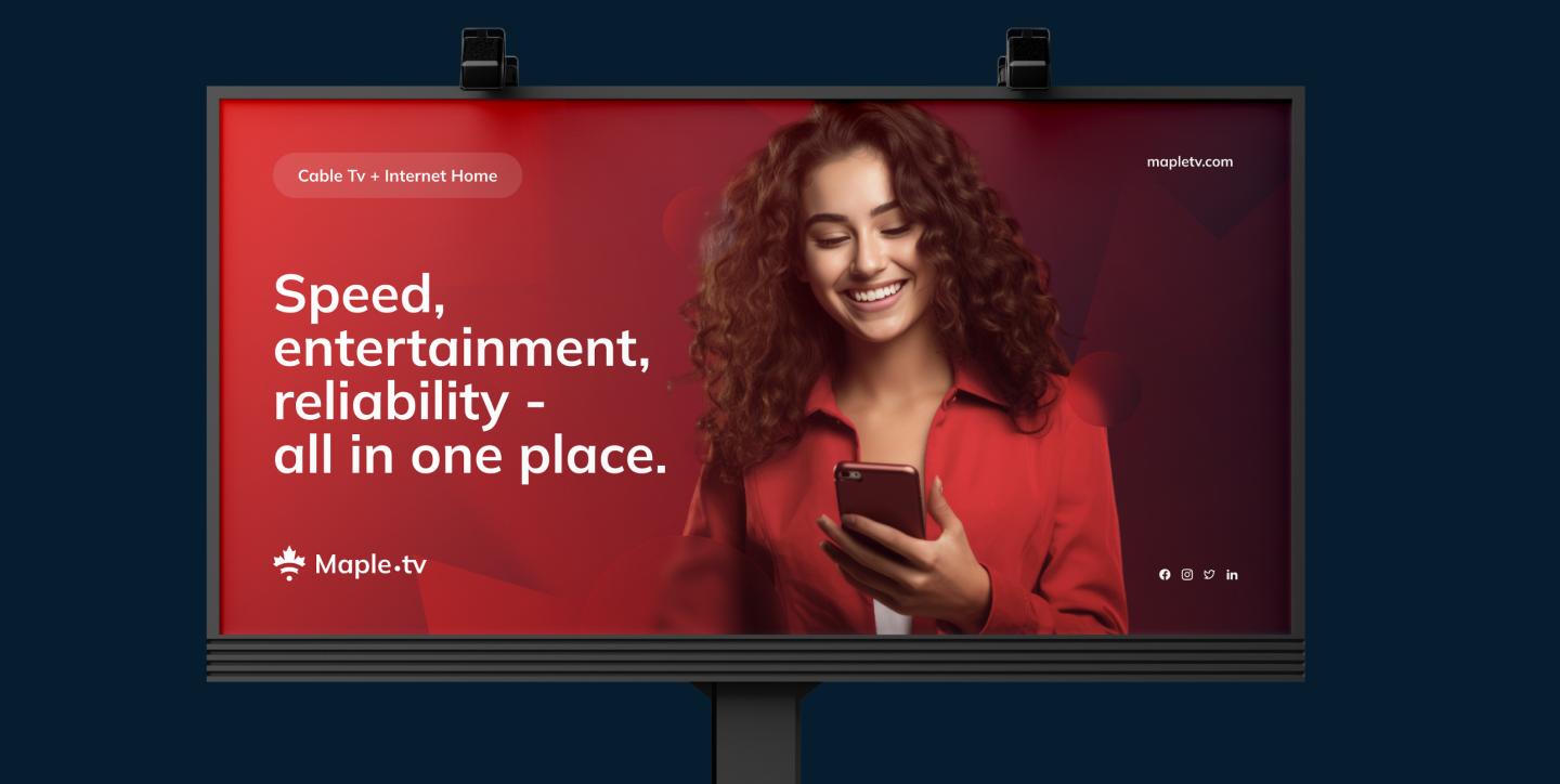
Maple.tv Project
Traditional telecom and entertainment brands often feel generic, competing on price rather than presence. We created a distinctive brand identity that positions MapleTV as a bold, trustworthy name in entertainment.
Industries
- Media & Entertainment
- B2B
- B2C

The Challenge
Lean too far into playfulness, and a brand risks feeling unreliable, exactly the wrong impression for a company people trust with their connection. Our challenge was building an identity with enough range to feel like entertainment without ever losing the dependability people need from their internet provider.

From Product Strategy to Brand Execution
- 1.
Immerse
Researching competitor positioning and cultural cues within the B2C telecom and entertainment space.
- 2.
Plan
Defining brand strategy, tone of voice, and a positioning territory that reflects MapleTV's ambition.
- 3.
Create
Designing the visual identity system: logotype, color palette, typography, and a flexible set of brand assets.
- 4.
Launch
Delivering brand guidelines that ensure consistency across every application, from packaging to campaigns.
Solution
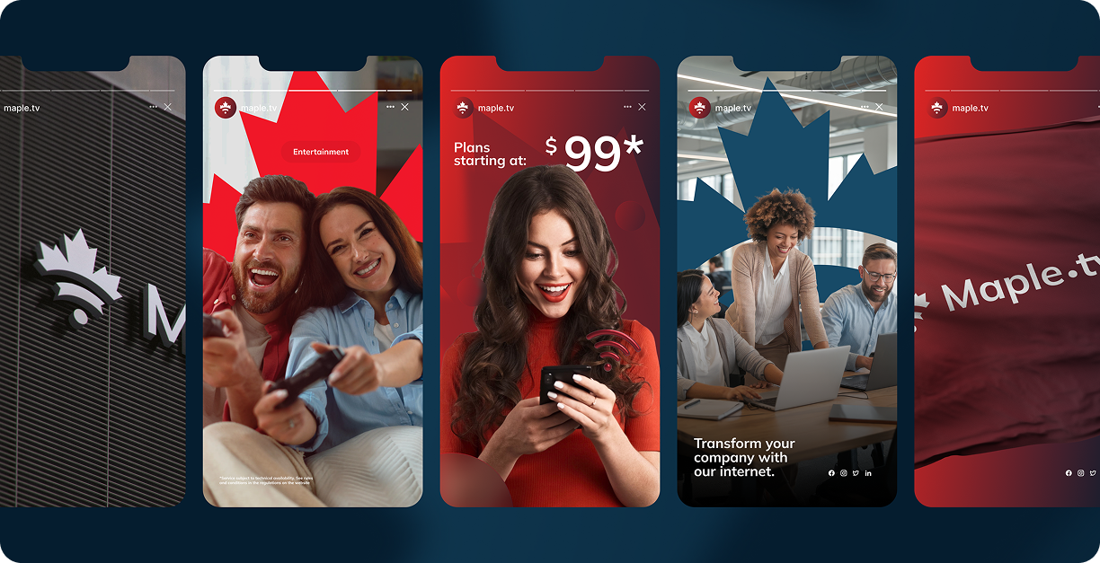
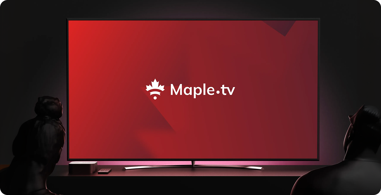
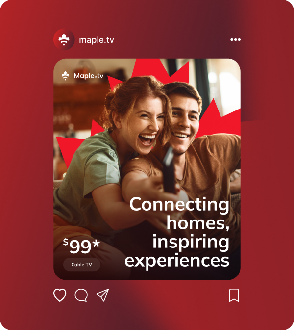
The result is a bold, versatile identity built on clarity and warmth, a visual language that feels premium without losing approachability. Logo, color, and typography come together into one cohesive system, giving MapleTV a consistent presence from advertising to packaging.

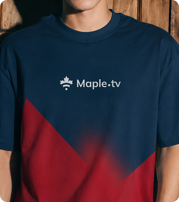


A brand that goes beyond representing entertainment, feeling like it belongs there: instantly recognizable, effortlessly trustworthy.