


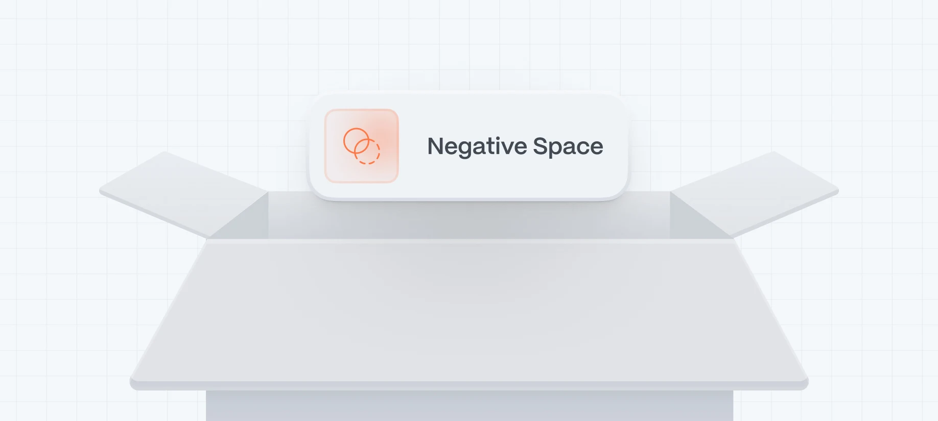
Have you ever felt a website breathe? That sense of calm, clarity, and focus isn’t magic—it’s negative space doing its job.
Also known as “white space” (though it doesn’t have to be white), negative space refers to the empty areas around your content—between text, images, buttons, and sections. It’s not just blank real estate. It’s a powerful design tool that:
- Emphasizes your message
- Improves readability and comprehension
- Guides user attention
- Adds a sense of premium polish
For startups trying to stand out in crowded digital markets, mastering positive and negative space can be a competitive edge. Especially when clarity equals trust—and trust drives conversions.
What Is Negative Space (and How It Works)
Understanding Positive vs. Negative Space
Positive space: where your content lives—text, images, buttons, forms.
Negative space: the gaps around these elements.
It’s not about absence—it’s about purpose. Well-used negative space balances the layout and creates breathing room for ideas to stand out.
Why It’s More Than Aesthetic
It isn’t fluff—negative space is functional. Studies show better-scanned pages increase comprehension and conversions. It slows the scroll and lets users digest content comfortably.
7 Ways Empty Space Enhances Your Website
- Improves Readability & Focus
Dense text is intimidating. With negative space, lines, paragraphs, and headings stand out—guiding readers along the narrative.
- Highlights Critical Elements
CTAs, value propositions, and features shine when surrounded by room to breathe.
- Increases Engagement
Users tend to stay longer and interact more when content isn’t overwhelming.
- Builds Perceived Value
Luxury brands, law firms, and premium services often rely on space for a sense of elegance and authority.
- Simplifies Navigation
Spacing between menu items avoids misclicks and speeds decision-making.
- Helps Hierarchy Feel Intuitive
Padding, margins, and grouping direct the eye in a natural flow.
- Supports Responsive Design
Consistent spacing translates well across screen sizes, making your site flexible and polished.
Design Principles to Guide Negative Space
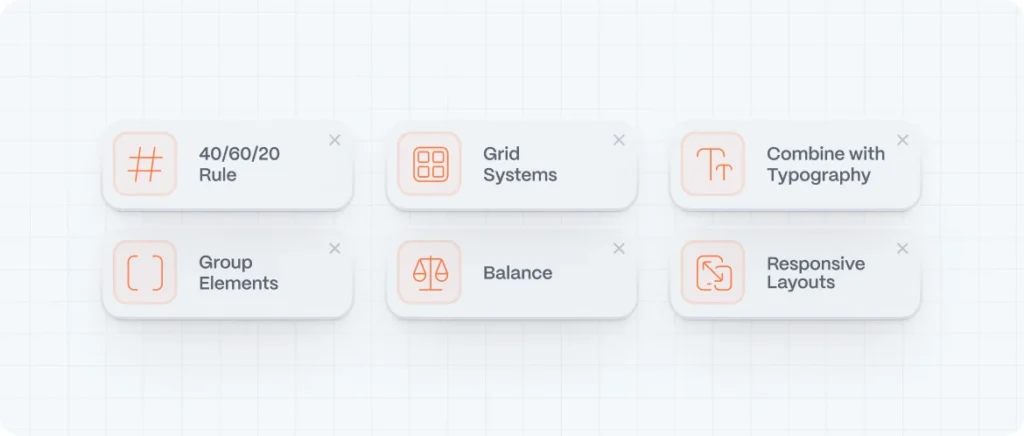
Principle 1: Embrace the 40-60-20 Rule
Allocate space mindfully—40% around major elements, 60% between groups, 20% inside content blocks.
Principle 2: Group Related Elements
Use proximity and whitespace to visually tie related items together and separate different ideas.
Principle 3: Use a Grid System
Align elements within a 8pt or 10pt grid for rhythm and consistency across pages.
Principle 4: Balance Edge-to-Edge
Avoid text or images collapsing to the edges—give them room to shine.
Principle 5: Combine With Typography
Pair spacing with readable fonts and generous line height (1.4–1.6x) so content feels light and approachable.
Principle 6: Adjust in Responsive Layouts
Ensure breathing room increases as screens shrink—this maintains comfort on mobile.
Real Examples: Brands That Nail Negative Space
Apple
Minimalist layouts, large images, and bold headlines surrounded by calm space. Feels high-end and intentional.
Stripe
Their pricing and dashboard pages are clean, clear, and easy to scan—thanks to generous margins and whitespace.
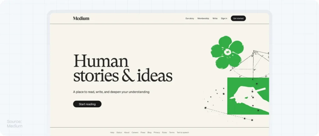
Medium
Content-focused design: wide gutters, light type, and no distractions help users immerse in reading.
Dropbox
Balanced space, clean grids, intuitive CTAs, and crisp visuals make for calm navigation and trust.
Evo Design (proposed redesign)
Imagine Evo’s new homepage: white-blocked sections, clear CTAs, spaced navigation—your visual identity is front and center.
How to Add Negative Space to Your Site: A Step-by-Step Guide
- Audit Your Current Layout
Measure padding/margins. Are elements too cramped?
- Simplify Excess
Remove redundant icons, reduce menu items, cut repeated sections.
- Apply Whitespace with Purpose
Add breathing room around CTAs, forms, and headlines.
- Use CSS Variables
Set base spacing units:
:root {
  --spacing-unit: 16px;
} - Refactor with a Grid
Rebuild in Figma or code using Flexbox or CSS Grid.
- Test & Iterate
Use hotjar heatmaps and scroll depth to see how spacing impacts behavior.
Common Pitfalls & How to Avoid Them
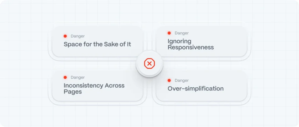
Pitfall: Space for the Sake of It
Empty space isn’t a decorative choice. Every gap needs intent—improved clarity, contrast, or hierarchy.
Pitfall: Inconsistency Across Pages
Define and apply spacing rules globally to maintain brand cohesion.
Pitfall: Ignoring Responsiveness
Spacing that looks spacious on desktop may feel cluttered on mobile. Always test.
Pitfall: Over-simplification
Too much space with too little content feels empty. Balance is key.
FAQs: Positive & Negative Space in Web Design
What is negative space in design?
It’s the empty space surrounding your content—it’s used to improve focus, hierarchy, and UX.
Difference between positive and negative space?
Positive space holds content. Negative space is everything else. Both work together visually and functionally.
Does white space increase conversions?
Absolutely. Improved readability, focus on CTAs, and reduced clutter boost conversions.
How much white space is enough?
There’s no magic number. Follow base spacing units (like 16 px), scale proportionally, and test with users.
Can negative space hurt SEO?
No. If your content and hierarchy remain clear, more whitespace helps readability—and Google rewards that.