


Few brands in the world can say more by showing less.
Prada is one of them.
More than a fashion house, Prada is a case study in visual restraint, strategic branding, and digital sophistication. It is a masterclass in elegant design that doesn’t beg for attention—but earns it.
In this article, Evo Design takes a close, critical look at Prada’s digital presence—specifically its website—and how every design choice, from typography to user flow, reinforces the brand’s luxury positioning. If you’re building a premium brand or working on high-end web experiences, there’s a lot to learn here.
Brand DNA: Prada Is Not About Shouting, It’s About Precision
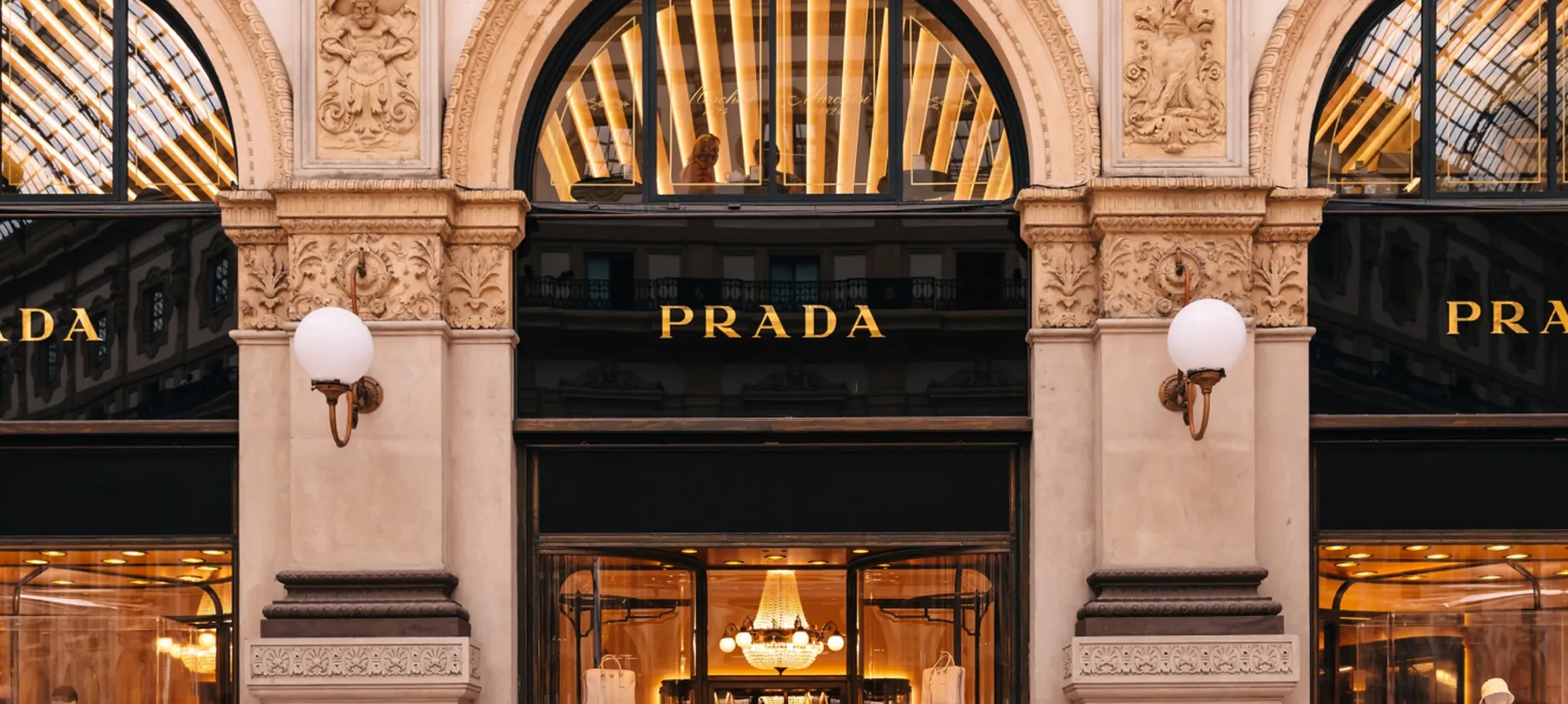
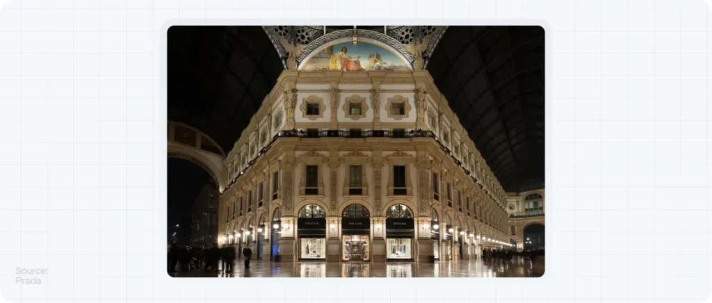
Founded in 1913, Prada has evolved from a high-end leather goods store in Milan to a global symbol of intellectual fashion, minimalism, and artistic rebellion.
Unlike other luxury brands that lean into exuberance and status-driven messaging, Prada does something different: it whispers, with conviction.
What defines Prada’s branding:
- Understated elegance
- Avant-garde minimalism
- Emotional distance that invites curiosity
- A refusal to follow visual trends
These principles shape the way Prada presents itself online just as much as they do on the runway.
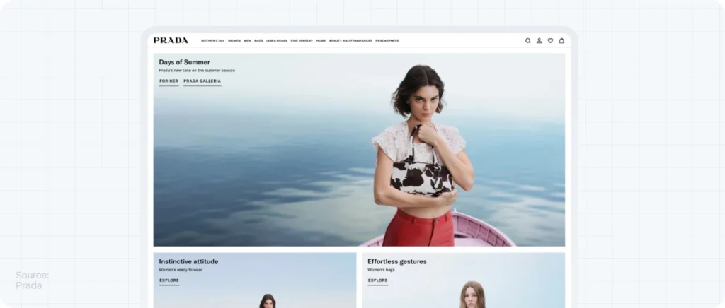
First Impressions: Visiting Prada.com
Click onto prada.com, and you’re met with silence.
No autoplayed videos. No overbearing banners. No discount codes in your face.
Instead, you see space, clarity, and control.
This is not an e-commerce site designed to convert you quickly. It’s a digital environment designed to immerse you slowly. Every scroll, every pause, is part of an experience.
And that’s exactly the point.
Design Decisions That Reinforce the Prada Brand
Navigation & UX: Purposefully Reduced
The site uses minimal top-level navigation, no hamburger menus, and a small but effective main menu. There is no push to lead you anywhere—it trusts the user to explore.
This minimal interaction pattern signals exclusivity: you’re not being sold to—you’re being invited in.
Color Palette: A Monochromatic Masterclass
The dominant use of black, white, and muted grays is not accidental. It’s intentional luxury. Color is used sparingly, only when necessary to highlight product shots or campaign visuals.
This is a prime example of how monochromatic color palettes can signal control, elegance, and hierarchy.
Typography: Understated Authority
The typography is clean, all-uppercase in some titles, almost editorial in tone. There’s no aggressive branding or oversized type. The typeface isn’t decorative—it’s functional, serious, and timeless.
It supports the content, rather than competes with it.
Product & Campaign Presentation
Products are not glorified through flashy effects or lifestyle images. They’re displayed with precision: centered, full-screen, static.
Campaigns are presented as short films or editorial visuals, not over-explained. Prada doesn’t sell with text—it sells with concept, mystery, and image.
Emotional Design: What Prada Does Without Saying a Word
In a time when many brands overshare, overcaption, and overexplain, Prada does the opposite.
There’s no About page explaining their mission. No banners screaming “sustainability” or “handmade.”
This is emotional restraint. It says: we don’t need to convince you—if you understand, you belong.
That level of confidence is a luxury in itself.
What Designers and Brands Can Learn from Prada
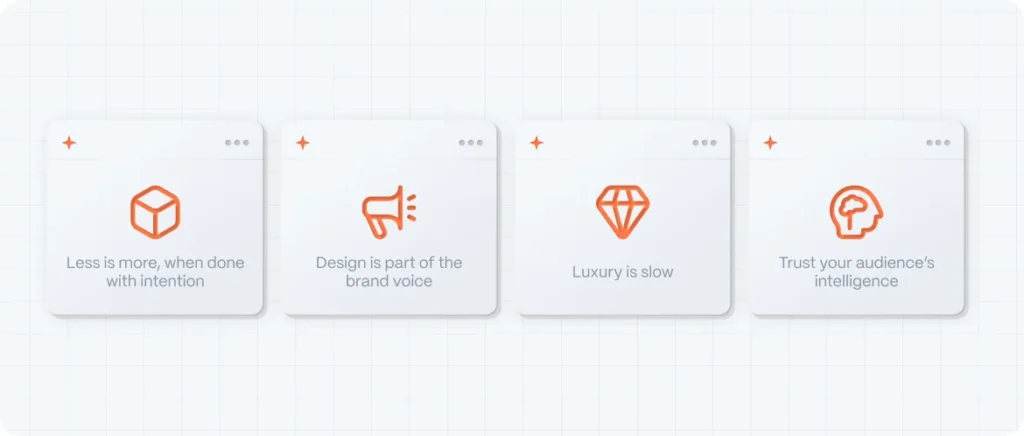
Less is more, when done with intention
Minimalism is not emptiness. It’s discipline. Every element must earn its place.
Design is part of the brand voice
Colors, fonts, spacing, and layout all speak. Don’t just think about what you say—consider how you look when saying it.
Luxury is slow
Prada’s site doesn’t chase attention—it demands presence. Don’t be afraid to create space for your users to breathe, explore, and absorb.
Trust your audience’s intelligence
You don’t need to explain everything. Leave room for interpretation. That’s where connection happens.
Evo Design’s Perspective: When Branding and Digital Experience Align
At Evo Design, we help brands translate who they are into digital experiences that communicate without overexplaining.
We build systems where:
- Color supports hierarchy
- Typography enhances brand tone
- Layouts guide without overwhelming
- Silence, space, and subtlety speak volumes
Whether you’re launching a high-end fashion label, a boutique architecture studio, or a premium lifestyle brand, we believe design is your sharpest tool—not just to sell, but to signal.
The Prada Principle
Prada’s website is not trying to impress everyone.
It’s designed to resonate deeply with a specific kind of viewer—one who values sophistication, detail, and quiet confidence.
And that’s the lesson:
Don’t try to be loud. Be clear. Be intentional. Be undeniable.
If your brand is ready to embody that philosophy, Evo Design is ready to help you build it.