


It’s easy to overlook the footer. After all, it’s at the bottom of the page. It’s where links go to hide and copyrights go to sleep, right?
Wrong.
In 2025, the website footer has evolved from afterthought to strategic real estate. It’s one of the most visited sections of your website—especially for users looking for clarity, trust signals, and next steps. And when designed thoughtfully, it can play a major role in user experience, SEO, and even conversion rates.
If you’re a startup launching or scaling a product, ignoring your website footer design means missing out on valuable micro-moments—when users are still curious but need one last nudge.
In this guide, we’ll break down:
- What makes a great footer
- Common mistakes to avoid
- Footer design principles
- Conversion tactics hidden in plain sight
- Inspiring footer examples from real brands
- And how to make your own footer work harder
Why Your Website Footer Matters More Than You Think
Most startup founders obsess over the homepage, the hero section, the pricing table. But what about the part of your site that users actually scroll down to when they’re:
- Looking for credibility
- Trying to find contact info
- Wondering who you are
- Searching for policies before converting
In fact, studies from Nielsen Norman Group show that footers are some of the most consistently visited UI elements—especially on pages with long scrolls or dense content.
Good footers:
- Reduce friction
- Provide reassurance
- Improve navigation
- Support SEO with internal links
- Keep users engaged when they’re about to leave
It’s the digital equivalent of a strong closing handshake.
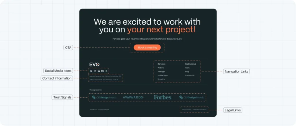
Anatomy of a High-Performing Website Footer
Think of your footer like a mini-site map. It’s the final summary of your value, your identity, and your trustworthiness.
Let’s break down what goes into an effective website footer:
1. Navigation Links
Help users get where they want to go—even if they didn’t find it above the fold.
Best practices:
- Limit to 3–4 categories: Product, About, Resources, Legal
- Use clear, descriptive labels
- Maintain the same structure across all pages
Tip: Avoid overwhelming users with 20+ links. Group and label clearly.
2. Contact Information
Users often go to the footer when they want to get in touch—especially if they’re ready to buy.
Include:
- Email (with clickable mailto:)
- Phone (tap-to-call)
- Physical address (if relevant)
- Business hours
For service-based startups, this is especially critical.
3. Social Media Icons
A small but mighty touch. Social icons in the footer give users a passive way to stay connected.
Best practices:
- Use minimal icons (usually monochrome)
- Open in new tabs
- Don’t make them the focal point
4. Legal Links
Required. Period.
Include:
- Privacy Policy
- Terms of Service
- Cookie Notice (if applicable)
Why? Transparency builds trust—and keeps you compliant.
5. Newsletter Signup
Email still converts better than any other channel. A footer signup form is a frictionless way to capture interested users.
Tips:
- Keep it simple (email + submit)
- Add a short value proposition (“Get exclusive updates”)
- Use a double opt-in to protect list quality
6. Trust Signals
If you’ve worked with notable clients or earned certifications, add their logos discreetly here.
Bonus: Show payment methods (for e-com), security badges (for SaaS), or review ratings.
7. Accessibility & Utility Features
- “Back to Top” button
- Language switchers
- Dark mode toggles
- ADA-friendly elements like proper contrast and keyboard navigation
Common Footer Design Mistakes to Avoid
Before you start adding more to your footer, pause and check if you’re guilty of any of these:
❌ Clutter overload – Trying to cram in every link possible
❌ Low contrast text – Footers often get overlooked in terms of accessibility
❌ Redundant content – Repeating the main nav word-for-word adds no value
❌ No visual hierarchy – All links have the same size and weight
❌ Dead ends – No CTA, no email form, no suggested content
A footer should be focused, useful, and elegant—not a junk drawer of leftovers.
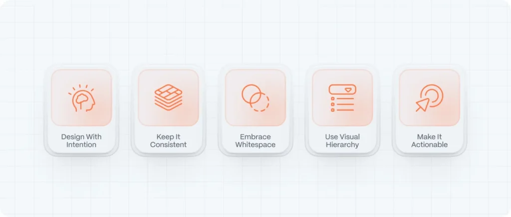
Footer Design Best Practices
Now let’s talk about what makes a footer go from functional to fantastic:
1. Design With Intention
Your footer isn’t just the bottom—it’s the last impression. Use it to reinforce your brand tone.
For example:
- A wellness brand might use calming colors and soft typography
- A tech startup might use bold monospace fonts with sharp grids
- A sustainable e-commerce brand might include certifications and eco badges
Make sure the footer feels like part of the design system—not an afterthought.
2. Keep It Consistent Across Pages
Users scroll down expecting the same structure. Keep your footer layout uniform site-wide.
That said, you can:
- Use dynamic CTAs depending on the page
- Change copy or offers subtly
But the structure (navigation, legal, contact) should stay consistent.
3. Embrace Whitespace
Just because it’s at the bottom doesn’t mean it should be packed tight. A well-spaced footer feels modern, breathable, and professional.
Tip: Don’t be afraid of a “tall” footer—if it’s well structured, it won’t feel heavy.
4. Use Visual Hierarchy
If everything has the same visual weight, nothing stands out.
Use:
- Headings for categories
- Icons for recognizability
- Spacing to group content
- Color variation to draw attention (e.g., highlight the newsletter form)
5. Make It Actionable
Yes, the footer is often where users decide to exit. But you can reframe that moment.
Add a CTA:
- “Start your free trial”
- “Download our whitepaper”
- “Join our newsletter”
Subtle, helpful prompts can re-engage users before they go.
Real Website Footer Examples Worth Learning From
Here are some brands that are nailing their footer design in 2025:
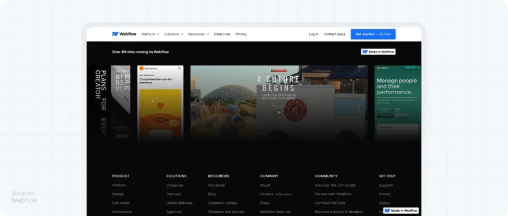
1. Webflow – [https://webflow.com](https://webflow.com)
Extensive footer with clearly separated sections: platform, resources, company, social. Uses consistent grid, excellent spacing, and subtle animations.
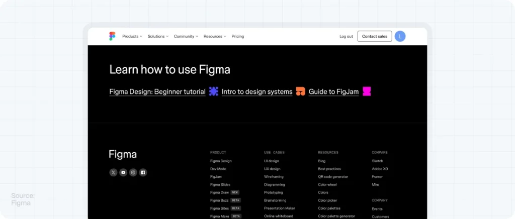
2. Figma – [https://figma.com](https://figma.com)
Minimal but smart. Footer sticks to essentials—navigation, legal, CTA for newsletter. Feels coherent with the rest of the site.
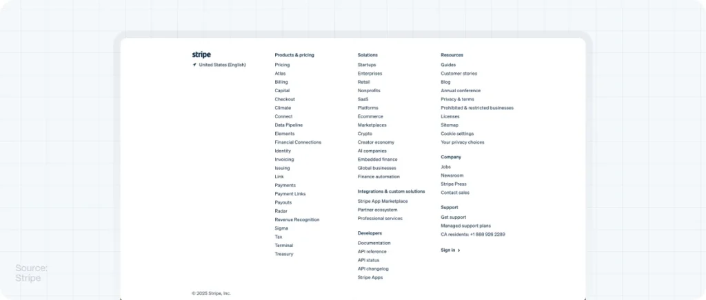
3. Stripe – [https://stripe.com](https://stripe.com)
A textbook example of clean hierarchy. Multiple columns, bold headings, excellent readability, and prominent trust signals.
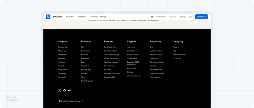
4. Dropbox – [https://dropbox.com](https://dropbox.com)
Uses the footer to reinforce brand identity and drive engagement with products, support, and careers—all with impeccable alignment.
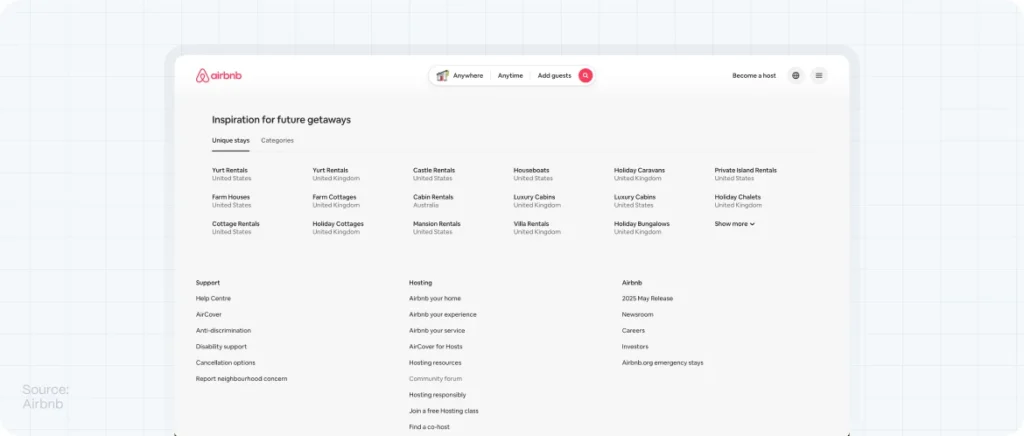
5. Airbnb – [https://airbnb.com](https://airbnb.com)
Incorporates localization, accessibility, trust signals, and legal. Dynamic and responsive depending on region.
Footer Design and SEO: What You Need to Know
Good footer design supports search performance—when done right.
Internal Linking
Your footer is a great place for strategic internal links. Prioritize:
- High-value pages (blog, pricing, contact)
- Semantic anchor text
- Avoid keyword stuffing or black-hat link farms
HTML Structure
Use semantic HTML:
Helps Google crawl and understand your page structure better.
Accessibility
Alt text, keyboard navigation, and clear contrast help improve UX and align with Core Web Vitals, which Google rewards.
Load Speed
Don’t bloat your footer with unnecessary scripts or embedded widgets. Keep it lightweight and efficient.
How Evo Design Builds Footers That Convert
At Evo, we approach the footer as an essential design and marketing asset—not a utility.
We help startups:
- Identify user behaviors at the bottom of the funnel
- Design footers that reinforce brand and UX
- Optimize for SEO and accessibility
- Integrate marketing tools and lead capture
- Prototype layouts with visual hierarchy and clean grids
Because a smart footer isn’t just the end of the page—it’s the beginning of another interaction.
FAQs: Website Footer Design
What should a website footer include?
A good footer includes navigation links, contact info, legal pages, social icons, and optional elements like newsletter signup, CTAs, or trust signals.
Is the footer important for SEO?
Yes. Footers support internal linking, improve crawlability, and contribute to site structure—all helpful for SEO.
How many links should go in a footer?
Ideally, under 15 links. Prioritize clarity over quantity, grouping them into 3–4 categories.
What is the ideal footer layout?
Use a grid layout with distinct columns for each content type (e.g., About, Resources, Contact, Legal). Include headings and use spacing to create hierarchy.
Should footers look the same on mobile?
They should be adapted. Stack content vertically, collapse menus when needed, and maintain tap-friendly sizing.