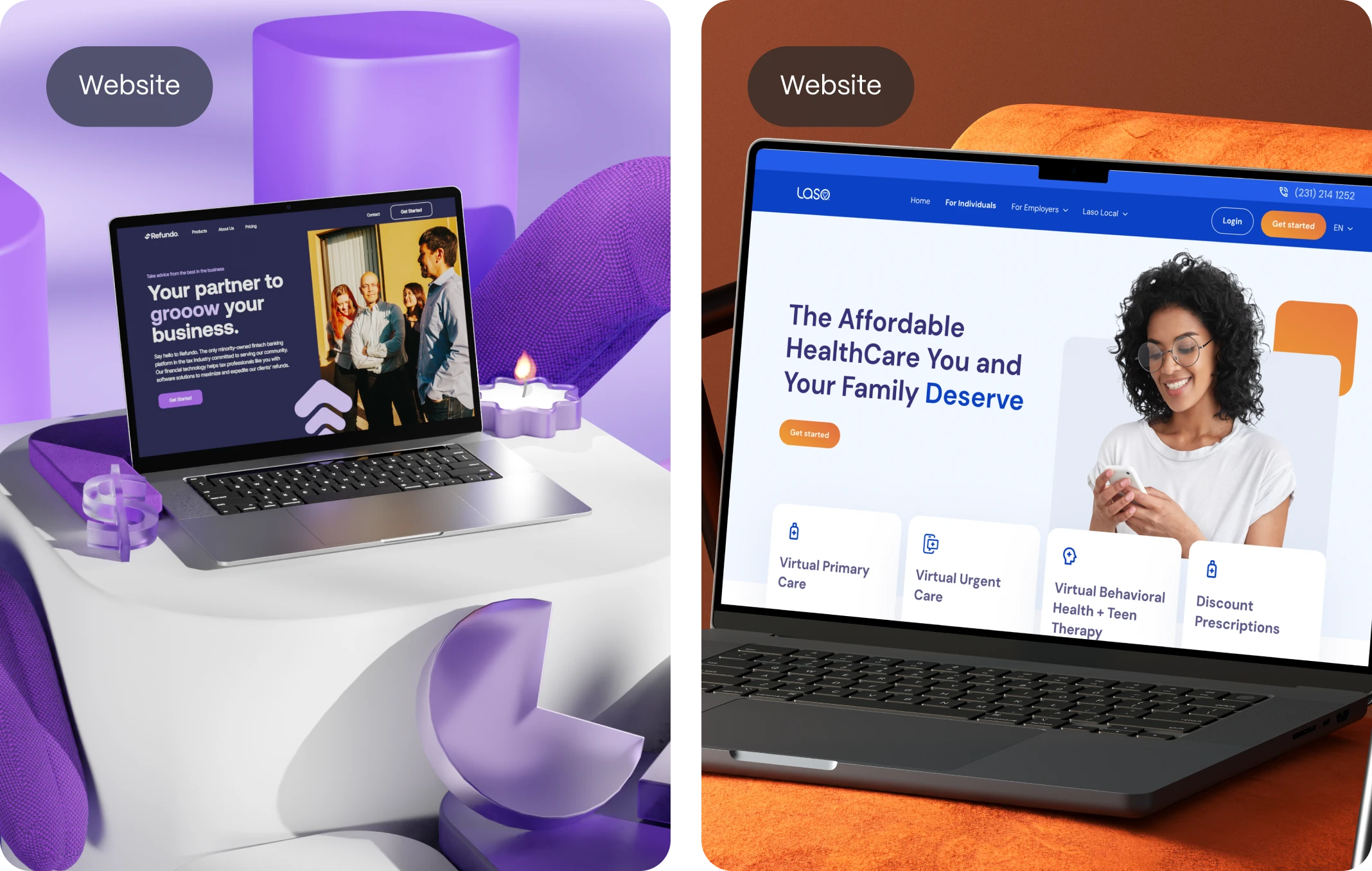
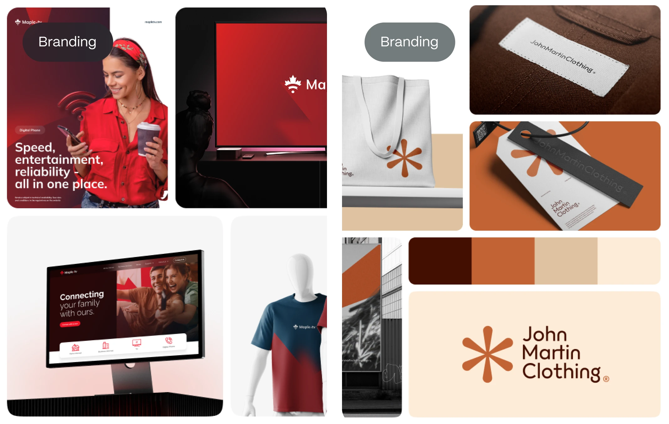
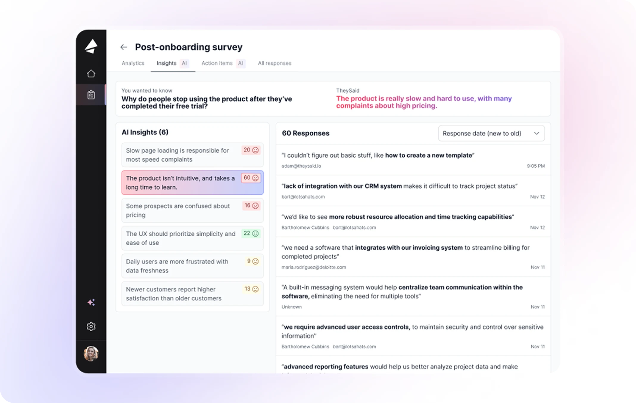
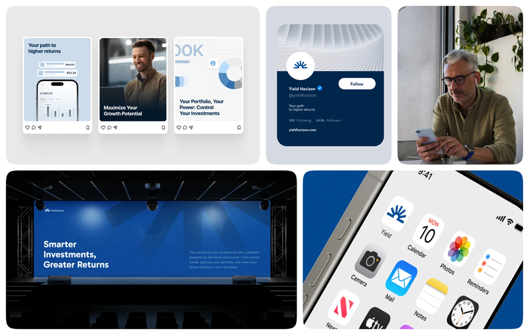
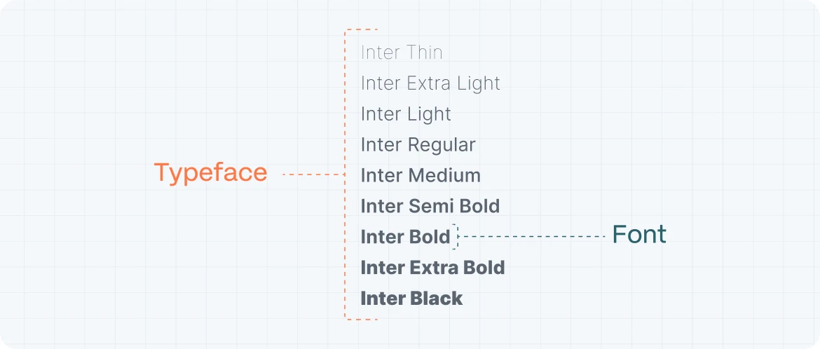
In today’s hyper-connected world, users don’t just visit websites—they experience them. And one of the most overlooked yet powerful elements of this experience is typography. More than just letters on a screen, fonts communicate mood, brand personality, usability, and even trust. At the heart of it all lies a revolutionary tool in digital design: web fonts.
Web fonts are the invisible voice behind every interface, bridging the gap between a brand’s soul and its users’ eyes. They influence how fast a visitor reads, how long they stay, and whether they’ll remember your brand after clicking away. In this comprehensive guide, we’ll explore how web fonts unlock creativity, improve branding, and optimize user experience—especially for startups looking to stand out in competitive markets.
What Are Web fonts?
Before we dig into the impact of web fonts, let’s establish what they are. In essence, web fonts are fonts hosted on the web and loaded into browsers via CSS, allowing websites to display typefaces that aren’t installed on a user’s device. This is different from system fonts like Arial or Times New Roman, which rely on local device libraries.
Web fonts are delivered via services like Google Fonts, Adobe Fonts, or custom font hosting solutions. By embedding these fonts using @font-face or similar declarations, designers can ensure consistent typography across platforms, screen sizes, and devices.
The real magic? Freedom. No longer limited to basic system fonts, brands and designers can now express themselves with distinctive typefaces tailored to their identity. And in an era where visual differentiation is critical, web fonts offer a serious competitive edge.
Why Typography Matters More Than Ever
Typography is a strategy. Fonts shape perception, organize content, and guide attention. According to research by MIT and Microsoft, subtle changes in font style can influence reading speed, emotional response, and even credibility.
For startups and product-driven businesses, the choice of typography can be the difference between connection and confusion. Consider how:
- Serif fonts suggest tradition, trust, and professionalism.
- Sans-serif fonts imply modernity, clarity, and minimalism.
- Display or decorative fonts express boldness, emotion, and uniqueness.
In digital products and marketing websites alike, typography silently conveys tone—before users even read a single word.
Branding Through Web fonts
Think of your brand’s typography as its visual voice. It must be consistent, recognizable, and aligned with your mission. Web fonts allow you to build this voice with precision.
Emotional Branding Through Font Choice
A fintech startup might opt for a geometric sans-serif like Inter or IBM Plex to communicate stability and innovation. A wellness brand might lean into a soft, rounded serif like Lora or Recoleta to express calm and care. The font you choose becomes a non-verbal signal that supports (or undermines) your message.
Logo vs. Web Fonts
Many startups use custom lettering or logotypes—but forget to extend that identity to their digital typography. Using complementary web fonts that align with your logo’s aesthetic creates cohesion and reinforces your visual system. Consistency across logo, headlines, and body text builds trust and memorability.
Readability and User Experience
Even the most beautiful typefaces mean nothing if users can’t read them. Web fonts must balance personality with legibility—especially in responsive, dynamic environments.
Key Principles of Readable Typography
- Font Size: Start with 16px minimum for body text. Don’t assume your user has perfect vision or is reading in optimal lighting.
- Line Height: Aim for 1.4–1.6x the font size for smooth vertical rhythm.
- Contrast: Make sure there’s enough contrast between text and background. WCAG recommends at least 4.5:1 for normal text.
- Line Length: Keep paragraphs between 50–75 characters per line to avoid fatigue.
Web font Performance Tips
Web fonts, if not optimized, can slow down page loads—hurting UX and SEO. To avoid this:
- Use only necessary weights and styles (e.g., Regular and Bold)
- Preload fonts using
rel="preload"to reduce FOUT (Flash of Unstyled Text) - Choose variable fonts when possible—they’re lighter and more flexible
How to Choose the Right Web fonts
There’s an art to choosing a font, but also a science. Startups should ask three key questions when selecting a typeface:
- Does it align with our brand voice?
- Is it readable across all devices and screen sizes?
- Is it technically optimized for the web?
Tools for Choosing Web fonts
- Google Fonts: Free and easy to integrate, with reliable performance
- Adobe Fonts: Premium options, seamless integration with Creative Cloud
- Fontshare and Fontspring: Great for lesser-known but high-quality fonts
Take time to test fonts in situ. How does it look on your homepage? On mobile? Inside buttons or form fields? Great typography doesn’t just look good—it feels right.
Font Pairing Techniques
Pairing fonts is a bit like pairing wine and cheese: harmony is everything. Done right, font pairs enhance hierarchy, contrast, and scannability. Done wrong, they create chaos and confusion.
Best Practices for Font Pairing
- Contrast Serif + Sans-Serif: A classic combination. Use serif for headlines and sans-serif for body copy (or vice-versa).
- Match Tone and Proportions: Even contrasting fonts should share similar x-heights, stroke contrast, or letter spacing to feel cohesive.
- Limit to Two Fonts: Maximize usability and maintain focus. Three or more fonts often dilute the brand voice.
Examples:
- Playfair Display + Source Sans Pro: Elegant meets modern.
- Montserrat + Lora: Geometric meets literary.
- Roboto + Roboto Slab: Harmonious but with enough variation.
Variable Fonts: The Future of Typography
Variable fonts are reshaping how designers work with type on the web. They contain multiple styles and weights in a single file, allowing for dynamic, responsive typography without bloating load times.
Benefits of Variable Fonts
- Smaller file sizes = faster sites
- Smooth transitions between weights, widths, and slants
- Greater creative flexibility, especially in animations or micro-interactions
Some of our favorite variable fonts include:
- Inter Variable
- Roboto Flex
- Recursive
Startups can use variable fonts to create responsive typography that adapts beautifully across breakpoints, screen resolutions, and user needs.
Accessibility and Inclusive Typography
Design isn’t truly good until it’s inclusive. Fonts play a critical role in accessibility. Whether it’s a user with dyslexia, low vision, or cognitive challenges, thoughtful typography can make or break their experience.
Tips for Accessible Web fonts
- Avoid overly decorative fonts in body text
- Maintain strong contrast ratios
- Use clear spacing and generous padding around text
- Choose fonts with distinct letterforms (e.g., clear distinction between “I”, “l”, and “1”)
Web fonts such as Atkinson Hyperlegible, Lexend, and Open Dyslexic are built specifically with accessibility in mind. They’re free, and they make a real difference.
Web fonts and SEO
Typography and SEO may seem disconnected—but they’re more interlinked than most realize. Google doesn’t directly “read” your fonts, but UX metrics influenced by typography affect SEO rankings.
Indirect SEO Benefits of Good Web fonts
- Faster load times (especially with optimized or variable fonts) improve Core Web Vitals
- Clear, readable text reduces bounce rate and increases time on page
- Structured content with strong typographic hierarchy enhances accessibility and scannability
Bonus tip: Don’t embed web fonts using JavaScript-heavy solutions. Stick with clean, standard CSS to keep your site crawlable and fast.
The Psychology of Fonts
Fonts evoke emotion. They activate subconscious associations. They affect how users feel about your brand, long before they read a single line of copy.
Common Font Psychology Insights
- Serif fonts: Credibility, tradition, formality (e.g., Merriweather, Georgia)
- Sans-serif fonts: Modernity, neutrality, approachability (e.g., Helvetica, Open Sans)
- Script fonts: Elegance, creativity, intimacy (e.g., Pacifico, Great Vibes)
- Monospaced fonts: Precision, tech-savviness, retro feel (e.g., Space Mono, Courier)
Startups often benefit from fonts that strike a balance—distinct enough to stand out, yet neutral enough to stay versatile across use cases.
Real Startup Case Studies
Let’s see web fonts in action.
- Notion
Notion uses Inter for its sleek, utilitarian UI. It’s neutral, legible, and tech-forward—aligning perfectly with its productivity-first identity.
- Headspace
This wellness brand uses Gilroy and Apercu to communicate warmth and clarity. Soft curves and geometric consistency mirror the brand’s calm tone.
- Stripe
Stripe’s use of Atlas Grotesk feels modern yet serious. The typography reinforces their reputation as a dependable, design-savvy financial platform.
These examples prove that the right font choice is never arbitrary. It’s intentional, strategic, and deeply intertwined with product-market fit.
Integrating Web fonts into Your Startup Website
Here’s a step-by-step approach for using web fonts in your startup’s website:
- Define your brand tone and attributes
- Explore web fonts that align with that identity
- Test readability across breakpoints
- Pair fonts for hierarchy and contrast
- Use only the necessary weights/styles
- Preload and compress files for speed
- Ensure accessibility compliance
- Create a typography system in your design library
FAQ: Webfonts
What are webfonts used for?
Webfonts enable designers to use custom typefaces in websites, enhancing branding, readability, and user experience across devices.
Are Google Fonts free?
Yes. Google Fonts offers hundreds of free, open-source fonts optimized for web use.
Do webfonts affect website speed?
Yes. Poorly implemented webfonts can slow load times. Use preload tags and limit font weights to reduce performance impact.
Can I use any font as a webfont?
Not all fonts are licensed for web use. Always check licensing and use webfont-specific file formats like WOFF, WOFF2, or TTF.
What’s the best font for accessibility?
Fonts like Atkinson Hyperlegible, Lexend, and Open Dyslexic are designed with accessibility in mind. Avoid decorative fonts for body text.
What is a variable font?
Variable fonts contain multiple styles in one file, allowing for more responsive, efficient, and dynamic typography.

