


Every digital product has a surface that people interact with. That surface is called the interface. It is where intentions become actions, where a brand becomes tangible, and where users decide whether to continue or abandon their journey. For startups preparing to launch new products or services, user interface design is not a secondary detail—it is part of the product itself.
A good interface is intentional. It is structured to support business goals, user needs, and product scalability. It responds to real human behavior and is designed to work across contexts, devices, and emotional states. This article explores what startup leaders need to understand about user interface design, from theory to execution, so they can make more informed decisions during product development and go to market with confidence.
What Is a User Interface?
A user interface is the part of a digital product that users interact with directly. It includes everything from buttons, forms, and icons to layout, colors, and typography. The interface is the environment in which a person navigates, executes tasks, and receives feedback from a system.
Interfaces exist in many forms. A website homepage, a mobile app dashboard, a smartwatch notification, or a voice interaction menu are all examples of user interfaces. Each interface is designed to serve a specific function and facilitate a specific behavior. Understanding the purpose of each component and how it contributes to a cohesive experience is the foundation of successful user interface design.
Why Interface Design Matters for Startups
In the early stages of a startup, product development is often resource-constrained and time-sensitive. There is pressure to ship quickly, test the market, and iterate fast. However, launching with a poor interface creates barriers that affect adoption, retention, and perceived value.
A well-designed interface supports:
Usability: It helps users complete tasks with ease and clarity.
Perception of quality: It conveys professionalism, care, and strategic thinking.
Onboarding: It reduces friction in the first moments of use.
Differentiation: It expresses the unique character of the brand.
Scalability: It supports future growth with reusable patterns and structure.
Startups that treat interface design as part of the product strategy tend to outperform those that treat it as cosmetic polish.
Principles of Effective Interface Design
Strong interfaces are built on a foundation of established principles that guide how information is presented, how actions are triggered, and how feedback is delivered. These principles apply across platforms and product types.
Clarity
Every element in the interface must communicate its purpose. Labels should be descriptive. Icons should be familiar. Layouts should prioritize what matters most. Clarity reduces decision fatigue and empowers users to act.
Consistency
Consistency creates predictability. It allows users to build mental models of how the system works. Colors, typography, spacing, and component behaviors should follow a unified logic. Repetition of patterns across screens improves learnability.
Hierarchy
Not all elements have the same level of importance. Visual hierarchy is achieved through contrast in size, color, placement, and weight. It guides the user’s attention and indicates what to do next.
Feedback
Interfaces should always respond to user actions. A click, swipe, or submission must trigger a visible response. Feedback helps users feel in control and reduces the sense of uncertainty.
Affordance
Affordance refers to the visual cues that suggest how something should be used. A button should look clickable. A slider should look draggable. Affordances make interaction intuitive without the need for instruction.
From Theory to Practice – Applying Design Thinking
Designing a strong user interface begins with understanding people. The first step is not drawing screens or choosing fonts, but learning how users think, feel, and behave.
1. Research
Talk to your users. Observe how they use similar products. Identify pain points and goals. This input helps define user flows and anticipate friction points in the interface.
2. Personas and Scenarios
Create profiles that represent your key user types. Develop scenarios that describe what they’re trying to achieve. These tools provide focus during design decisions and help evaluate whether the interface supports those goals.
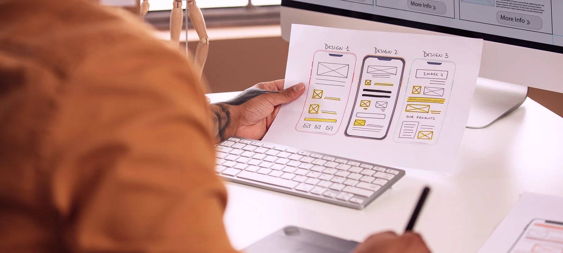
3. Wireframes and Prototypes
Start with low-fidelity wireframes to structure layout and content. Gradually evolve into interactive prototypes that simulate user flow. Testing these prototypes reveals gaps and areas for refinement before development begins.
4. Component Design and Systems
Create a design system or pattern library early. This includes buttons, input fields, cards, and navigation elements. Reusable components accelerate development and maintain consistency.
Designing Online User Interfaces for Product Launch
Launching a product involves more than an interface—it involves creating a full digital ecosystem. The interface is the entry point to that ecosystem. It sets expectations and drives early adoption.
Key interface considerations for launching:
Homepage or landing page design: It must communicate value quickly. Use concise messaging, visual hierarchy, and immediate calls to action.
Signup and onboarding flows: Keep forms minimal. Use progressive disclosure. Celebrate completions to reinforce engagement.
Dashboards or main product views: Present relevant information without clutter. Enable primary actions with prominence and ease.
Error states and edge cases: Prepare the interface to guide users when things go wrong. Offer clear explanations and next steps.
Launching with a polished, tested, and user-validated interface builds momentum. It shows that the team behind the product understands the user and has invested in their experience.
Interface Patterns That Support Conversion
Certain interface patterns are proven to improve performance in terms of conversion, retention, and engagement. These patterns are especially relevant for startups seeking rapid traction.
Examples include:
Sticky navigation bars: Provide constant access to key actions.
Microinteractions: Offer subtle feedback during interaction (like a heart animation when favoriting an item).
Progress indicators: Encourage users to complete a process by showing how far they’ve come.
Empty state design: Turn empty spaces into opportunities by explaining what users can do next.
Confirmation layers: Prevent mistakes by confirming destructive actions with clear prompts.
These interface patterns contribute to a more responsive, reassuring, and empowering user experience.
Common Interface Design Mistakes and How to Avoid Them
Avoiding critical mistakes early can save time, budget, and reputation. Here are some of the most common interface design errors made during early-stage product development.
1. Overcomplicating the Interface
Trying to show too much information at once overwhelms the user. Interfaces should prioritize clarity and simplicity over completeness.
2. Ignoring Mobile Experience
Many startups still prioritize desktop during MVP development. With mobile-first users dominating in many industries, this approach leads to lost engagement and lower accessibility.
3. Inconsistent Component Behavior
When buttons, modals, or inputs behave differently across screens, users become confused. A well-defined design system ensures visual and behavioral consistency.
4. Insufficient Feedback
Interfaces that don’t confirm actions, show loading states, or guide error resolution create uncertainty. Feedback is essential for building trust.
5. Lack of Accessibility Considerations
Ignoring accessibility limits reach and exposes the product to legal and ethical risk. Designing for screen readers, keyboard navigation, and color contrast improves inclusivity.
Choosing the Right Tools and Collaborators
Designing a strong user interface is a collaborative process that includes product managers, developers, marketers, and designers. Choosing the right tools and workflows ensures alignment and quality.
Recommended tools:
Figma: For interface design, prototyping, and design systems
Notion: For documentation and component libraries
Storybook: For building UI components with code
UserTesting, Maze, or PlaybookUX: For usability testing
Lighthouse and Web.dev: For performance and accessibility audits
Whether hiring in-house or partnering with an agency like Evo Design, working with people who understand the intersection of design, development, and business strategy is essential.
Measuring Interface Performance Post-Launch
After launch, interface design should be evaluated continuously through both qualitative and quantitative data.
Metrics to track:
Conversion rate: Are users completing the intended action?
Bounce rate: Are users leaving too early?
Task success rate: Are users able to complete key flows without friction?
Time on task: How long does it take to complete key actions?
Error rate: Where are users getting stuck or making mistakes?
Tools like Hotjar, Google Analytics, and FullStory provide visual and behavioral data to analyze interface performance and identify areas for optimization.
The Role of Interface in Brand and Perception
The user interface is often the first and most frequent brand touchpoint. It expresses not only utility but also personality, tone, and trustworthiness.
A strong interface can:
Establish a distinctive brand voice through typography, color, and layout
Reinforce values like transparency, simplicity, or boldness through visual storytelling
Generate user delight through thoughtful animations and details
Build long-term loyalty by creating a sense of familiarity and reliability
For startups, investing in the user interface is an investment in the brand. It sets expectations for quality and defines how the company shows up in the lives of its users.
FAQ – User Interface Design for Startups
What is user interface design?
User interface design is the process of creating the visual and interactive elements of a digital product that users engage with directly, such as buttons, forms, and layouts.
Why is user interface design important for startups?
It directly affects usability, conversion, retention, and perception of quality. A well-designed interface supports business goals and enhances the user experience.
How does interface design relate to branding?
The interface is a brand touchpoint. It communicates tone, values, and attention to detail. A consistent interface builds trust and reinforces brand identity.
What’s the difference between UI and UX?
UI refers to the interface elements the user sees and interacts with. UX is the broader experience the user has, including emotions, satisfaction, and efficiency of completing tasks.
Should we design mobile-first?
In most cases, yes. With a large portion of web traffic coming from mobile devices, designing with smaller screens in mind ensures broader accessibility and performance.