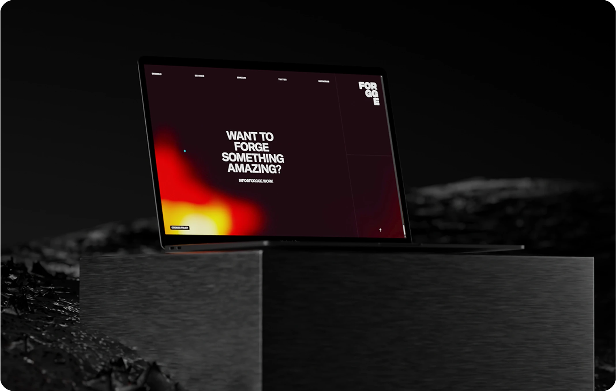

Ever landed on a website that looked “cool” but left you totally lost? That’s bad UI design in action, ignoring the UI Design Essentials that make digital experiences seamless.
In the digital space, great design is not just about beauty—it’s about functionality, clarity, and flow. And at the heart of it all are the user interface elements: the buttons you click, the menus you open, the forms you fill out, and the messages you see when something goes wrong (or right).
At Evo Design, we build products where design is not a layer added at the end—it’s the foundation of every user interaction. That’s why understanding and mastering UI components is non-negotiable for anyone building digital experiences today.
Whether you’re a product owner, junior designer, or digital strategist, this guide will give you a clear, practical breakdown of the core elements of user interface design—and how to use them to craft intuitive, elegant, and effective products.
What Is UI Design (and Why It’s Crucial)?
UI Design (User Interface Design) is the process of designing all the visual and interactive elements that users engage with in a digital product.
It answers questions like:
- How do users navigate from one point to another?
- How is information visually organized on the screen?
- What visual cues guide interaction?
- How does the design respond to different devices and screen sizes?
UI design is the layer users see and feel. When it’s done right, the experience feels seamless. When it’s wrong, users bounce—fast.
The UI Design Essentials: Key User Interface Elements You Need to Know
Let’s break down the essential categories of user interface elements and how they work together to create intuitive, human-centered design systems.
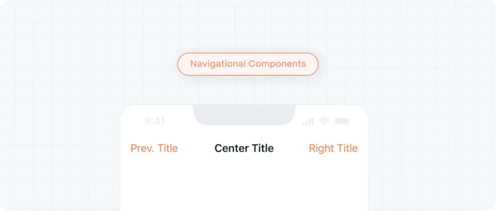
1. Navigational Components
These guide users through your product and help them understand where they are and where they can go.
Common Navigational UI Components:
- Navigation menus (horizontal, vertical, hamburger)
- Breadcrumbs
- Tabs and segmented controls
- Pagination
- Search bars
Best practice: Use consistent iconography and clear labels. Navigation should be effortless, not experimental.
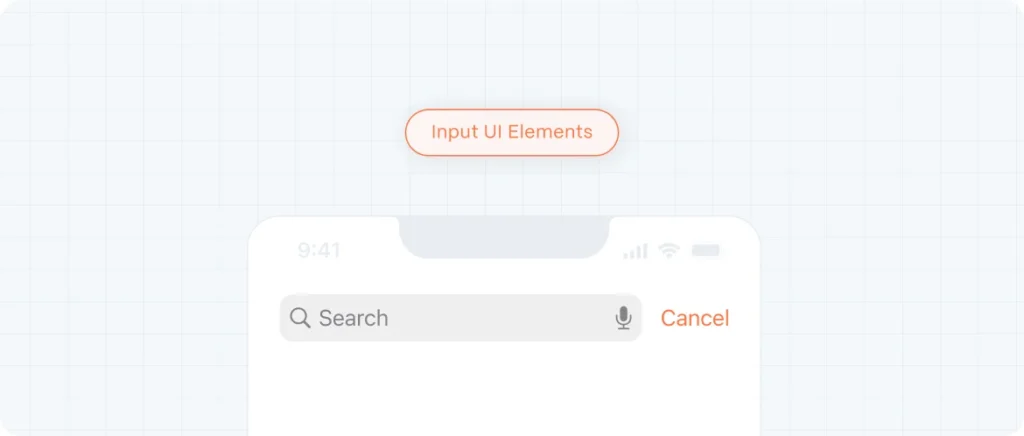
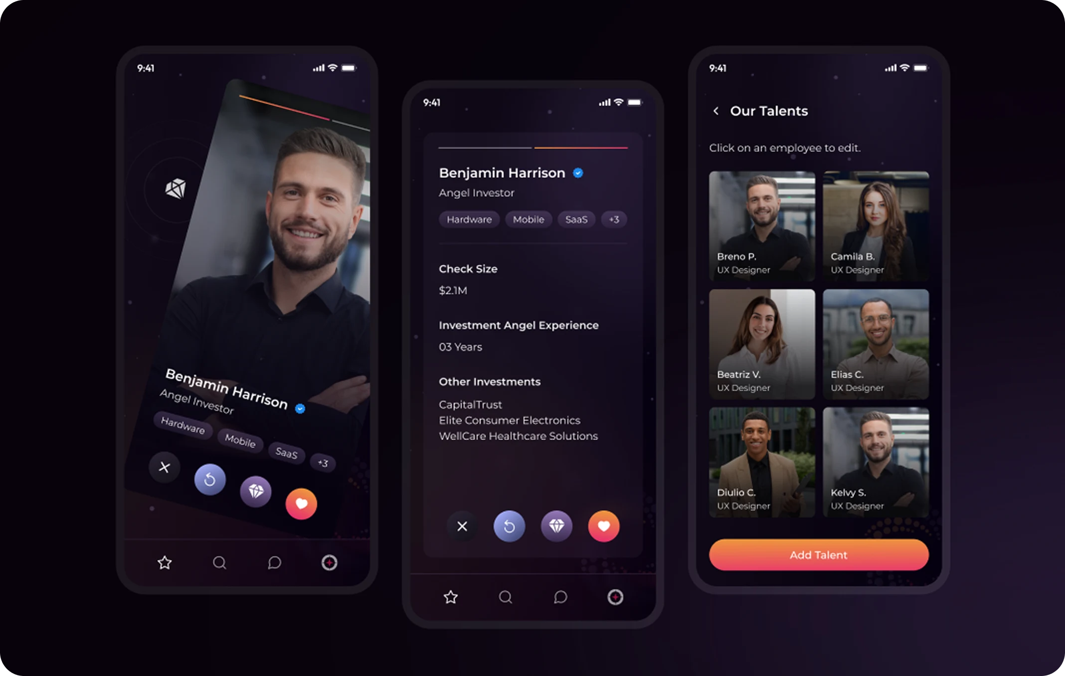
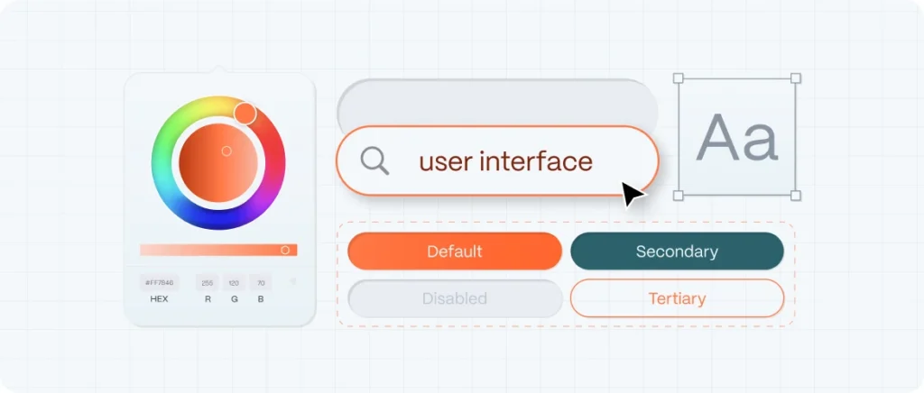
2. Input UI Elements
These allow users to enter information or make selections.
Common Input Elements:
- Text fields
- Dropdowns
- Radio buttons and checkboxes
- Sliders and steppers
- Date pickers
- Toggle switches
Pro tip: Always pair input elements with labels, error messages, and helper text to enhance accessibility and reduce cognitive load.

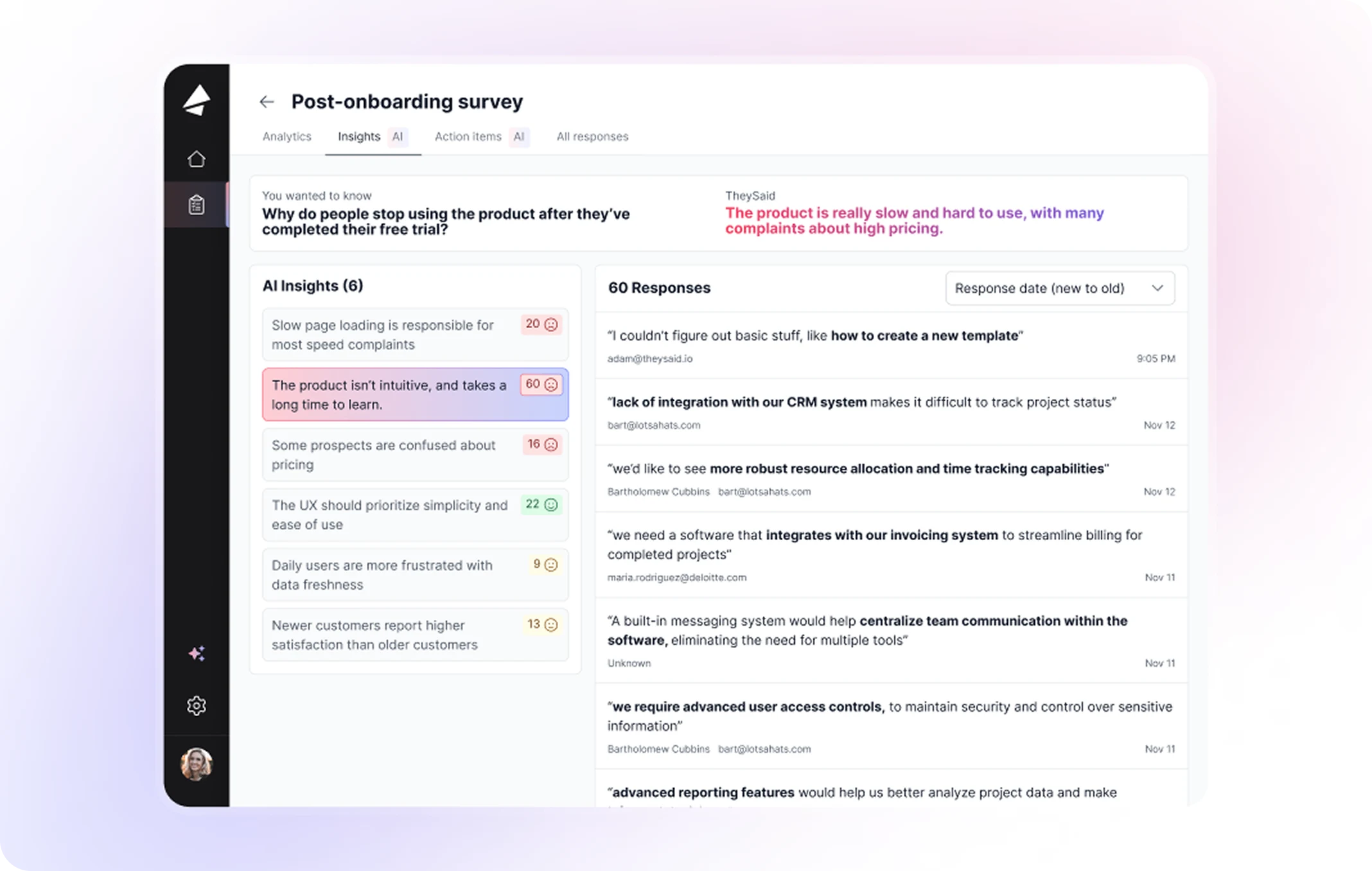
3. Output UI Elements
These display information back to the user—often dynamically based on input or system feedback.
Key Output Components:
- Notifications and alerts
- Tooltips
- Badges
- Status indicators (loading spinners, progress bars)
- Confirmation messages
Caution: Output elements should communicate clearly but not interrupt the flow unless absolutely necessary.
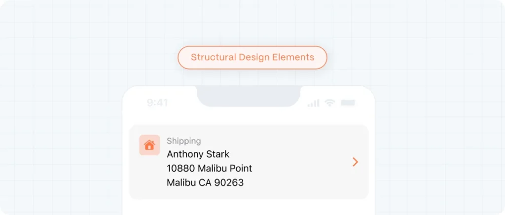
4. Structural Design Elements
These form the framework of your interface—organizing content and interaction zones.
Examples:
- Containers and cards
- Modals and overlays
- Grids and layout columns
- Sections and dividers
- Sidebars and footers
Best practice: Use visual hierarchy (spacing, color, typography) to guide the eye without overwhelming the user.

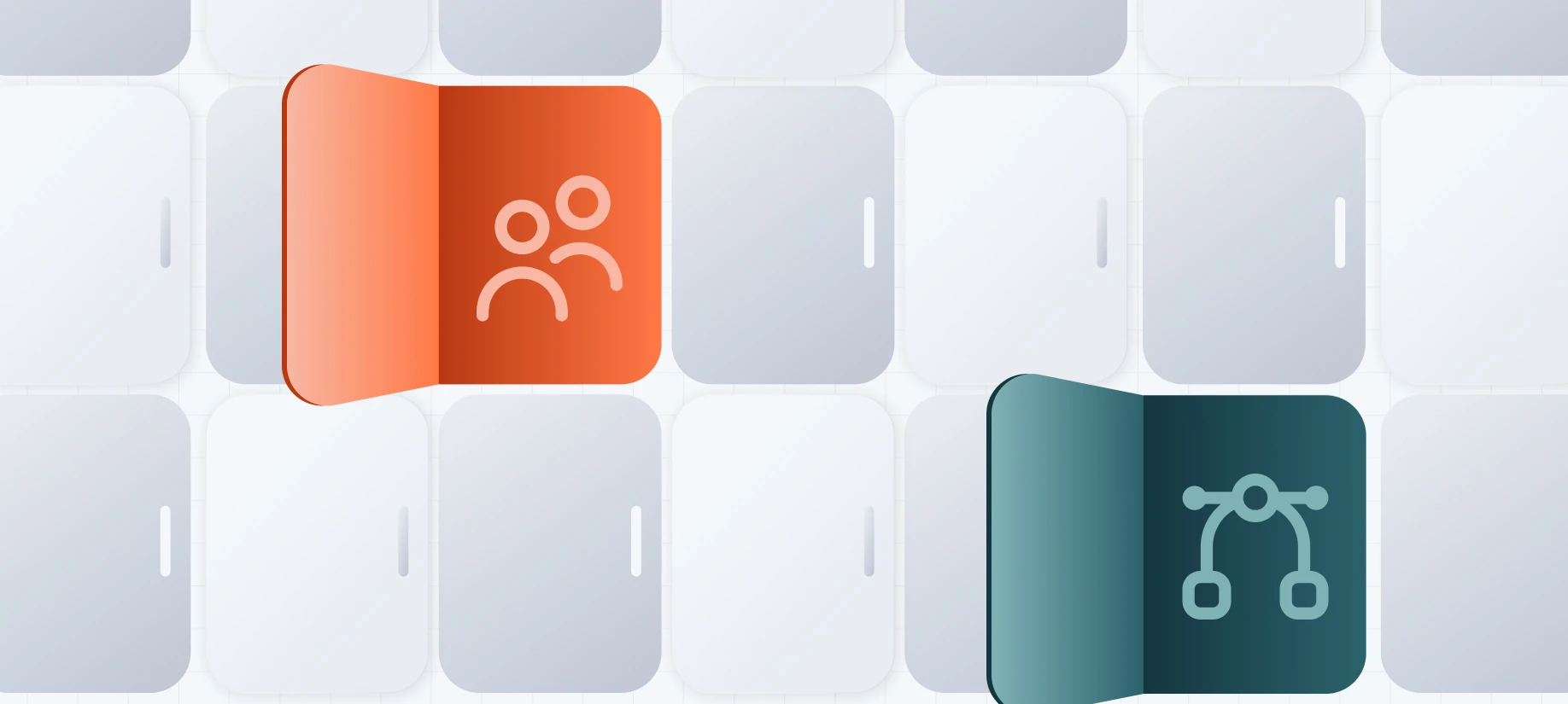
5. Decorative & Functional Visual Elements
These reinforce brand identity and aid usability without necessarily offering direct interaction.
Includes:
- Icons
- Avatars
- Illustrations
- Color schemes and typography
- Microanimations
Well-crafted design elements build trust and clarity—but remember: every pixel must have a purpose.
Designing with Purpose: Best Practices for High-Performance UI
Design systems vary, but some principles apply universally:
Clarity First
Don’t make users think. Every action should be obvious, every screen self-explanatory.
Consistency Builds Trust
Use a defined UI component library to maintain cohesion across screens and platforms.
Accessibility Is Not Optional
Design with WCAG compliance in mind: color contrast, focus states, screen reader labels, keyboard navigation.
Responsiveness Is Key
All UI elements should scale gracefully across breakpoints—from mobile to desktop to tablet.
Feedback Closes the Loop
Every action (submit, error, hover) must have a clear, immediate response.
From Components to Experience: The Evo Design Approach
At Evo Design, we don’t treat UI as a visual afterthought. It’s an integral part of the user experience strategy—from wireframe to polished interface.
We:
- Build scalable design systems from atomic elements
- Test and refine UI components based on usability insights
- Customize visuals to reflect brand identity without compromising function
- Collaborate closely with development to ensure design fidelity and performance
Design the Interface. Shape the Experience.
Mastering UI design means understanding the role each component plays in guiding, informing, and empowering users.
It’s not just about pretty screens—it’s about clarity, control, and conversion.
When users interact with your product, your UI elements become your brand’s voice.
If you’re building a product that needs to feel intuitive, elegant, and scalable—Evo Design can help you get there.
Let’s build an interface that works beautifully.