


Imagine landing on a website where the font is too small to read, the spacing is inconsistent, and the headlines scream at you in six different styles. You probably wouldn’t stay long.
That’s the silent power of typography—when done well, it goes unnoticed. But when done poorly, it breaks trust, hurts usability, and weakens a brand’s voice.
In this in-depth guide, we’ll explore how to create a Typography Style Guide that elevates your web design from “just okay” to “effortlessly professional.” Whether you’re designing for startups or global brands, mastering web typography is non-negotiable.
What Is a Typography Style Guide (and Why You Absolutely Need One)?
A Typography Style Guide is a set of design rules that define how text appears across a website or digital product. It’s more than just choosing a pretty font—it ensures consistency, improves readability, and reinforces your brand identity across all touchpoints.
A solid guide should define:
- Typefaces and fallback fonts
- Font sizes and hierarchy
- Line height and letter spacing
- Font weights and styles
- Usage guidelines for headings, paragraphs, and links
- Mobile and responsive adjustments
Great typography doesn’t decorate a page—it structures it.
Typography in Branding: The Voice of Your Visual Identity
Typography is branding in action. It’s the difference between a bold, corporate tone and a friendly, conversational one. The right font can convey trust, innovation, luxury, or minimalism in just a glance.
Consider these examples:
apple typograghy
- Apple uses San Francisco for clarity and modernity.
- The New York Times uses a classic serif font to reinforce tradition and authority.
- Airbnb uses Circular to appear approachable and global.
Your website typography is often the first “voice” your customer hears. Choosing it wisely is crucial.
Typeface vs. Font: Let’s Clear This Up
Here’s where many designers (and clients) get it wrong:
Typeface: The design of the letterforms (e.g., Helvetica, Times New Roman).
Font: A specific style and size of a typeface (e.g., Helvetica Bold 16px).
Typeface vs. Font
Think of it this way: A typeface is the song, and the font is the version of that song played on a specific instrument.
When building a Typography Style Guide, be precise about both. Specify not only the typeface but also how each font should be used across components.
How to Build a Web Typography Style Guide Step-by-Step
1. Choose the Right Typeface(s)
Start by selecting one or two typefaces—one for headings and one for body copy. Avoid mixing too many styles unless you’re an expert in typographic harmony.
Pro tip: Use Google Fonts or licensed web-safe fonts to ensure consistency across devices.
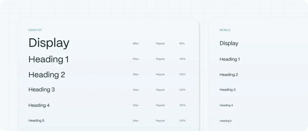
2. Set Your Font Hierarchy
Hierarchy creates structure. A typical setup includes:
- H1: 48px – Page Titles
- H2: 36px – Section Headers
- H3: 24px – Subheaders
- Body Text: 16px – Paragraphs
- Caption/Text Label: 12–14px
Use scale ratios (like 1.25 or 1.333) to keep the sizing intuitive and responsive.
3. Define Line Height and Letter Spacing
Good typography breathes. Ideal line height is usually 120%–150% of the font size. Letter spacing (tracking) depends on the font’s natural design, but avoid extremes.
4. Set Colors and Contrast
Accessibility is non-negotiable. Use tools like Contrast Checker to ensure your text is readable, especially over backgrounds. For an accessible design, consider reading about accessibility UX design.
5. Add Responsive Rules
Typography must adapt. Define how sizes adjust on tablets and smartphones, using media queries or fluid type techniques (e.g., clamp() in CSS).
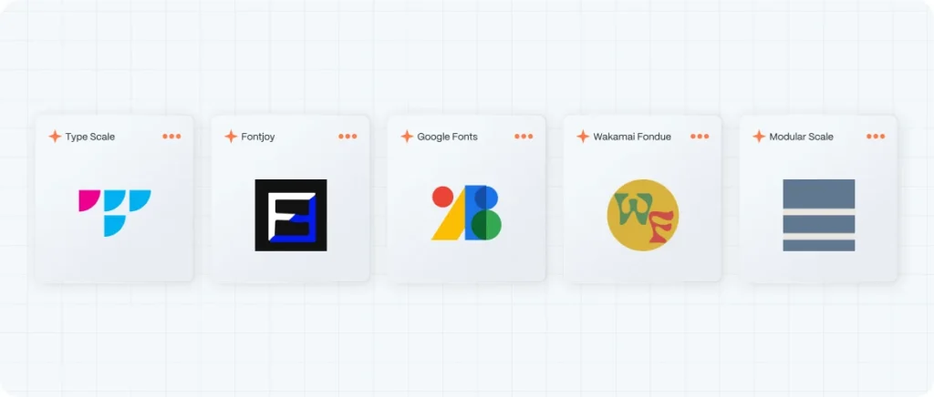
Typography Tools We Recommend
- Type Scale – for hierarchy
- Fontjoy – for pairing inspiration
- Google Fonts – web-safe typefaces
- Wakamai Fondue – to analyze font features
- Modular Scale – scale systems for web typography
Typography and SEO: What’s the Link?
Typography affects SEO in more ways than most realize:
- Readability improves dwell time and reduces bounce rate.
- Heading structure (H1–H6) informs search engines about content hierarchy.
- Clean, semantic typography contributes to faster page loads and better indexing.
And yes—Google rewards websites with excellent UX, and typography is a major UX factor.
How Evo Design Approaches Website Typography
At Evo Design, we treat typography as architecture. Every pixel, every letter, and every space between them is intentional. We develop Typography Style Guides tailored to your brand personality, audience, and business goals.
We combine data, psychology, and design expertise to ensure that every headline you publish feels like your brand—because it is.