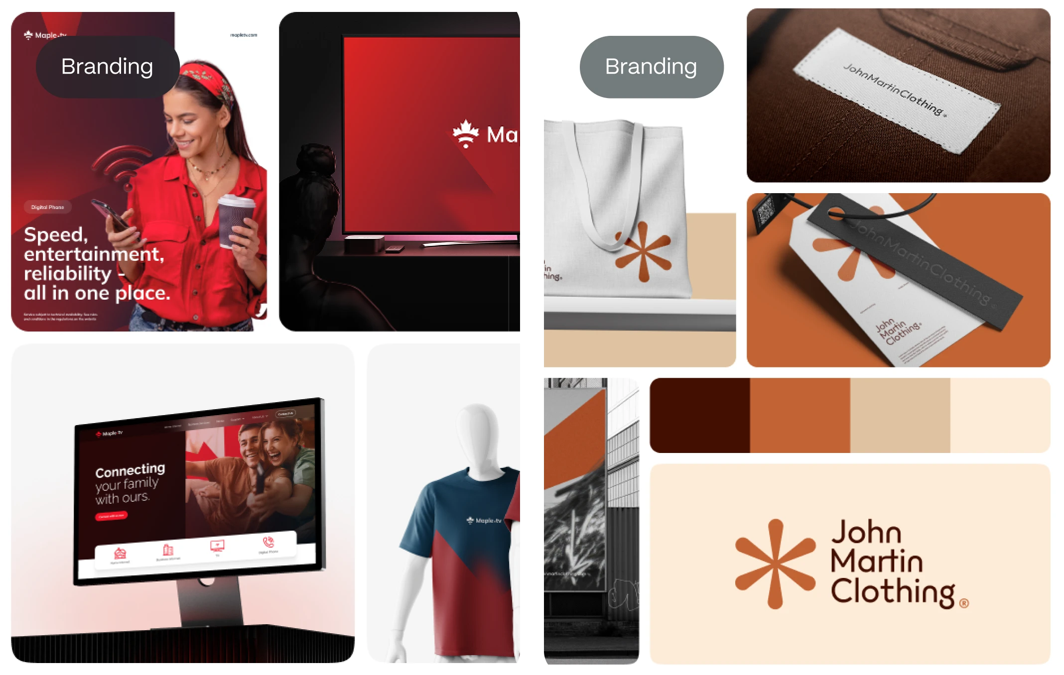
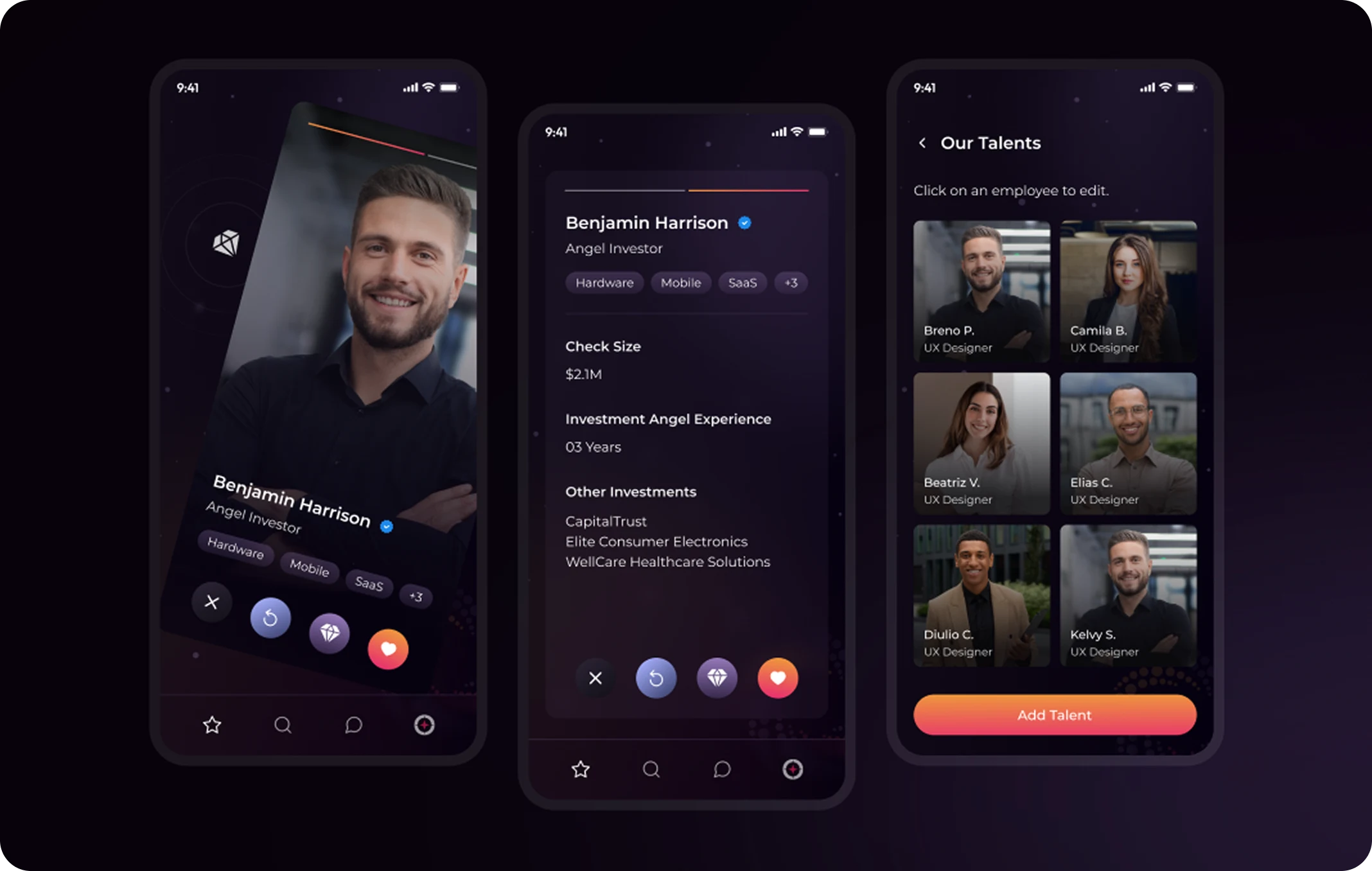
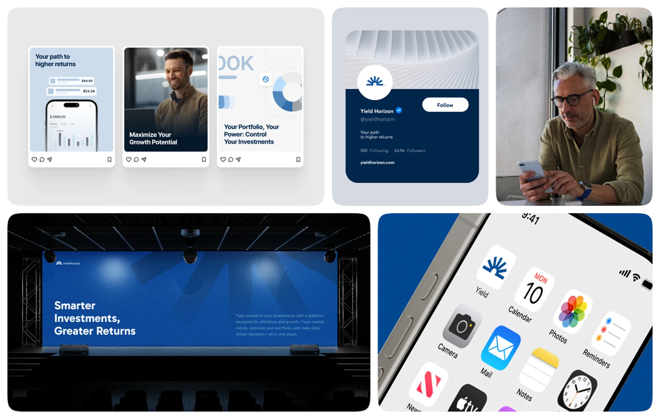
Scroll through any luxury brand’s website—from high-end fashion houses to boutique architecture studios—and you’ll notice a common visual language: refined simplicity.
One of the most powerful (and often overlooked) tools behind that sophistication?
A monochromatic color palette.
This approach to color isn’t just about using different shades of the same hue—it’s about creating visual cohesion, emotional depth, and brand clarity with intentional restraint.
In this article, we’ll explore why monochromatic color palettes are more than just an aesthetic choice—they’re a strategic design framework that can align your website with your brand personality and speak directly to your ideal customer.
What Is a Monochromatic Color Palette?
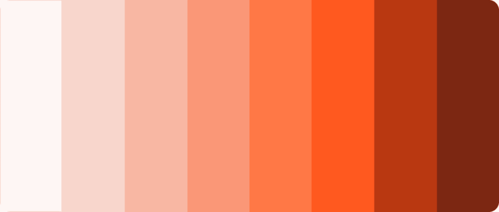
A monochromatic color palette is built using only one base hue, expanded through its tints (with white), shades (with black), and tones (with gray).
The result?
A unified, harmonious, and elegant visual system that feels intentional—never overwhelming.
While it may sound limiting at first, this constraint actually unlocks infinite variations in mood, depth, and visual hierarchy without ever straying from your brand’s DNA.
Why Monochromatic Color = Elegant Design
Minimal doesn’t mean boring. In fact, true luxury lies in restraint.
Here’s why monochromatic palettes are a secret weapon for elegant designs:
1. Visual Harmony
With fewer competing hues, your design feels more controlled and polished. Every element looks like it belongs.
2. Emotional Focus
Colors evoke emotion. A monochromatic approach lets you amplify the psychological effect of a single color—deepening your message.
Blue → Trust, calm, clarity
Beige → Sophistication, warmth, neutrality
Black → Power, elegance, exclusivity
3. Hierarchy Without Distraction
Using tones and shades to create contrast allows you to guide the user’s attention—without resorting to aggressive color changes.
4. Luxury Aesthetics
From Chanel to Bang & Olufsen, many high-end brands use limited color palettes to reflect simplicity, confidence, and exclusivity.
Branding insight: In the luxury space, saying less is saying more. Monochrome design communicates clarity and control.

Monochromatic in Action: Where to Use It in Web Design
– Hero Sections
Set the tone immediately with a deep shade background, mid-tone imagery, and high-contrast text—all within one hue family.
alt text: Hero Sections
– Typography
Vary font weights and colors within a single hue to define information hierarchy without breaking the visual flow. You can check our article about typography style guide for web design
alt text: Typography
– Buttons and CTAs
Use light tints for backgrounds and darker shades for CTAs. The variation is enough to guide action while keeping the look cohesive.
alt text: Buttons and CTAs
– Imagery
Consider using duotone or grayscale-treated images that match your color palette to avoid visual dissonance.
alt text: Imagery
When Monochromatic Doesn’t Work (and How to Fix It)
As powerful as it is, monochromatic design must be used intentionally.
Here’s what to avoid:
- Low contrast: Your palette needs enough variation in luminance to maintain legibility.
- Overuse of grayscale: If every shade is too close, your design risks looking flat or lifeless.
- Ignoring accessibility: Even in a minimal palette, ensure text/background contrast meets WCAG standards. More about accessibility ux design
Pro tip: Use tools like Contrast Checker and ColorBox to test depth and accessibility.
Monochromatic Design in Branding: Consistency Meets Sophistication
Monochromatic branding doesn’t stop at web design. It creates a visual identity system that can extend to:
- Social media templates
- Product packaging
- Brand photography
- Pitch decks and presentations
This consistency across touchpoints reinforces recognition and positions your brand as intentional, curated, and elevated. Maybe you need some social media branding design tips for startups
Evo Design’s Approach to Monochromatic Branding
At Evo Design, we see color as strategy, not decoration.
When a client wants to convey elegance, modernity, or minimalism, a monochromatic palette is often the first direction we explore. But we don’t stop at choosing a “nice shade of beige”—we study the brand’s psychology, audience, and market positioning to define a color system that communicates who they are before a single word is read.
From branding kits to website UI systems, we apply monochrome logic to deliver designs that feel timeless, premium, and powerfully simple.
One Hue. Infinite Impact.
In a world overwhelmed by noise and visual clutter, monochromatic color palettes offer clarity, calm, and undeniable elegance.
Whether your brand speaks in deep navy, warm earth tones, or pure black, the strategic use of monochrome can elevate your digital presence—and connect emotionally with the customers you’re trying to reach.
Looking to translate your brand into a color system that’s elegant by design?
Let Evo Design create a monochromatic strategy that sets your brand apart.

