UI design is a field of trends, cycles, and reinventions. From skeuomorphism to flat design, from material design to glassmorphism, each wave reflects a combination of aesthetics, technology, and user expectations. Among these movements, neumorphism has emerged as one of the most visually distinctive styles of the last decade, blending soft shadows, minimal surfaces, and subtle depth into interfaces that feel tangible yet modern.
For startups and digital-first businesses, mastering neumorphism goes beyond visual appeal. It is about understanding how this design language impacts usability, accessibility, and brand perception. This article is a complete guide: we will define what neumorphism is, explore its core characteristics, analyze its strengths and weaknesses, and provide real-world examples of how startups can integrate it into products that sell, convert, and retain users.
What Is Neumorphism?
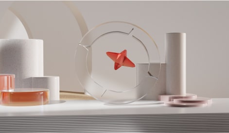
Neumorphism (short for “new skeuomorphism”) is a UI design trend that reimagines how depth and light behave on digital surfaces. Unlike flat design, which eliminates shadows for a cleaner and simpler aesthetic, neumorphism uses soft shadows, highlights, and subtle gradients to create an illusion of extruded or pressed elements.
The result: buttons, cards, and inputs that look as if they are part of the background itself—emerging softly, without hard edges, creating an interface that feels almost tactile.
Neumorphism gained popularity in 2020 after designers began showcasing Dribbble concepts and Behance prototypes using this style. While not yet a mainstream design system like Google’s Material Design, it has become a favorite for portfolios, landing pages, fintech apps, and futuristic dashboards.
Core Characteristics of Neumorphism
To identify neumorphism, look for these visual traits:
- Soft Shadows – Every element casts a light and dark shadow, usually diagonal, creating a subtle 3D effect.
- Low-Contrast Color Palette – Interfaces often use monochromatic or slightly varied backgrounds, usually in muted tones like gray, off-white, or pastel shades.
- Minimal Borders – Instead of hard strokes, depth is created purely through shadow and light.
- Embedded or Extruded Effects – Buttons look as if they are carved into the background or softly protruding from it.
- Consistent Lighting – The entire interface follows one light direction, typically top-left.
Together, these features create a soft, almost plastic-like texture that feels modern and futuristic.
Neumorphism vs. Other UI Styles
To understand neumorphism’s role in UI design, it helps to compare it with other popular movements:
- Skeuomorphism – Imitates real-world objects (e.g., Apple’s old Notes app resembling a notepad). Neumorphism is inspired by this but more abstract.
- Flat Design – Eliminates depth and focuses on bold colors, typography, and simplicity. Neumorphism reintroduces depth, but subtly.
- Material Design – Google’s system that uses layered cards, motion, and bolder shadows. Neumorphism is softer, lighter, and less structural.
- Glassmorphism – Focuses on transparency, blur, and frosted glass effects. Neumorphism is opaque, tactile, and shadow-driven.
Advantages of Neumorphism
Why are startups and designers drawn to neumorphism?
- Modern Aesthetic – It feels futuristic and sophisticated, ideal for brands that want to differentiate visually.
- Tactile Feedback – Elements appear pressable, providing intuitive affordances.
- Consistency – By merging elements with the background, interfaces look clean and cohesive.
- Brand Positioning – For startups, neumorphism can communicate innovation and exclusivity.
Limitations and Challenges
Despite its appeal, neumorphism has challenges startups must consider:
- Accessibility Issues – Low-contrast palettes can make interfaces harder to read for users with visual impairments.
- Scalability – Overusing soft shadows can create visual fatigue in complex dashboards.
- Responsiveness – On small screens, details may disappear or lose clarity.
- Performance – Heavy use of shadows and gradients may impact rendering speed on older devices.
A successful neumorphic design requires balance: enough depth to be engaging but not so much that it harms usability.
Best Practices for Using Neumorphism
If your startup or product team is considering neumorphism, follow these guidelines:
- Use Sparingly – Apply neumorphism to key interactive elements (buttons, toggles, cards) instead of entire layouts.
- Combine With Flat Design – Pair neumorphism with flat sections to maintain contrast and clarity.
- Prioritize Accessibility – Increase contrast, add labels, and test with accessibility tools.
- Optimize for Devices – Always test neumorphic designs on both desktop and mobile.
- Brand Alignment – Ensure neumorphism supports, not conflicts with, your overall brand identity.
Real-World Examples of Neumorphism
- Fintech Dashboards – Investment apps use neumorphic cards for a premium, futuristic aesthetic.
- Health Apps – Soft, tactile buttons for tracking daily activity or meditation progress.
- Smart Home Interfaces – Neumorphic toggles feel intuitive for turning devices on and off.
- E-commerce Landing Pages – Product highlights with neumorphic CTA buttons encourage clicks.
- Portfolio Websites – Designers use neumorphism to showcase innovation and mastery of trends.
How Startups Can Leverage Neumorphism
For startups, neumorphism is more than a visual trend—it is a strategic tool:
- Differentiate Products – A unique UI can set a product apart in crowded SaaS or app markets.
- Build Brand Identity – Neumorphism conveys modernity, sophistication, and forward-thinking values.
- Enhance User Experience – With thoughtful execution, neumorphic elements can feel intuitive and interactive.
- Marketing Leverage – Screenshots of a beautifully designed neumorphic app can elevate brand storytelling and investor presentations.
Future of Neumorphism
Neumorphism may not replace material or flat design, but it has carved a space as a complementary style. In 2025, we see it evolving with:
- Hybrid Systems – Designers blending neumorphism with glassmorphism or flat UI.
- Dark Mode Integration – Stronger contrast in dark mode interfaces makes neumorphism more usable.
- Adaptive Shadows – Smarter design systems using AI to auto-generate neumorphic shadows and gradients.
FAQ
What is neumorphism in UI design?
Neumorphism is a UI design style that uses soft shadows and highlights to create subtle depth, making elements appear embedded or extruded from the background.
Why is neumorphism popular?
It offers a futuristic, tactile, and elegant aesthetic, appealing to startups and brands looking to differentiate visually.
What are the challenges of neumorphism?
Accessibility, low contrast, performance, and scalability are common issues if not used carefully.
How can startups use neumorphism effectively?
By applying it to key interactive elements, combining it with flat design, and aligning it with brand identity.
Is neumorphism the future of UI design?
It is not a replacement for material or flat design but a complementary style that, when applied strategically, elevates user experience.

