We are overflowing with visual noise. Where every pixel counts and attention spans are short, minimalist logo design stands out as a powerful branding tool. More than a fleeting trend, minimalist design is a visual philosophy that promotes clarity, versatility, and longevity.
In this post, we’ll dive into the essence of the minimalist logo, explore why it works so effectively, highlight iconic examples, and show how your brand can benefit from a cleaner, more strategic logo.
What Is Minimalist Logo Design?
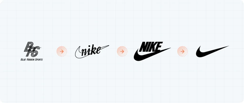
Minimalist logo design is the art of creating logos with the fewest elements possible—clean lines, geometric shapes, simple typography, and limited color palettes. The goal is to communicate a brand’s essence clearly, memorably, and timelessly.
A minimalist logo isn’t just “simple for the sake of being simple.” On the contrary—it demands high visual refinement and a deep understanding of the brand’s core identity.
“Less is more” isn’t just a catchphrase—it’s a powerful design principle.
alt text: minimalist logo
Why Choose a Minimalist Logo?
- VersatilityMinimalist logos look great everywhere—on tiny screens, billboards, print materials, digital assets, and app icons.alt text: nike billboard
- MemorabilitySimple shapes are easier to remember. Think of brands like Apple, Nike, and Airbnb.alt text: apple brand
- Timeless AestheticBy avoiding trends, minimalist logos stay relevant over time—saving you from constant rebrands.
- Focus on What MattersFewer elements mean more attention on the message, not the decoration.
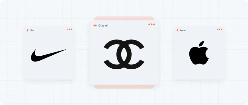
Iconic Minimalist Logos That Work
Apple
The bitten apple outline, no text needed, speaks volumes about innovation and simplicity.
alt text: apple brand
Nike
The swoosh is dynamic, clean, and universally recognizable.
alt text: nike brand
Chanel
Two interlocking Cs convey elegance and luxury with minimal graphic weight.
alt text: chanel brand
These logos work because every curve and line is intentional, tied to a deeper brand concept.
How to Create a Minimalist Logo That Works
At Evo Design, we believe that a successful minimalist logo starts long before the first sketch. Here’s how we approach it:
- Strategy Before StyleWe start by deeply understanding the brand—its purpose, values, audience, and positioning. You can learn more about brand archetypes to inform this process.
- Typography as a Hero ElementTypography matters. We select clean, modern sans-serif fonts that express your brand’s voice.
- Smart Use of Negative SpaceNegative space is a minimalist’s secret weapon. Take FedEx’s hidden arrow as a great example.
- Real-World TestingWe prototype logos in real-life scenarios—business cards, websites, social feeds—to ensure they look and feel right.
Minimalist Logo Design Trends for 2025
- Responsive logos that adapt to different screen sizes.
- Smart monochrome palettes, leveraging black, white, and neutrals.
- Abstract geometry for a sleek, tech-forward aesthetic.
- Subtle animations for digital platforms, without clutter.
How Evo Design Can Transform Your Visual Identity
At Evo Design, we take minimalist logo design seriously. We don’t just deliver a good-looking logo—we craft a strategic solution that captures your brand’s essence with visual intelligence.
Our process is rooted in research, immersion, ideation, and refinement. The result? A minimalist logo that’s as impactful as it is elegant.

