

We often talk about UX, UI, wireframes, and flows—but underneath it all, there’s something less visible and more powerful at play: interaction design.
It’s what makes a button feel clickable, a swipe feel satisfying, or a notification feel just right. And when done well, it’s completely invisible. That’s the beauty of it.
For startups building digital products, mastering interaction design isn’t just a design consideration—it’s a growth strategy. Because it’s not enough to look beautiful anymore. Your product has to feel right in motion. Every click, tap, scroll, and transition must build confidence and clarity.
In this guide, we’ll break down what interaction design really means, how it connects to UX and UI, its foundational principles, and the best practices to apply if you’re building something users will love—and return to.
What Is Interaction Design?
Interaction design (IxD) is the practice of designing how users engage with a digital product—moment by moment.
It focuses on the behavioral layer of a product: how things respond when you click, drag, scroll, speak, or move through them. It shapes not just how things look, but how they behave.
Official Definition (Straight from the Interaction Design Foundation):
“Interaction design is about creating meaningful relationships between people and the products and services that they use, from computers to mobile devices to appliances and beyond.”
In short, it’s the design of action and reaction.
While UI design is concerned with what you see, and UX with how it feels overall, interaction design is about what happens next.
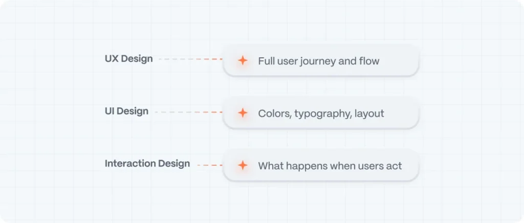
Interaction Design vs. UX Design vs. UI Design
Let’s clarify how interaction design fits into the broader design ecosystem:
| Discipline | Focus |
| UX Design | The full user journey, flow, and emotional experience |
| UI Design | Visual layout—colors, typography, layout |
| Interaction Design | Dynamic behavior—what happens when users act |
Interaction design is how the doors open, how lights respond, and how movement feels natural.
Why Interaction Design Matters for Startups
Startups live and die by first impressions and usability. No one has time to read tutorials or guess how your interface works.
A product that feels snappy, smooth, and smart builds trust faster. Users feel like the product was made for them. That’s interaction design at work.
Some real-world impacts:
- Reduces friction during onboarding
- Increases retention and satisfaction
- Makes the product feel more “premium”
- Supports accessibility and inclusivity
- Drives conversions through clearer feedback and responsiveness
If your app or site feels clunky, slow, or unpredictable, no visual polish will save it. Interaction design is the glue that holds UX together.
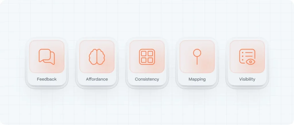
The 5 Core Principles of Interaction Design
Let’s explore the foundation every interactive product should stand on:
1. Feedback
Users need to know that the system is responding to their actions. A button click should animate. A form submit should show a spinner. A tap should ripple. Feedback closes the loop.
Why it matters: Without feedback, users feel unsure and frustrated.
Examples:
- Micro-animations on hover
- Vibration on mobile input
- “Saved” confirmation on form submission
Example: Figma file saving indicator
In Figma, every time you make a change, the top-left corner displays a small “Saving…” animation that transitions to “Saved.” It’s a subtle yet powerful confirmation that your work is being preserved—providing literal reassurance in real time.
Figma file saving indicator
2. Affordance
Affordance refers to the visual cues that indicate how an object should be used. A button should look pressable. A slider should look draggable.
Why it matters: Affordances reduce the learning curve. Users understand instantly what to do.
Examples:
- Raised buttons with shadow
- Icons with motion indicators (arrows, chevrons)
- Interactive cards with hover lifts
Example: Material Design raised button
Material Design’s raised buttons—filled, elevated, with clear shadow—immediately look clickable. This visual affordance shows users exactly where to tap or click to perform an action, reducing hesitation and improving usability.
Material Design raised button
3. Consistency
The same interaction should behave the same way everywhere. When users learn how something works, that knowledge should transfer across the product.
Why it matters: Consistency builds trust and reduces cognitive load.
Examples:
- Navigation patterns that repeat
- Uniform animation speeds and easing
- Shared color meanings (e.g., red for delete)
Every component on Airbnb—the menu toggles, search field interactions, listing cards—behaves exactly the same across pages. Colors, motion timings, and button styles never change, so users immediately understand how to operate each element.
4. Mapping
Mapping is the relationship between controls and their effects. Good mapping means users can intuitively connect cause and effect.
Why it matters: It improves predictability and reduces error.
Examples:
- Swiping left reveals delete (as in email apps)
- Volume sliders go from left (low) to right (high)
- Menu items placed close to where the action happens
Example: Gmail swipe-to-delete gesture on mobile
Gmail’s swipe actions map directly to intuitive actions: swiping left or right archives or deletes an email. The direction correlates with the intended result, making the interaction fast, predictable, and satisfying.
Gmail swipe-to-delete gesture on mobile
5. Visibility
Important functions should be discoverable. If users don’t know an option exists, they won’t use it.
Why it matters: Hidden features = unused features.
Examples:
- CTA buttons placed prominently
- Clear icons and labels
- Onboarding cues (like tooltips or modals)
Example: Spotify premium signup prompt
Throughout Spotify’s interface, the “Get Premium” CTA appears consistently in the top right—whether on web, mobile, or desktop. It remains visible without being intrusive, gently reminding users of the upgrade opportunity.
Spotify premium signup prompt
Designing Interactions: Step by Step
Here’s how to approach designing interactions from scratch—whether you’re prototyping a new app or refining an MVP.
1. Map the User Journey
Understand the full path users take. Identify key interactions: sign up, upload a file, schedule a meeting, make a payment.
Each step should have defined:
- Inputs (what users do)
- System responses (what they get back)
- Edge cases (what happens when things go wrong)
2. Define System States
Every interaction has multiple states: default, hover, active, loading, success, error. Design for all of them.
Example: A “Sign Up” button
- Default: neutral background
- Hover: slight lift or color change
- Click: loading spinner
- Success: green confirmation
- Error: red shake or tooltip
3. Use Motion with Purpose
Animations should feel natural—not decorative. Apply motion to:
- Communicate cause and effect
- Smooth transitions between states
- Direct user attention
Use ease-in and ease-out curves for fluidity, and keep animations under 300ms to maintain snappiness.
4. Prototype Early
Use tools like Figma, Framer, or Webflow to prototype real interactions. Don’t just design screens—design behavior.
Test with real users. Observe confusion points. Adjust accordingly.
5. Make It Accessible
Interaction design must serve all users. Ensure:
- Keyboard navigability
- Clear focus states
- Screen reader compatibility
- Motion sensitivity toggles for users with vestibular disorders
Inclusive interaction design isn’t just ethical—it’s strategic.
Best Practices in Interaction Design
Start With Microinteractions
Sometimes the smallest interactions leave the biggest impression. Microinteractions are single-purpose interactions like:
- Liking a post
- Pull-to-refresh
- Swiping a card
- Typing indicators in chat
They add humanity and feedback in the tiniest ways.
Keep it Predictable
Avoid unnecessary surprises. Users don’t want to learn how to use your interface. They want to use it.
Good interaction design feels familiar, even if the product is new.
Use Interactive Patterns Thoughtfully
Patterns like:
- Infinite scroll
- Swipe gestures
- Drag-and-drop
can enhance UX—but only if they’re implemented clearly and intentionally.
Don’t copy trends blindly. Apply patterns that match the user’s goal.
Balance Delight and Speed
It’s tempting to add fancy transitions, but don’t let them slow things down. Delight should never get in the way of efficiency.
Animations over 500ms can feel sluggish. Stick to quick, meaningful motion.
Prioritize Contextual Interactions
Don’t overload the interface with visible options. Surface them when relevant.
Example:
Show a floating “Edit” button only when the user hovers or selects content.
This keeps the UI clean without sacrificing functionality.
Real-World Examples of Great Interaction Design
- Airbnb
From subtle motion in filters to predictive suggestions, every click in Airbnb feels purposeful and elegant. - Duolingo
Gamified interactions, progress animations, and playful feedback make learning addictive and satisfying. - Apple Music
Smooth transitions, gesture-based navigation, and personalized feedback all reflect polished interaction thinking. - Asana
Microinteractions in task creation, drag-and-drop, and celebrations when you complete work keep engagement high. - Mailchimp
Smart onboarding, button animations, and user-friendly error messages make even email marketing feel less stressful.
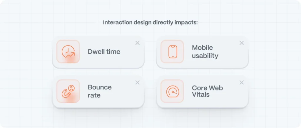
SEO Benefits of Better Interaction Design
Google’s algorithm increasingly favors user-centered experiences. And interaction design directly impacts:
- Dwell time: Engaging interfaces keep users on your site longer.
- Bounce rate: Predictable, interactive flows reduce exits.
- Mobile usability: Gesture-friendly interactions improve performance scores.
- Core Web Vitals: Good interaction feedback reduces Cumulative Layout Shift and improves responsiveness.
In short: if it’s good for the user, it’s good for search.
FAQs: Interaction Design
What is interaction design in UX?
It’s the practice of designing how users engage with a product. From clicks to swipes to animations, interaction design focuses on behavior and response.
What’s the difference between UX, UI, and interaction design?
UX is about the entire experience. UI is what you see. Interaction design is what happens when you do something—how the product reacts to your input.
What tools do interaction designers use?
Figma, Framer, Webflow, Principle, ProtoPie, and testing tools like Maze or Hotjar.
Is interaction design only about animation?
No. It includes all system feedback, affordance, states, and behavior. Animation is just one method of delivering those interactions.
What is the Interaction Design Foundation?
An educational platform offering high-quality courses on interaction design, UX, and human-computer interaction. It’s a great resource for growing your design skills.