


You have just a few seconds to make an impression online. And it’s not just about looking good—it’s about guiding the eye, telling a story, and helping users know what to do next. That’s where visual hierarchy comes in.
It’s the secret sauce behind every successful website layout. The reason users know where to click, what to read first, and how to navigate your product without friction.
At Evo Design, we believe that mastering visual hierarchy isn’t just about design—it’s about business. If you’re a startup trying to gain traction, your design must work hard to earn trust, clarify your message, and drive conversions.
In this article, we’ll explore:
- What visual hierarchy really is
- The principles behind it
- Techniques that work in 2025
- Examples from brands getting it right
- How to implement hierarchy into your startup’s website
Let’s dive in.
What Is Visual Hierarchy in Web Design?
Visual hierarchy is the arrangement of elements on a page in a way that guides the user’s eye through the content in a logical, intentional order.
It determines:
- What gets noticed first
- What gets read next
- What gets ignored entirely
Think of your website like a conversation. Visual hierarchy helps you control what you say first, second, and third—so users don’t feel overwhelmed or confused.
It answers the question: Where should I look?
Why Visual Hierarchy Matters for Startups
You can have the most brilliant product in the world, but if your site is cluttered, confusing, or visually flat, people won’t engage.
Here’s why this concept is critical:
- Reduces cognitive load: Clear layouts make it easier to understand your offer
- Improves conversion rates: Visual cues guide users toward the action you want them to take
- Boosts scannability: Users skim—hierarchy helps them find what they’re looking for
- Enhances mobile usability: Small screens need smart layouts
- Increases retention: A focused experience makes users stay longer
And from an SEO perspective, better engagement means lower bounce rates and stronger signals to Google that your site is worth ranking.
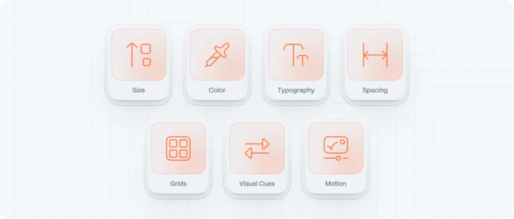
The 7 Core Principles of Visual Hierarchy
Mastering hierarchy means understanding how the brain processes information visually. These seven principles will help you design with clarity and intention:
1. Size
Big things catch the eye. Larger elements signal importance.
Use size to emphasize:
- Headlines over body copy
- Primary CTAs over secondary links
- Hero images over supporting icons
2. Color and Contrast
Bright colors and sharp contrasts draw attention. Muted tones fade into the background.
Use color to:
- Highlight buttons or offers
- Create mood and emotion
- Differentiate between sections
3. Typography
Fonts aren’t just visual—they’re informational.
Use typographic hierarchy to:
- Establish structure (H1 > H2 > paragraph)
- Create rhythm in reading
- Improve legibility and flow
4. Spacing and Proximity
Negative space groups related content and separates unrelated elements. You can see how important negative space is for web design.
Use it to:
- Create focus and breathing room
- Make sections feel digestible
- Guide the scroll naturally
5. Alignment and Grids
Consistent alignment gives your layout order. Grids are the foundation of strong hierarchy.
Use grid systems (like 12-column or 8pt) to:
- Keep everything structured
- Avoid visual chaos
- Create visual rhythm
6. Visual Cues and Direction
Arrows, lines, or even gaze direction in photos can point the user’s attention where you want it.
Subtle directional cues help:
- Draw attention to CTAs
- Guide users down a funnel
- Encourage scrolling
7. Motion and Animation
In 2025, motion is a core part of hierarchy. A gentle fade, a hover animation, or a sticky CTA adds interaction weight.
Just don’t overdo it—motion should enhance, not distract.
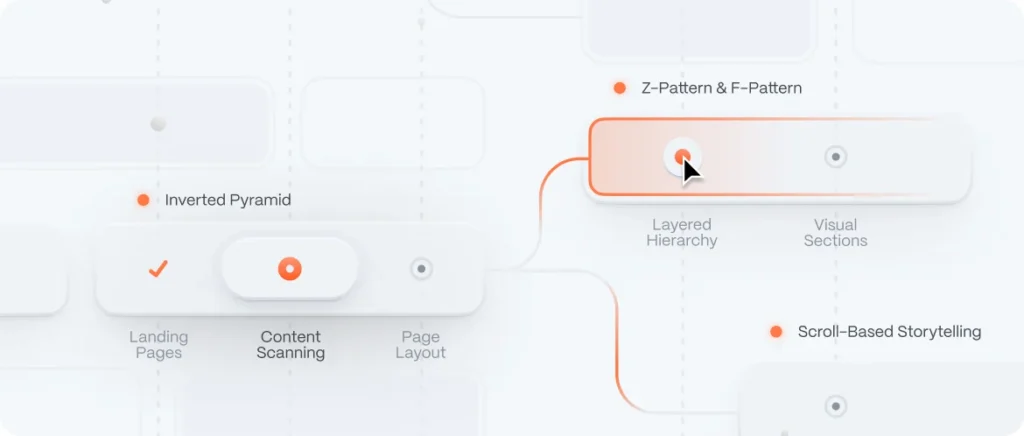
Techniques to Build Visual Hierarchy on Your Website
Let’s get practical. Here are methods to apply the principles above to real interfaces:
1. The Inverted Pyramid
Popular in journalism, this technique puts the most important info first, then trickles down into detail.
Use it for:
- Landing pages
- Product feature descriptions
- Blog posts
2. The Z-Pattern and F-Pattern
These are eye-scanning models. Users often scan in a Z or F shape:
- Z-pattern = landing pages with few sections
- F-pattern = content-heavy pages like blogs
Place key CTAs and messages along these paths.
3. Layered Hierarchy
Stack your content visually:
- Hero (bold, visual headline + CTA)
- Benefits (icons or cards)
- Testimonials
- Pricing or value proposition
- Secondary CTAs or footer
This mirrors the natural curiosity flow of new users.
4. Contrast for Call-to-Action
Make your CTA pop—through button size, bold color, or motion. One primary CTA per screen is best practice.
Examples:
- Calendly’s “Sign up free” button is bright and sticky
- Shopify uses green buttons on a mostly monochrome palette
5. Use Scroll to Tell a Story
Scrolling is not just functional—it’s an opportunity to build anticipation. Break long pages into visual chapters.
Techniques include:
- Full-bleed images
- Alternating text-image blocks
- Section-based color changes
Real Websites With Great Visual Hierarchy (2025 Edition)
Here are a few sites that are nailing visual hierarchy right now:
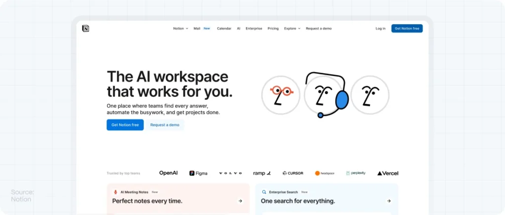
- Notion – https://www.notion.so
Huge typography, clear CTAs, strong spacing, and use of motion to highlight interactions.
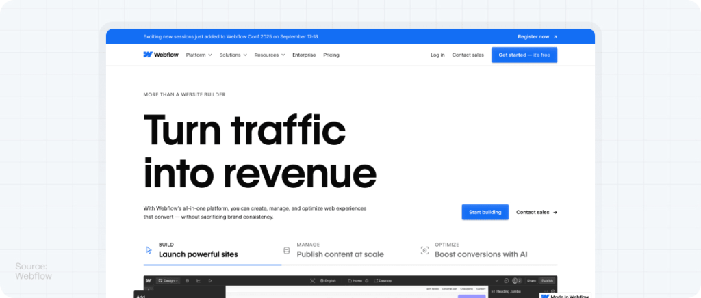
- Webflow – https://www.webflow.com
Every section is a masterclass in spacing, contrast, and flow. Great grid use and storytelling.
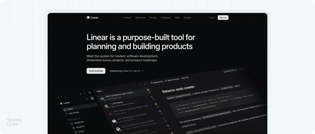
- Linear – https://linear.app
Minimal but impactful. CTA stands out. Typography hierarchy is clean and powerful.
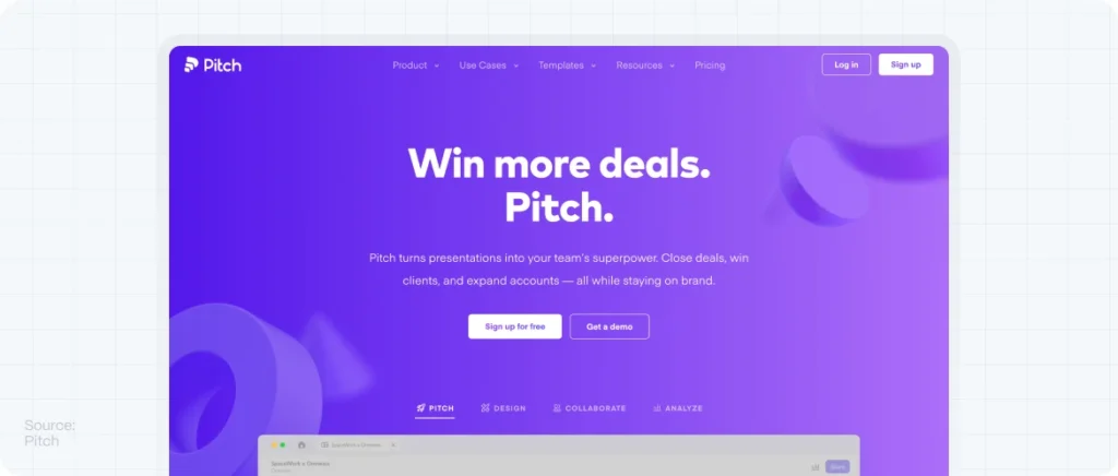
- Pitch – https://pitch.com
Elegant layers, staggered content, and bold callouts. Great example of motion as hierarchy.
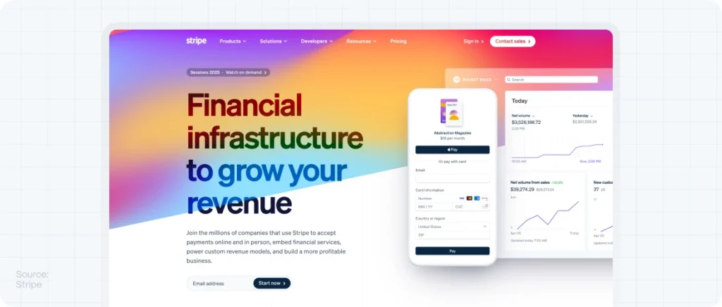
- Stripe – https://stripe.com
Even with technical content, everything is digestible thanks to color hierarchy and spacing.
What to Avoid: Hierarchy Mistakes That Kill UX
Don’t sabotage your own layout. Watch for these common pitfalls:
- Wall of text – Break up paragraphs with headings, images, or spacing
- Lack of contrast – Light gray on white is hard to read
- Too many CTAs – One primary action per screen is plenty
- Improper font sizing – Don’t let your H2s be bigger than H1s
- Visual imbalance – One side of the screen shouldn’t feel “heavier” unless intentional
Every layout decision should support the flow of information, not compete with it.
How Visual Hierarchy Affects Conversions and SEO
Better hierarchy = better performance.
Here’s how:
- Improves navigation → More time on site
- Reduces bounce rate → Signals relevance to Google
- Guides to CTAs → Higher conversion rates
- Optimizes mobile experience → Better Core Web Vitals
- Enhances scanability → More users reach your key messages
Visual hierarchy is one of the most cost-effective CRO (Conversion Rate Optimization) tools you can implement—because it’s baked into your layout.