

If you’ve ever felt like your website looks “fine” but somehow isn’t converting—or if you’re launching a new product and want to make the right first impression—this post is for you. Because here’s the truth: a website layout isn’t just about aesthetics. It’s a strategic tool. One that guides visitors through a journey, connects your product to real needs, and builds the trust required for someone to take action.
Whether you’re a founder, marketer, or designer building a product from scratch or scaling a business, understanding the anatomy of a high-performing website layout can be the difference between “nice design” and measurable growth. This isn’t just about putting boxes in the right places. It’s about understanding user behavior, applying cognitive design principles, and aligning every pixel with your business goals.
Let’s unpack the essential elements of an effective website layout and the proven best practices behind them.
Why Website Layouts Matter More Than You Think
You have less than 5 seconds to show users they’re in the right place. In those moments, layout is doing the heavy lifting—before words are even read.
A well-structured website layout:
- Reduces cognitive load
- Improves user retention and dwell time
- Drives more conversions
- Builds brand trust
In SEO terms, better layouts lead to lower bounce rates and higher user engagement—two key signals for Google rankings. And in business terms? Better layouts lead to more leads, more sales, and stronger brand perception.
The Core Anatomy of a High-Performing Website Layout
Let’s break down the essential elements that make up a layout that not only looks good but works hard for your business.
1. The Visual Hierarchy
Think of your website as a conversation. You wouldn’t greet someone with your phone number first—you’d start with a hook, a promise, or a question. That’s what visual hierarchy helps you do: guide attention in the right order.
Best practices:
- Use contrasting font sizes to differentiate headings, subheadings, and body.
- Apply spacing and grouping (Gestalt principles) to suggest relationships between elements.
- Reserve bold, colorful elements for CTAs or points of conversion.
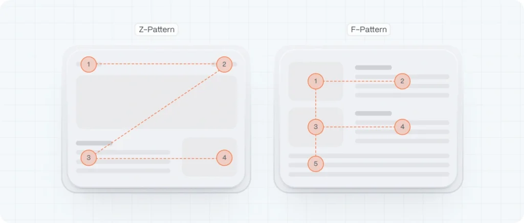
Use F-pattern or Z-pattern layouts to follow natural eye-scanning behavior
When someone lands on your website, their eyes don’t move randomly—they follow predictable patterns. That’s where F-pattern and Z-pattern layouts come into play. These models are based on years of eye-tracking research and help designers structure content in a way that aligns with how people naturally read on screens.
The F-Pattern: Perfect for Content-Heavy Pages
The F-pattern mimics the way we read blocks of text—especially in Western cultures, where we scan left to right and top to bottom. This pattern is most common on content-rich pages like blogs, news articles, and service pages.
Here’s how it works:
- The user starts by scanning horizontally across the top of the page (the first horizontal stroke of the “F”).
- Then they move slightly down and scan a shorter horizontal line (the second stroke).
- Finally, they scan vertically down the left side, often skimming rather than reading every line (the vertical stroke of the “F”).
Example:
Imagine a SaaS pricing page. Users first read the headline, then look across the features table, and finally scan down the list of plan options. If that vertical column has CTAs aligned on the left, it’s easier to capture attention as they move down.
To take advantage of the F-pattern:
- Put your most important content (headline, value proposition, primary CTA) in the top and left areas.
- Use headers, bullets, and bold text to break up content and support skimming.
- Keep key links and navigation to the left/top areas to match the natural scan.
The Z-Pattern: Ideal for Simpler, Goal-Oriented Pages
The Z-pattern layout is common on pages where there’s less content and a clear conversion goal—like landing pages, startup homepages, or product intros. It follows the shape of the letter “Z” across the screen:
- The eye scans from top left to top right (usually your logo and main nav).
- Then it zigs diagonally to the bottom left.
- Finally, it moves horizontally across the bottom, usually landing on a CTA.
Example:
Think about a landing page with a strong headline on the left, a signup button on the right, then a compelling image or value message in the center diagonally, and a bold CTA in the bottom-right corner. That’s textbook Z-pattern.
To leverage the Z-pattern:
- Place your logo and navigation on the top-left and top-right, respectively.
- Use the diagonal space creatively (a hero image or short explanation).
- Anchor your CTA on the bottom right—this is where attention naturally lands last.
These layout strategies aren’t rigid formulas, but they’re reliable starting points. They help designers align visual flow with user expectations. And when that happens, people stay longer, read more, and are far more likely to take action. Layouts that follow the user’s eye are not just easier to use—they’re more persuasive, too.
Alt text: F-pattern or Z-pattern
2. Grid Systems: The Backbone of Structure
You may not see a grid on a website, but if it feels balanced, clean, and effortless to navigate—it’s probably there, quietly doing its job in the background.
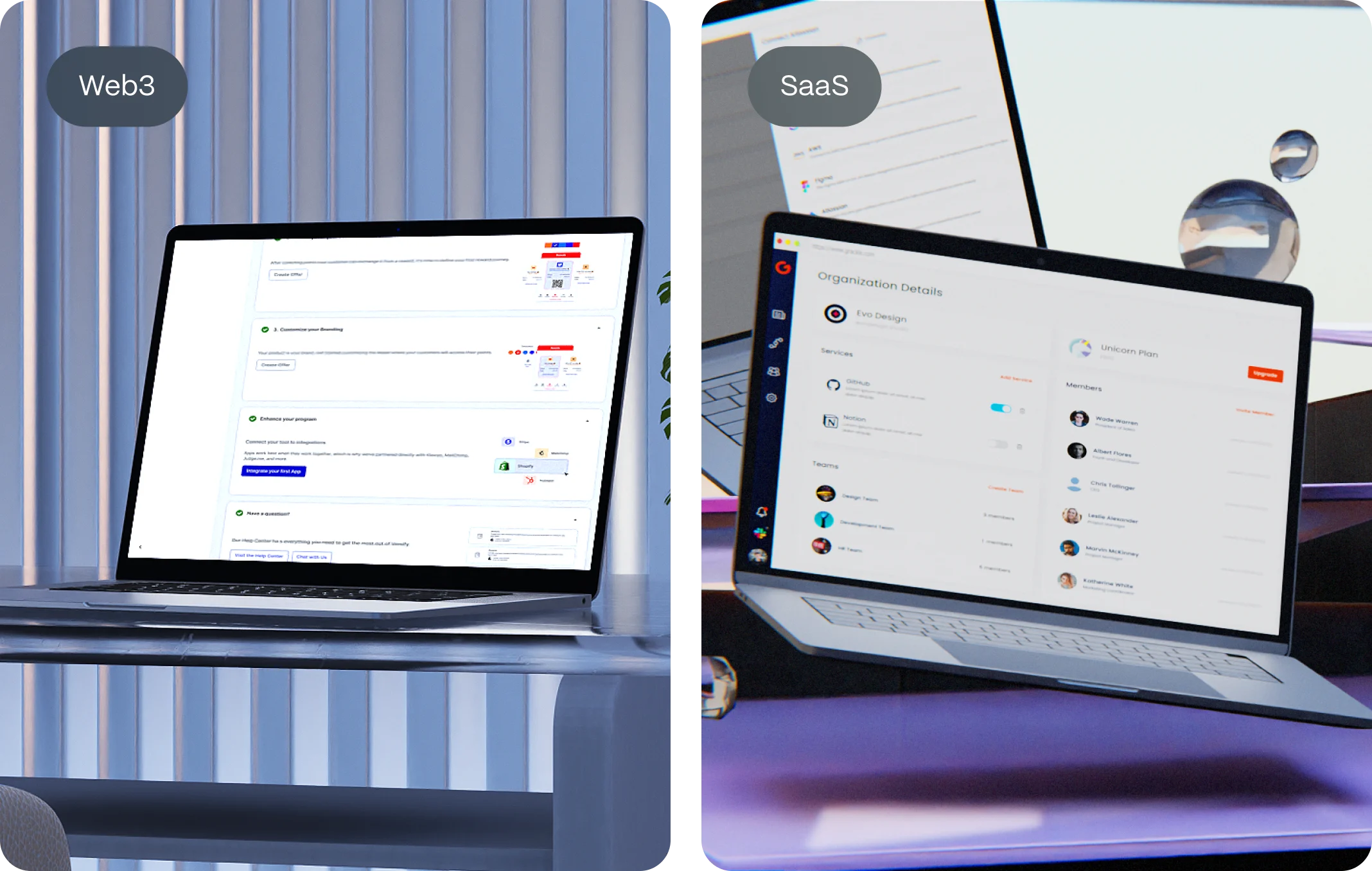
Grids are the invisible scaffolding that hold your design together. They provide structure, consistency, and alignment, allowing designers to place elements with purpose rather than guesswork. Whether you’re working on a minimalist homepage or a complex SaaS dashboard, grids keep everything from spiraling into chaos.
1. Visual Harmony and Balance
A grid layout helps create a visual rhythm. When text, images, and buttons snap into consistent alignment, users instinctively feel more at ease. That harmony enhances credibility—because users associate visual order with professionalism and trust.
Think of it like walking into a well-organized space versus a cluttered room. Your brain breathes easier when things “just line up.”
2. Responsive by Nature
Modern grid systems are built with flexibility in mind. Frameworks like CSS Grid or Bootstrap’s 12-column system allow designers to create layouts that adjust seamlessly across devices—desktop, tablet, mobile.
That means your carefully planned homepage will look just as clean on a smartphone as it does on a 27-inch monitor.
3. Faster Design and Development
A well-defined grid speeds up the design process by reducing ambiguity. Instead of debating spacing and alignment for every section, designers and developers work within a shared system. It’s like having rails on a racetrack—it keeps things moving fast, but in the right direction.
Startups especially benefit from this: faster prototyping, quicker iterations, and fewer back-and-forths between design and dev teams.
4. Consistency Across Pages
Grids enforce consistency from page to page. When your layout framework is standardized, elements like headers, content blocks, and CTAs appear in familiar places—giving users a sense of orientation and predictability as they navigate.
That consistency doesn’t just improve UX—it strengthens brand recognition. Over time, visitors begin to expect certain patterns and behaviors, which builds familiarity and trust.
5. Focus on What Matters
Perhaps the most underrated benefit: grids remove distraction. With a strong layout foundation, users can focus on your message, your product, and your CTA—without getting lost in visual noise.
When design gets out of the way, content becomes the hero.
3. Navigation That’s Simple and Strategic
Great design is invisible. And there’s perhaps no better example of that than your website’s navigation. When it works well, users barely notice it. But when it’s confusing, cluttered, or inconsistent? Visitors get frustrated, bounce early, and may never come back.
In the anatomy of a perfect website layout, navigation acts as the connective tissue—quietly guiding users from curiosity to conversion.
1. Start with Structure, Not Style
Before you design a single menu, think strategically: what do your users need to find? What’s their goal when they arrive? Mapping out these user journeys helps you structure navigation in a way that feels natural—not forced.
Stick to the essentials. Overloading your main menu with too many options leads to decision fatigue (thanks, Hick’s Law). A clean, focused menu with 5–7 top-level links performs better than one with 12 vague categories.
2. Use Clear, User-Centered Labels
Forget internal jargon. Labels like “Solutions,” “Services,” or “Resources” are too broad to be helpful. Instead, speak the language of your users.
For example:
- “For Startups” is clearer than “Solutions”
- “Pricing” works better than “Plans & Packages”
- “Our Work” is more engaging than “Portfolio”
Your navigation is your pitch—make it intuitive, not cryptic.
3. Make It Mobile-First (But Not Mobile-Only)
On smaller screens, navigation should be collapsible but still easy to access. Hamburger menus are standard, but don’t bury key CTAs inside them. Keep high-value actions like “Book a Demo” or “Get Started” visible at all times.
Also, make sure touch targets are large enough for fingers—not just cursors. A menu item should be at least 44px tall, according to Google’s mobile UX guidelines.
4. Sticky Headers & Smart Interactions
A sticky header (navigation bar that stays at the top as you scroll) can improve usability, especially on long pages. Just keep it slim—don’t let it dominate the screen real estate.
You can also enhance navigation with microinteractions: subtle hover states, dropdowns that appear on focus, or color changes to indicate where the user currently is. These tiny cues reinforce confidence and orientation.
5. Reinforce Navigation Throughout the Page
Good navigation doesn’t only live at the top of your layout. Use secondary navigation or anchor links to guide users deeper into your content, especially on long-form pages. And don’t forget the footer—it’s a crucial secondary nav that many users rely on.
Internal links within your content also double as SEO boosters, improving crawlability and keeping users engaged longer.
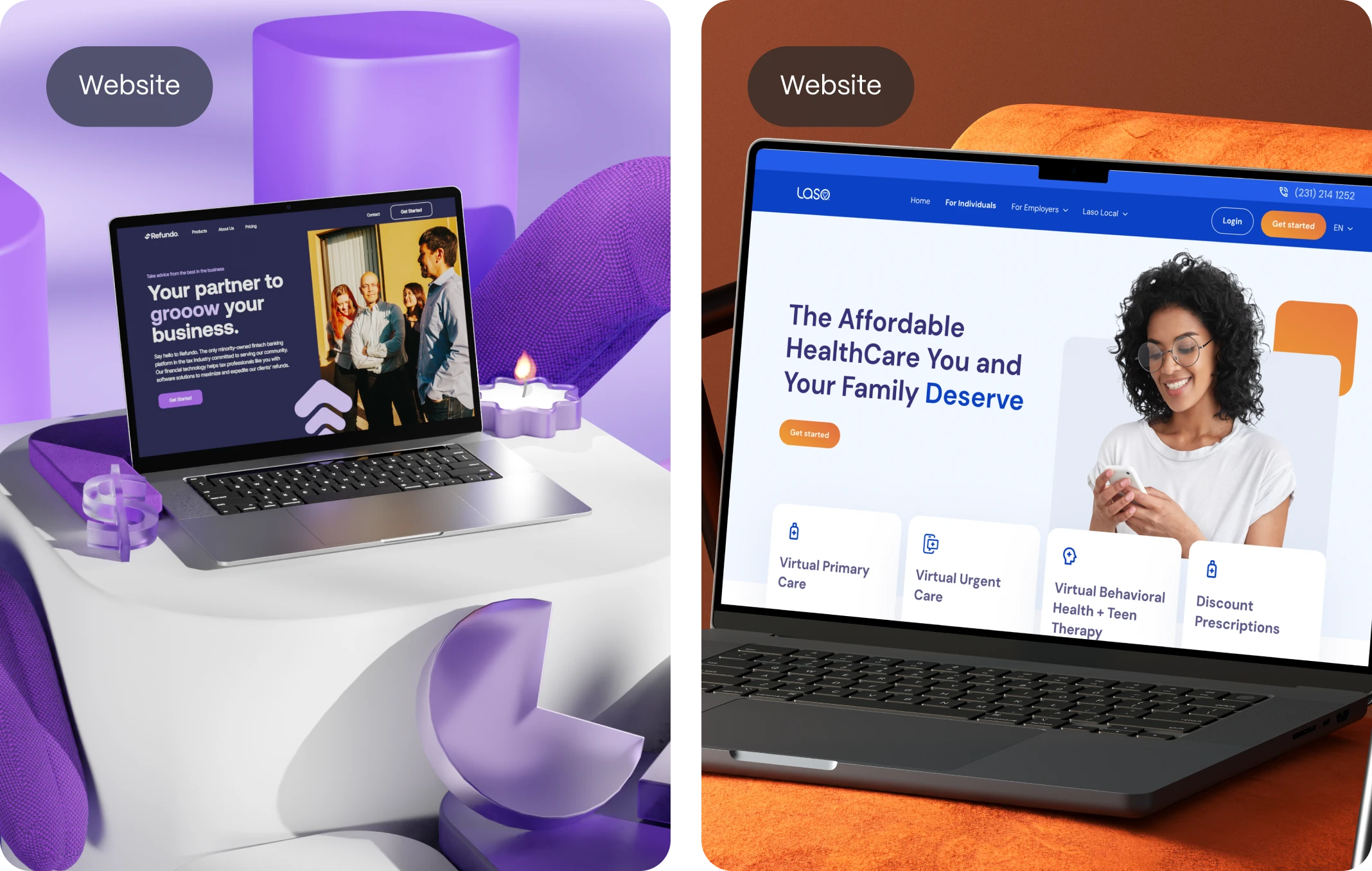
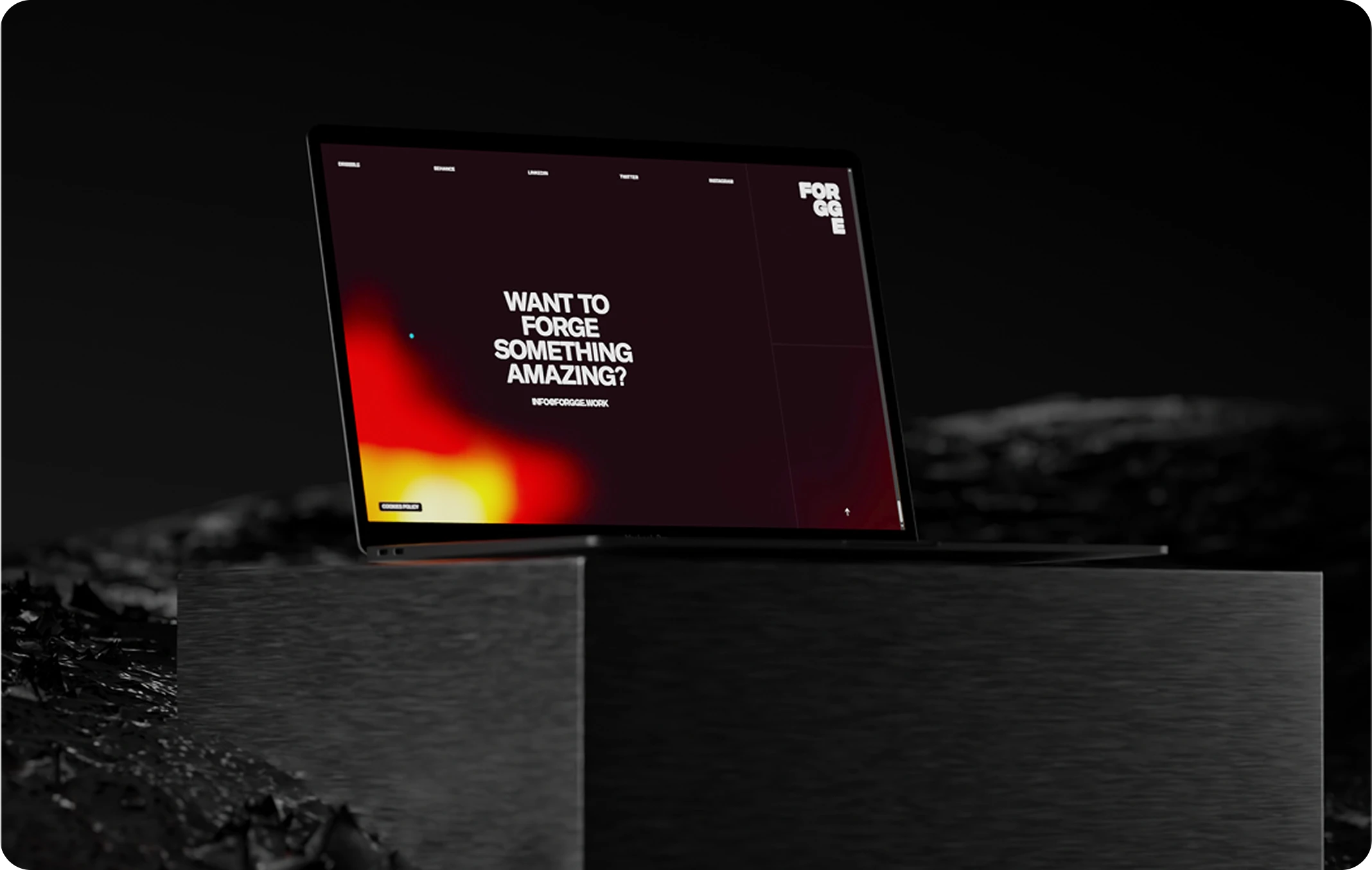
4. The Hero Section: Where First Impressions Form
In web design, the hero section is your opening act—the first thing users see when they land on your site. And like any great first impression, it sets the tone for everything that follows.
Within seconds, visitors are asking themselves:
What is this? Is it for me? Why should I care?
Your hero section should answer all of that, instantly.
Think of it as the digital handshake between your brand and the user. It introduces your value, builds initial trust, and provides a clear path forward. In the anatomy of a perfect website layout, this is where clarity meets creativity.
Why the Hero Section Matters So Much
Users make snap judgments. According to Nielsen Norman Group, most users leave a website within 10–20 seconds if they don’t find a reason to stay. That means your hero section isn’t just decorative—it’s strategic real estate.
A strong hero:
- Tells users what you do and who it’s for
- Shows the value proposition clearly and succinctly
- Establishes emotional tone (trust, excitement, curiosity)
- Guides users to the next action with a CTA
It’s the difference between “Meh, not for me” and “Wow, I need this.”
Creative Ways to Make Your Hero Section Effective
Standing out doesn’t mean doing more—it means doing it better. Here are some ways to make your hero section unforgettable without overwhelming the user:
- Interactive Product Demos: Tools like Webflow or Framer let you embed subtle interactivity right in the hero, giving users a hands-on preview of what you offer.
- Looping Micro-Videos or Cinemagraphs: Short, silent visuals can evoke emotion and context better than static images.
- Smart Taglines with Personality: A hero message that reflects your brand voice (“Work better, not harder”) connects faster than buzzword-heavy intros.
- Social Proof, Subtly Included: A small line under your CTA—“Trusted by 3,000+ startups”—can be all the nudge a user needs to scroll.
- Contrast and Simplicity: A clean background with one bold color element (like your CTA button) creates focus and urgency.
Best Practices for a High-Converting Hero Section
No matter how creative you get, these fundamentals will keep your hero section grounded in usability and strategy:
- Headline First, Always
Use a clear, benefits-driven H1. Avoid vague phrases. For example:
Bad: “Solutions for a better tomorrow”
Better: “Designing websites that help startups grow faster” - Subheadline with Context
Add a short sentence that explains how you do what you do, or why it matters. - One Clear CTA
Whether it’s “Book a Demo,” “Try for Free,” or “See Plans,” don’t confuse users with multiple buttons. Stick to one main action. - Use Supporting Visuals
Hero images or illustrations should reinforce the message, not compete with it. Show the product, the people it helps, or the outcome it creates. - Design for Mobile Too
Your hero should adapt beautifully on small screens—no cropped images, overlapping text, or hard-to-tap CTAs. - Keep It Above the Fold
Users should get the full hero experience without scrolling. If your CTA is hidden below the fold, it might never be seen.
5. Content Blocks That Flow Like a Story
Once you’ve captured a visitor’s attention with a strong hero section, the next challenge is keeping them engaged. That’s where well-structured content blocks come in. They aren’t just visual dividers or sections of text—they’re narrative tools.
Think of your homepage—or any key landing page—as a story with chapters. Each content block should serve a distinct purpose, leading the user on a journey from problem recognition to solution discovery and finally to action. When that flow feels intuitive, users don’t just scroll—they follow.
Design with a Narrative Arc in Mind
Every great layout follows a loose but effective storyline. Here’s a structure we use at Evo Design for product-driven pages that need to educate, build trust, and convert:
- Problem — Address the user’s pain point or the challenge they face.
- Solution — Introduce your product or service as the answer.
- Proof — Show that it works: testimonials, stats, logos, case studies.
- CTA — Give them a simple, clear next step.
This sequence doesn’t just “present information”—it builds momentum.
Make Every Block Purpose-Driven
Each block on your page should do one job and do it well. Resist the temptation to cram too much into a single section. A good rule of thumb: one core idea per block, visually reinforced by layout and design.
For example:
- A feature block might pair an icon with a headline and two lines of copy—simple, digestible, and skimmable.
- A customer testimonial block could focus on one strong quote, not a wall of reviews.
- A “how it works” block might use a 3-step visual diagram with short descriptions.
By giving each block a distinct identity and message, you help users absorb your story without cognitive overload.
Design with Flow and Rhythm
Your content blocks should have a rhythm—visually and cognitively. Too many similar-looking sections back-to-back will cause fatigue. Break it up:
- Alternate text-and-image alignment (left-right-left).
- Change background colors or textures subtly to signal a shift in tone.
- Use whitespace intentionally to give the eye time to breathe.
Think of it like a conversation: you wouldn’t speak in the same tone and speed for 10 minutes straight. You pause, emphasize, and re-engage.
Best Practices for Story-Driven Content Blocks
- Use clear headlines that summarize the point of each section. People scan before they commit to reading.
- Keep paragraphs short—3–4 lines max is ideal for web.
- Support with visuals that enhance, not distract. Custom illustrations, icons, or screenshots work well.
- Add micro-interactions or scroll-based animations to bring blocks to life subtly.
- Repeat CTAs every few blocks to give users opportunities to act without scrolling back up.
6. Content Blocks That Flow Like a Story
Once you’ve captured a visitor’s attention with a strong hero section, the next challenge is keeping them engaged. That’s where well-structured content blocks come in. They aren’t just visual dividers or sections of text—they’re narrative tools.
Think of your homepage—or any key landing page—as a story with chapters. Each content block should serve a distinct purpose, leading the user on a journey from problem recognition to solution discovery and finally to action. When that flow feels intuitive, users don’t just scroll—they follow.
Design with a Narrative Arc in Mind
Every great layout follows a loose but effective storyline. Here’s a structure we use at Evo Design for product-driven pages that need to educate, build trust, and convert:
- Problem — Address the user’s pain point or the challenge they face.
- Solution — Introduce your product or service as the answer.
- Proof — Show that it works: testimonials, stats, logos, case studies.
- CTA — Give them a simple, clear next step.
This sequence doesn’t just “present information”—it builds momentum.
Make Every Block Purpose-Driven
Each block on your page should do one job and do it well. Resist the temptation to cram too much into a single section. A good rule of thumb: one core idea per block, visually reinforced by layout and design.
For example:
- A feature block might pair an icon with a headline and two lines of copy—simple, digestible, and skimmable.
- A customer testimonial block could focus on one strong quote, not a wall of reviews.
- A “how it works” block might use a 3-step visual diagram with short descriptions.
By giving each block a distinct identity and message, you help users absorb your story without cognitive overload.
Design with Flow and Rhythm
Your content blocks should have a rhythm—visually and cognitively. Too many similar-looking sections back-to-back will cause fatigue. Break it up:
- Alternate text-and-image alignment (left-right-left).
- Change background colors or textures subtly to signal a shift in tone.
- Use whitespace intentionally to give the eye time to breathe.
Think of it like a conversation: you wouldn’t speak in the same tone and speed for 10 minutes straight. You pause, emphasize, and re-engage.
Best Practices for Story-Driven Content Blocks
- Use clear headlines that summarize the point of each section. People scan before they commit to reading.
- Keep paragraphs short—3–4 lines max is ideal for web.
- Support with visuals that enhance, not distract. Custom illustrations, icons, or screenshots work well.
- Add micro-interactions or scroll-based animations to bring blocks to life subtly.
- Repeat CTAs every few blocks to give users opportunities to act without scrolling back up.
7. Footer That’s Functional (Not Forgotten)
It’s easy to treat the footer as an afterthought—a place to dump legal links, disclaimers, or leftover content. But the best websites treat the footer as a strategic design element. It’s the closing chapter of your user’s journey, and when used wisely, it can reinforce trust, provide clarity, and offer a final nudge toward conversion.
Think of the footer as the “second chance” space. If someone scrolls all the way down, they’re not bouncing—they’re looking for something. And your layout should help them find it.
What Belongs in a Great Footer?
There’s no universal checklist, but high-performing footers usually include a blend of:
- Key navigation links — especially for deeper pages users may have missed (e.g., Careers, Resources, Blog, Support).
- Contact information — email, phone, location, or even a contact form.
- Newsletter signup — give users a low-friction way to stay connected.
- Social media icons — ensure they’re subtle, on-brand, and open in new tabs.
- Trust signals — like security badges, client logos, affiliations, or certifications.
- Legal links — terms of service, privacy policy, cookies, accessibility statements.
The goal is to provide closure, not clutter. Only include what adds value, context, or direction.
Footer as a Conversion Touchpoint
Yes, even the bottom of your page can convert.
If a visitor scrolls all the way down, they might be considering your offer but haven’t fully committed. Including a final call to action in the footer—whether it’s “Get Started,” “Book a Free Consultation,” or “Subscribe for Updates”—can catch them at just the right moment.
Also, if your site includes lead magnets, case studies, or product demos, the footer is a great place to surface those offers again, without disrupting the rest of the layout.
Make It Mobile-Friendly and Legible
A common mistake? Cramming too much into a narrow column on mobile. Make sure your footer stacks naturally, with enough padding and font sizes that are easy to read on small screens. Don’t be afraid of whitespace—it’s your ally in mobile layouts.
Think of the Footer as UX Insurance
A smart footer acts like a safety net. If a user didn’t find what they were looking for above the fold—or if they skipped through your homepage quickly—the footer gives them another path forward. It’s often where people go when they’re lost, skeptical, or looking for proof.
By investing care into your footer design, you’re showing that no part of your site is an afterthought. And that attention to detail? It speaks volumes about your brand.
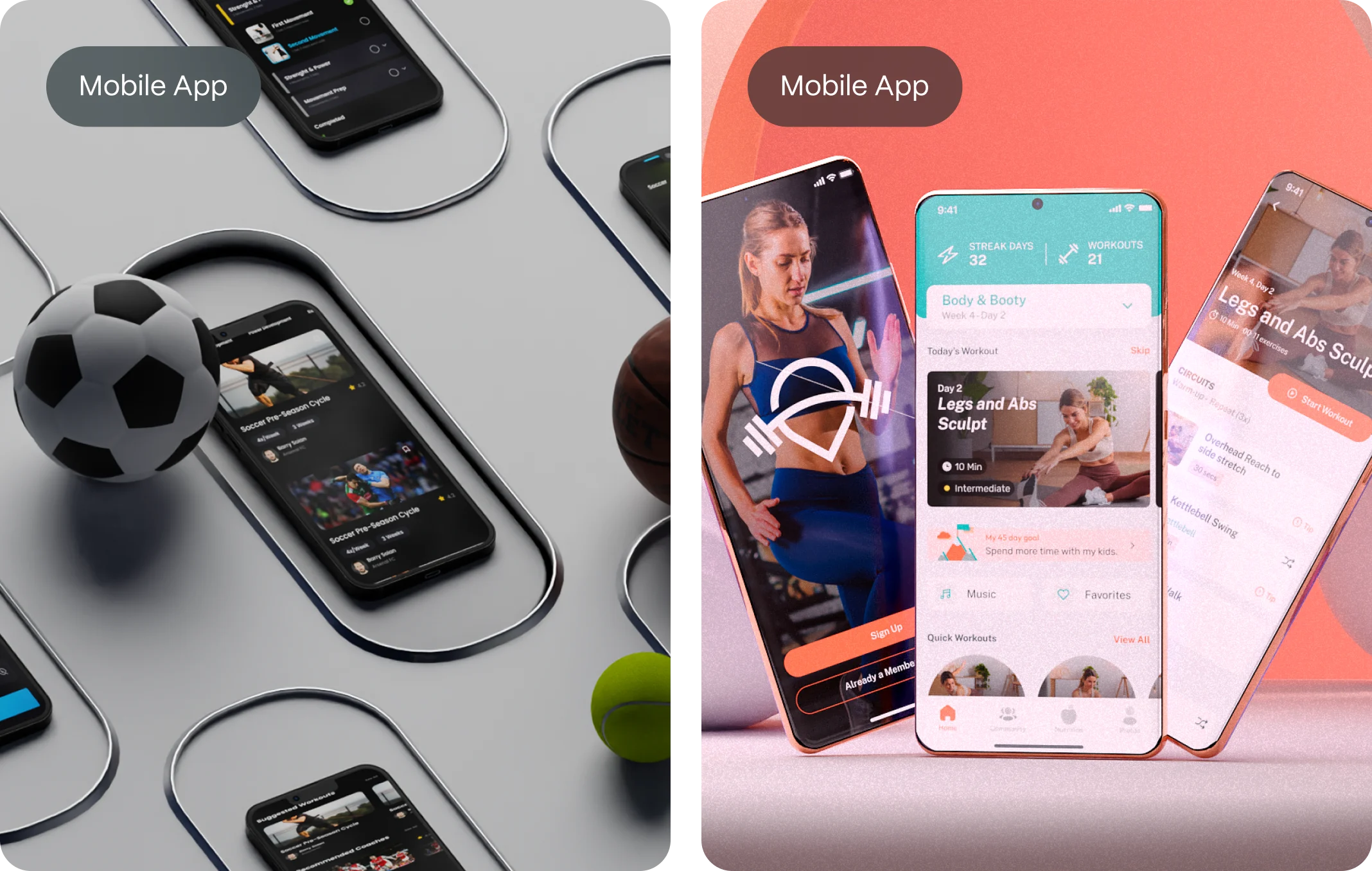
8. Mobile Responsiveness: Non-Negotiable
With over 60% of global website traffic now coming from mobile devices, your layout needs to adapt intuitively across screen sizes. Mobile responsiveness isn’t just about shrinking things down. It’s about rethinking the experience entirely—how users navigate, how content stacks, how buttons behave, and how fast your pages load.
A truly responsive layout meets users where they are, on the devices they actually use.
Mobile Is No Longer “Later”
Gone are the days when designers would build the desktop version first and “deal with mobile” after. Today, it’s the reverse. Startups and SaaS brands that lead with a mobile-first mindset benefit from:
- Cleaner design hierarchy (fewer distractions, more focus)
- Faster load times (a key Google ranking factor)
- Better conversions on smaller screens (where most users make decisions)
If your navigation is hard to tap, your text is too small, or your forms stretch off the screen, users won’t wait around to figure it out. They’ll leave.
Mobile-Responsive Layout Best Practices
Here’s how to ensure your layout performs beautifully across devices:
- Stack content vertically
On mobile, horizontal layouts don’t work. Use a clean vertical flow where sections follow each other logically—hero → value → features → testimonials → CTA. - Use flexible grids and media queries
CSS Grid and Flexbox allow you to define responsive behaviors easily. Media queries let you adjust font sizes, margins, and layout logic based on screen width. - Design tap-friendly CTAs
Buttons should be at least 44px high, with enough space around them to prevent accidental taps. - Optimize typography
Choose typefaces that are legible at smaller sizes. Maintain strong contrast between text and background, and avoid walls of text. - Compress and prioritize images
Lazy-load non-critical visuals and use next-gen formats like WebP. Mobile users expect speed, and every second counts. - Reconsider navigation
A hamburger menu is standard, but make sure critical CTAs or contact links aren’t buried. Sticky nav bars work well on mobile too—just keep them minimal.
Don’t Just Design It—Test It
Once your layout looks good, you still need to test it:
- Open it on real devices (not just a responsive simulator).
- Check usability with your thumb.
- Run it through Google’s Mobile-Friendly Test.
- Use Chrome DevTools to simulate various screen sizes and connection speeds.
The key? Don’t assume. Always verify.
9. Scannability and Readability: The Invisible Design Power Duo
Even the most beautiful website layout will fail if people can’t read it—or worse, if they don’t want to. That’s where scannability and readability come in. These two often-overlooked principles aren’t just about typography; they’re about behavior. Because the truth is, users don’t read websites like books. They scan them. And your layout needs to respect that reality.
In fact, according to studies by the Nielsen Norman Group, users typically read only 20–28% of the text on a webpage. That means your job as a designer or content strategist isn’t to force people to read—it’s to guide their eyes.
Scannability: Designing for How We Really Read
Scannability is all about how easily users can find the information they’re looking for without reading every word. A highly scannable page lets users jump from headline to headline, pick out key ideas, and move confidently toward action.
Best practices for improving scannability:
- Use clear visual hierarchy with consistent heading levels (H1, H2, H3)
- Break up text into short paragraphs (2–4 lines max)
- Use bullet points and numbered lists where appropriate
- Highlight keywords or phrases in bold to draw attention
- Add anchor links for long pages to allow fast navigation
- Include section dividers and whitespace to visually segment content
Every time you make it easier for someone to find what they’re looking for, you increase the chance they’ll stay, read, and convert.
Readability: Making Words Feel Effortless
Readability goes deeper—it’s about how easily your content can be understood once someone starts reading. That depends on your word choice, sentence structure, font styling, and layout.
Key factors that influence readability:
- Typography: Use web-friendly fonts (like Inter, Roboto, or Open Sans), avoid font sizes below 16px, and maintain strong contrast between text and background.
- Line height and spacing: Too little spacing makes text feel dense; aim for a line height of 1.4–1.6x the font size.
- Plain language: Speak in terms your users understand. Avoid jargon, buzzwords, or internal labels that add friction.
- Consistent formatting: Users feel more comfortable when text structure is predictable—same heading styles, same spacing, same visual rhythm.
Readability also improves SEO. Google rewards pages where users spend more time and interact more—both signs of engaging, accessible content.
The Compound Effect of Scannability + Readability
When you combine both, the effect is powerful:
- Visitors find what they need faster.
- They understand your message with less effort.
- They feel less overwhelmed and more in control.
- They’re more likely to trust, engage, and convert.
In the anatomy of a perfect website layout, this pairing doesn’t just enhance the look of your content—it amplifies its impact. It turns passive scrolling into active discovery. And that’s the moment when design stops being decoration and becomes communication.
10. Conversion-Focused Design
Every layout element must work toward your business goal. Whether that’s lead generation, product sales, or app signups, each section should nudge users toward that outcome.
While a beautiful website layout can impress, a conversion-optimized layout performs. But even the most thoughtfully designed pages should never be static. That’s where CRO—Conversion Rate Optimization—comes in. It’s the discipline of continually improving your website’s ability to turn visitors into leads, customers, or loyal fans.
Understand Before You Optimize
The first principle of CRO is diagnosis before prescription. Before changing anything on your layout, ask: Where are users dropping off? What’s blocking them from converting?
Key tools to support this:
- Heatmaps (via Hotjar or Crazy Egg) to track click behavior
- Scroll maps to see how far users scroll before losing interest
- Session recordings to observe real interactions
- Analytics funnels (Google Analytics or Mixpanel) to spot where users abandon the journey
Only when you understand user behavior can you confidently design better pathways.
Principle #1: One Goal Per Page
Every high-converting layout starts with clarity. Each page should have a single conversion goal, supported by all the content and design around it. When pages try to do too much—inform, entertain, sell, educate—they often do none of them well.
For example:
- A homepage might aim to route visitors to the right product.
- A landing page might push a free trial signup.
- A blog post might lead to a content download or email subscription.
Everything on that page—headlines, visuals, CTAs—should point toward that goal.
Principle #2: Reduce Friction
Friction is anything that causes hesitation, confusion, or extra effort. Common sources of friction in web layouts:
- Long or complex forms
- Vague CTAs (“Submit” vs. “Get My Free Trial”)
- Unclear value propositions
- Poor mobile usability
- Confusing navigation or layout inconsistency
Optimizing for conversions means identifying and removing those blockers one by one.
Principle #3: Test, Don’t Guess
The most important CRO mindset? You are not your user.
That’s why A/B testing is a cornerstone of CRO. Instead of relying on opinions, let real data guide you. Test different:
- Layout structures (long-form vs. compact)
- CTA placement and wording
- Hero headlines
- Trust indicators (client logos, testimonials, guarantees)
Start small, test one variable at a time, and look for statistically significant results. Tools like Google Optimize, VWO, or Optimizely make this process accessible—even for startups.
Principle #4: Use Social Proof Wisely
Humans look to others to validate decisions. That’s why testimonials, reviews, client logos, and case studies are such powerful conversion tools.
CRO principles suggest placing social proof:
- Near CTAs (to reduce hesitation)
- On pricing pages (to reduce perceived risk)
- In the hero section (to build trust immediately)
- On exit popups (as a final reassurance)
Be sure the proof is authentic, specific, and ideally paired with a face or brand name.
Principle #5: Think Like a Funnel
Your website layout should support the conversion funnel, not interrupt it. Think about your page as a narrative:
- Introduce the problem.
- Build desire with benefits and proof.
- Resolve objections.
- Guide them to act.
Good layout decisions support this flow visually and cognitively. Poor layouts disrupt it.
CRO principles remind us that design is never done. The most successful websites aren’t the ones that launch perfectly on day one—they’re the ones that evolve. When you combine layout strategy with CRO discipline, your website becomes a live, learning machine—constantly adjusting, improving, and performing better over time.
Design Psychology Behind Effective Layouts
The best web layouts apply cognitive science, not guesswork. A few psychological principles in play:
- Hick’s Law: The more choices you give users, the longer they take to decide (or they give up).
- Fitts’s Law: CTA buttons should be large and placed where the user’s cursor is likely to be.
- Gestalt Principles: Proximity and similarity help users visually “group” related items.
- Von Restorff Effect: The most different item on a screen stands out—use this for your CTA.
SEO and Website Layout: What Google Loves
Google doesn’t rank pretty pages—it ranks user-focused ones. But here’s the thing: good layout and good SEO go hand in hand.
How layout impacts SEO:
- Improved dwell time: users stay longer when pages are clear and engaging.
- Lower bounce rates: intuitive navigation keeps users exploring.
- Faster loading: clean layout = lighter code.
- Mobile-first indexing: responsive layouts are prioritized.
Tips from Neil Patel’s playbook:
- Use H1, H2, and H3 tags in a structured way
- Keep content above the fold
- Include internal links strategically
- Use schema markup for key elements
FAQs: Website Layouts
What is a website layout?
A website layout is the structural arrangement of visual elements (text, images, navigation, etc.) on a webpage. It defines how content is presented to users.
How does website layout affect SEO?
A good layout improves user experience, dwell time, and navigation—all of which are positive signals for Google rankings.
What is the best layout structure for conversions?
Layouts that follow a story arc (problem → solution → proof → CTA), use strong visual hierarchy, and minimize distractions tend to convert better.
Should I use templates or custom layouts?
Templates are a good start but can feel generic. Custom layouts aligned with your brand and product strategy offer stronger differentiation and better performance.What tools help build better layouts?
Figma for wireframes, Webflow for visual development, Hotjar for behavior analytics, and Google PageSpeed Insights for performance testing.