


Let’s be honest. The phrase “how to design a website” has been googled millions of times, and most of the answers out there are either too technical or too generic. In 2025, web design is no longer just about code or beauty — it’s about clarity, strategy, user trust, and conversion. Especially for startups, your website is your storefront, your investor pitch, your first impression, and your revenue engine — all wrapped into one.
At Evo Design, we don’t just build websites. We craft digital ecosystems that help companies grow. This guide is your no-fluff, high-impact companion to creating a website that not only looks great but actually works. Whether you’re a founder, marketer, or product leader, you’ll learn how to map out your structure, design interfaces with purpose, and launch a website that converts.
The Mindset Shift — Designing for Humans, Not Robots
The biggest mistake companies make when designing websites? They design for themselves — not for their users.
Steve Krug’s philosophy in Don’t Make Me Think is more relevant than ever: users don’t read, they scan. They don’t tolerate confusion, they bounce. In 2025, attention is currency — and your design must be obvious, frictionless, and intuitive from the first second.
Here’s the rule: if a user has to think, you’ve already lost.
- Don’t hide CTAs.
- Don’t use clever copy when clarity will do.
- Don’t bury essential content three scrolls deep.
Your homepage must answer three questions in under 5 seconds:
- What is this?
- Is it for me?
- What do I do next?
If your website doesn’t make that obvious, no aesthetic layout will save you.
This shift in thinking requires empathy. Great web design doesn’t come from asking “what do we want to show?” but “what do users need to see — and when?” It’s about aligning the mental model of the visitor with the structure and flow of your interface. Every second of user hesitation creates psychological load, and that slows momentum. Streamlined UX isn’t just nice to have — it’s a growth lever.
Real human-centered design is less about adding more and more about removing what’s unnecessary. It means using plain language. It means resisting the urge to flex your vocabulary or your design skills if that gets in the way of clarity. Designing for humans means embracing simplicity without sacrificing elegance — making things feel easy, accessible, and trustworthy.
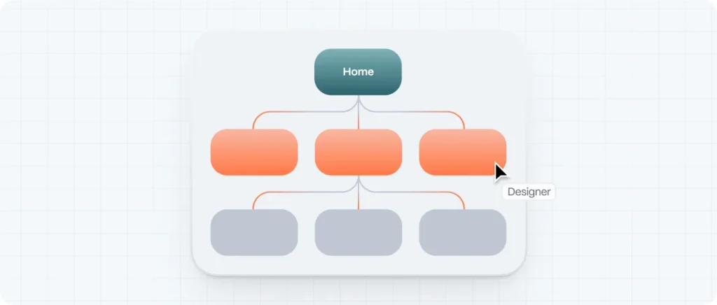
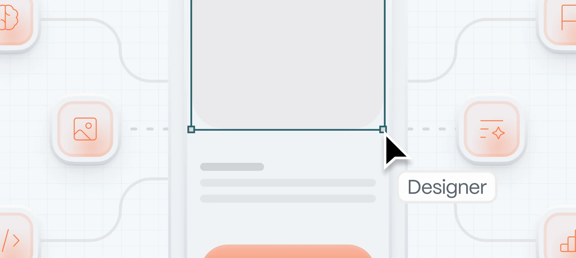
Structure First — The Foundation of Information Architecture
Before you open Figma or drag a block in Webflow, pause. Think like an architect. Great websites start with structure, not screens.
Information architecture (IA) is the blueprint behind the curtain. It’s how content is grouped, how navigation flows, and how a user moves from curiosity to action. Without solid IA, your website is just a pretty chaos.
How to start building your information architecture:
- Create a content inventory — list all the pages and types of content you need.
- Group related content — this forms your navigation hierarchy.
- Prioritize the paths to revenue — your IA should mirror your funnel.
- Think in user stories — what does a first-time visitor need to see vs. a returning one?
Tools like card sorting and tree testing (yes, they’re simple and powerful) can give you real-world validation of your structure before design even starts.
Think of IA as the GPS of your website. Without it, users get lost — and lost users don’t convert. A well-designed structure makes people feel in control, guiding them gently toward their goals without cognitive overload. And in practice, it means creating clear paths: from your homepage to your services page, from a blog article to a contact form, from a product detail to a trial signup. Each click should feel like the obvious next step.
Information architecture is also foundational for SEO. Google’s crawler is a user too — just one that speaks code. When your content is structured cleanly with proper tags, sitemaps, and internal links, you’re not only helping visitors navigate — you’re helping search engines understand and rank your site. IA is where UX and SEO shake hands.
Visual Design Principles That Build Trust
Beauty without function is decoration. In web design, visuals are not just for aesthetics — they are psychological triggers.
Use contrast to highlight actions. Use whitespace to create breathing room. Use color intentionally, not randomly. Icons should clarify, not confuse. And typography? It’s 90% of your design. Choose legible fonts and use hierarchy to create scanning paths.
Pro Tip: Drawing websites and creative portfolios often over-index on visuals but forget about usability. Your site should inspire and convert — not just impress other designers.
Clean visual design builds trust. And trust builds sales.
Visual design is how your brand speaks without words. And like body language, it’s often more persuasive than what’s being said. When visuals align with clarity and purpose, they reinforce your message and elevate credibility. A cluttered, chaotic interface feels like walking into a messy office. A clean, thoughtfully designed page says: “we care about our product, and we care about your experience.”
But good design isn’t universal — it’s contextual. A B2B SaaS homepage demands different visual tension than a lifestyle e-commerce brand. Your color palette, photography style, and visual rhythm must align with your audience’s expectations and the emotions you want to trigger. Design without strategic intent is just noise. Design with intent is persuasion.
Writing for the Web — Copy That Converts
Most design agencies overlook this: copywriting is part of design. Words are your voice, your brand, your conversion tool. In 2025, users want real talk, not buzzwords.
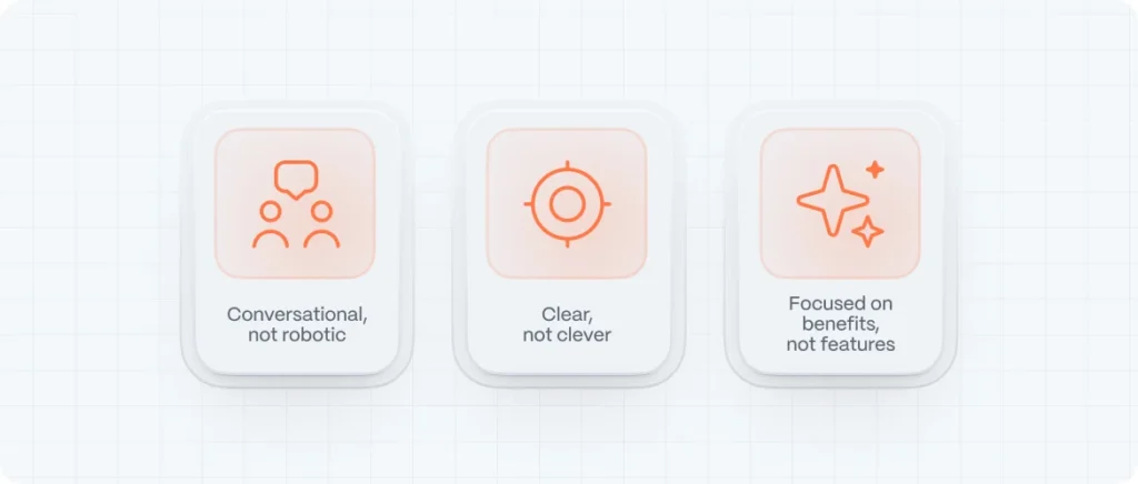
Good copy is:
- Conversational (not robotic)
- Clear (not clever)
- Focused on benefits (not features)
Remember: users scan. Use short sentences. Bullet points. Subheadings. Highlight important actions. Your call-to-action buttons should use verbs: “Get Started,” “Download Now,” “Join the Beta.”
SEO isn’t just about stuffing keywords. It’s about matching what people are actually searching for with content that answers those needs. We optimize our content not for algorithms, but for humans who use algorithms.
Writing for the web isn’t about sounding smart — it’s about being understood. Your users are busy. They’re scanning for answers, signs of relevance, proof they’re in the right place. If your copy doesn’t resonate in seconds, they’ll bounce. That’s why every headline must be a hook, every paragraph a promise, and every CTA a trigger for action.
Even microcopy — those tiny bits of text in buttons, forms, and tooltips — carries weight. It’s the difference between “Submit” and “Get Your Free Guide.” Between “Buy Now” and “Start Your Journey.” Every word should pull its weight. And when combined with design, great copy becomes invisible in the best way: it just works.
Development That Doesn’t Break the Experience
From Clean Code, we learn this: bad code makes everything harder — to scale, to test, to maintain. For startups especially, you need websites that can adapt fast.
Modern tools like Webflow, Framer, or Jamstack frameworks (Next.js, Astro) allow you to ship faster without compromising performance.
A good dev handoff should include:
- A style guide / UI kit
- Component documentation
- Responsive behavior rules
- SEO meta structure
- Schema markup (for Google’s rich results)
A beautiful design is meaningless if the code behind it is bloated, buggy, or broken. That’s why clean, semantic, maintainable code isn’t just a developer’s concern — it’s a business advantage. Developers and designers must work in sync, not in silos. Design tokens, shared component libraries, and cross-functional design systems aren’t buzzwords — they’re tools that ensure your brand feels consistent and stable across touchpoints.
In a world of Core Web Vitals, Google rewards websites that load fast, respond quickly, and stay visually stable. But beyond rankings, your users will feel the difference. Good development isn’t noticed — it just feels effortless. Poor development, on the other hand, creates invisible friction: slow load times, broken responsiveness, form errors. These small annoyances add up to lost trust — and lost revenue.
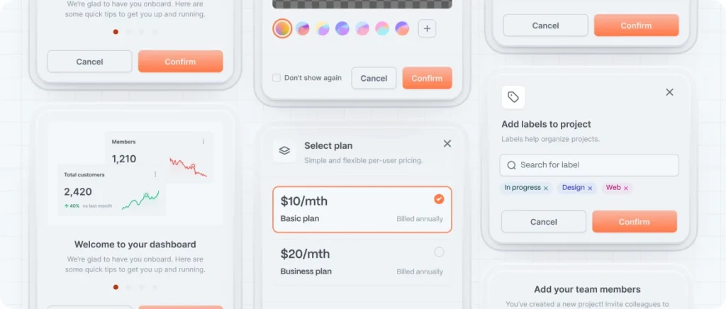
UX & UI Kits That Accelerate Project Delivery
Starting a web project from scratch every single time is not only inefficient — it’s risky. Startups need speed without compromising quality. That’s where UX and UI kits come in. Think of them as modular building blocks: predefined components, visual styles, and interaction patterns that dramatically cut design time while ensuring consistency across pages and platforms.
But not all kits are created equal. A truly valuable UI kit isn’t just a bunch of buttons and forms — it’s a system. It includes color palettes with accessible contrast ratios, typographic hierarchy, button states, form validations, error messaging, and even microinteractions. The best kits are based on real-world usability testing and can flex across different types of interfaces. When well-implemented, they become a shared language between designers and developers, reducing guesswork and rework.
SEO On-Page and Technical (Without the Jargon)
Here’s the uncomfortable truth: your website can be stunning, fast, and beautifully written — and still be invisible to Google. That’s because great SEO isn’t an afterthought. It’s baked into your site’s bones from the start. On-page and technical SEO ensure your content gets found, indexed, and ranked by the people who are actively searching for your solution.
On-page SEO is about clarity and intent. Each page should target one main keyword (like “website design agency” or “motion graphics company”) and support it with headers, meta tags, and semantic structure. Your headlines should be keyword-rich but human-friendly. Your paragraphs should flow naturally but align with what users are typing into search bars. Internal links should guide visitors deeper into your content, while alt text makes your visuals accessible and crawlable.
alt text makes your visuals accessible and crawlable.
Technical SEO is the invisible plumbing. That means fast load times, clean code, HTTPS, schema markup, mobile responsiveness, and crawlable sitemaps. Tools like Google Search Console and Screaming Frog are your allies here. But remember: technical SEO isn’t about hacking algorithms. It’s about creating a healthy, well-lit home for your content — one where Google feels welcome, and users stay longer.
How to Choose the Right Website Design Company
This is a critical decision — especially for startups. The wrong agency will burn your time and budget. The right one becomes a strategic partner. But how do you know who to trust? Fancy awards and dribbble shots won’t guarantee results. Look instead at process, team experience, and post-launch support.
A good agency won’t just ask what you want. They’ll challenge your assumptions. They’ll run workshops to align your goals with user needs. They’ll bring research and UX evidence into the discussion. They’ll speak the language of business outcomes — not just design trends. And most importantly, they’ll be transparent with timelines, scope, and pricing.
At Evo, we don’t sell pixels. We build growth engines. Our clients don’t just get websites — they get platforms that scale with them. So before signing with any agency, ask: Do they understand your market? Can they show measurable results? Will they collaborate or control? And do they genuinely care about your success beyond the launch? To help you with this choice, read about design agency vs in-house team.
FAQ — Web Design Questions Startups Ask Most
How long does it take to design a website?
It depends on the complexity. A simple marketing site can take 3–6 weeks. A product-heavy or multi-language platform might take 8–12 weeks or more. What matters is process — not just speed. Shortcuts in UX or SEO now will cost more later.
What’s the difference between UI and UX?
UX (User Experience) is how something works. UI (User Interface) is how it looks. A beautiful UI with poor UX is like a sports car with no engine. You need both — seamlessly integrated.
Can I just use a template to save money?
You can — and for early MVPs, that’s sometimes smart. But templates don’t reflect your unique brand, audience, or funnel. They may also come bloated with code, slowing performance and limiting SEO flexibility. Custom design isn’t just about aesthetics — it’s strategic.
How do I keep my site fresh after launch?
Set a content calendar. Monitor analytics weekly. Run quarterly audits for speed, UX, and SEO. Your website isn’t a brochure — it’s a living product that should evolve with your startup.