
Designers love UI kit — and with good reason. These toolkits, when done well, create cohesion across products, streamline workflows, and accelerate handoffs between designers and developers. But too many UI kits look great on Dribbble and fail in real product environments.
Why? Because they’re designed for aesthetics, not for people.
This article is a practical, psychology-informed guide to creating high-quality UI kits that serve real users and real teams. Drawing from timeless lessons found in Designing with the Mind in Mind, The Design of Everyday Things, 100 Things Every Designer Needs to Know About People, and Designing Interfaces, we’ll show you how to make UI kits that don’t just look good — they work.
What is a UI Kit?
A UI kit is a collection of pre-designed interface components that form the building blocks of a digital product. These elements—buttons, sliders, input fields, modals, cards, icons, and more—are created in a way that ensures visual consistency, interaction predictability, and efficient scalability.
At a glance, a UI kit should include:
- Typography system (headings, body text, captions)
- Color palette
- Button states (default, hover, pressed, disabled)
- Form elements (inputs, dropdowns, checkboxes)
- Layout grids
- Icon set
- Spacing rules
But don’t mistake a UI kit for a design system. While the two are related, a UI kit is more tactical. It’s the set of parts. A design system includes the rules, principles, and documentation that govern how those parts work together.

Why Most UI Kits Fail
Many designers fall into the trap of creating UI kits that look great in Figma or Sketch but break down in real-life usage. Here’s why:
Too much focus on aesthetics, not enough on behavior.
As Don Norman highlights in The Design of Everyday Things, design must be functional and intuitive. A button isn’t just a shape and a label—it’s a trigger for user action. If the state changes aren’t clear, or the affordance isn’t intuitive, it fails its purpose.
Lack of cognitive consideration.
According to Jeff Johnson in Designing with the Mind in Mind, humans have limits. Working memory is small. Visual perception is selective. If your UI kit doesn’t consider cognitive load, users will feel overwhelmed.
Inconsistent naming and structure.
From Designing Interfaces, we learn that consistency in components’ naming and behavior across the UI reduces user learning curve. If your button is called “Primary Action” in one screen and “Main CTA” in another, you’re introducing confusion and friction.
Ignoring real context.
Erika Hall, in Just Enough Research, points out that design must stem from real usage. If your UI kit isn’t validated with users or tested in prototypes, you’re designing in a vacuum.
What Makes a Great UI Kit?
Let’s break down the core principles behind a successful UI kit—backed by psychology and design best practices.
1. Clarity of Purpose
Each component should serve a clear function. The label, shape, color, and placement all must signal the user what will happen if they interact. Use strong visual affordances—as Norman emphasizes, users should know how to interact just by looking.
2. Familiarity and Recognition
People rely on recognition, not recall (100 Things Every Designer Needs to Know About People). That’s why your UI kit should follow common patterns. Buttons should look like buttons. Dropdowns should behave like dropdowns. Deviate only when there’s a compelling reason.
3. Hierarchy and Feedback
Use visual hierarchy—through color, size, and spacing—to guide attention. And provide instant feedback. Hover effects, loading states, and error messages help users feel in control.
4. Accessibility First
A UI kit isn’t complete without accessibility baked in. Use sufficient contrast, keyboard navigation, and proper semantic labeling. Follow WCAG guidelines from the start, not as an afterthought.
5. Modularity and Scalability
Design components to be reusable and composable. A button should work across screens, themes, and devices. Create variants, use auto-layout, and document usage clearly.
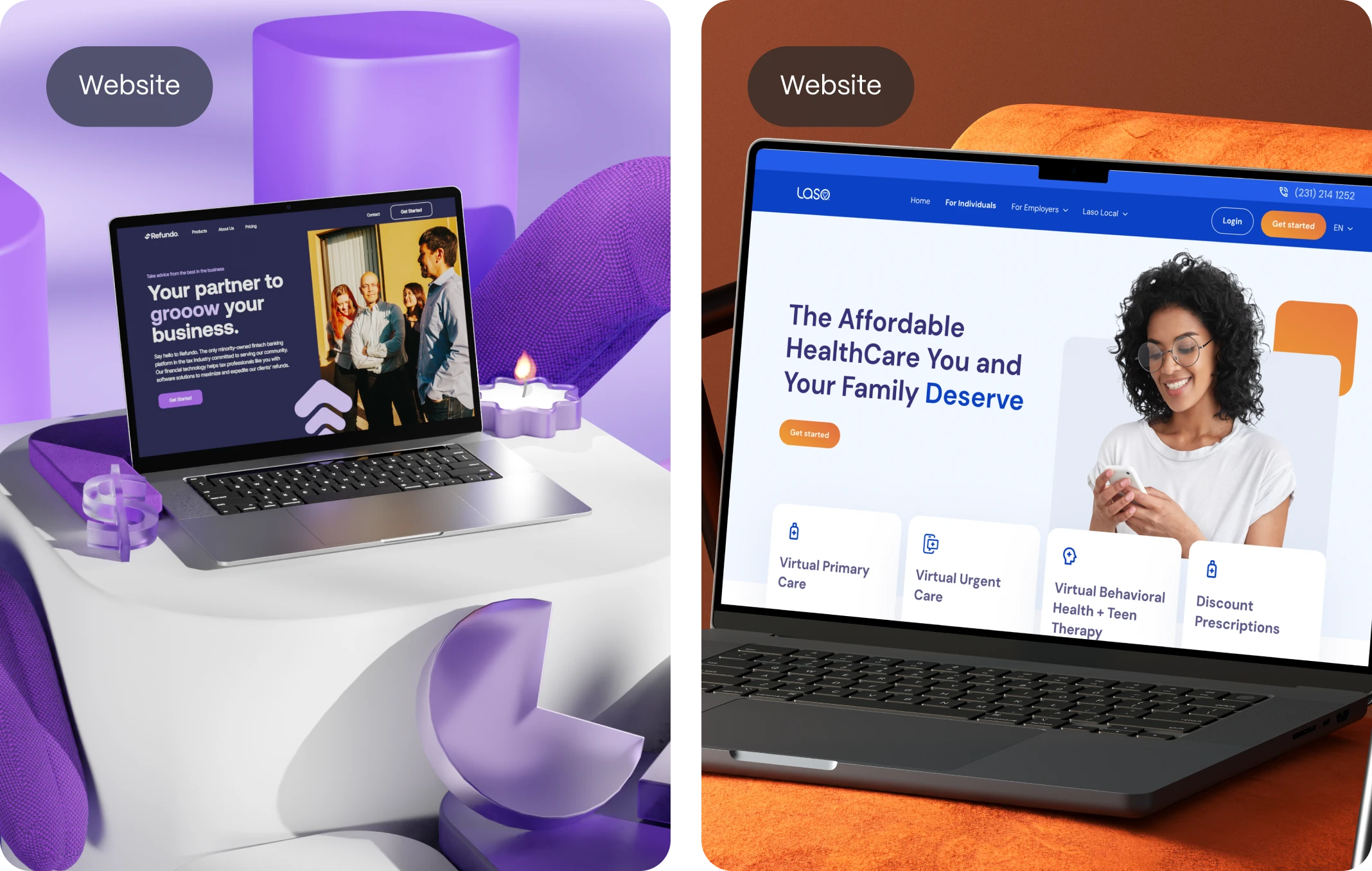
Examples of Great UI Kits
Let’s look at real-world examples that showcase what success looks like:
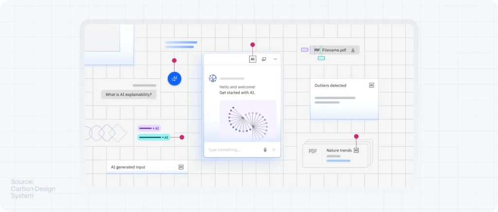
IBM Carbon Design System
Highly modular and deeply documented. Includes accessibility specs, usage guidelines, and a robust set of Figma components.
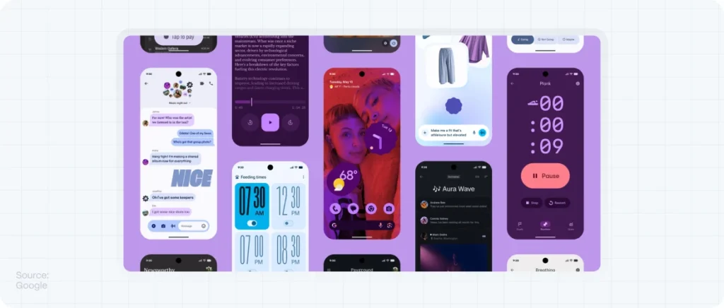
Google Material Design
While it’s not new, Material still leads the way in terms of motion guidance, theming, and cross-platform cohesion.
Shopify Polaris
Built with the needs of merchants and developers in mind. Polaris focuses on clarity, tone of voice, and adaptive components for different contexts.

How to Build Your Own UI Kit in 5 Steps
Ready to build yours? Follow this roadmap:
1. Audit Your Current Design Assets
Start with what you already have. Audit your existing designs. Look for inconsistencies in spacing, button styles, forms, etc. Group similar components together and note variations.
2. Define Your Visual Language
This includes your typography scale, color palette, iconography style, and grid system. Use tools like Typescale or Coolors to help. Apply accessible contrast from the get-go.
3. Design Core Components
Build buttons, inputs, dropdowns, modals, navbars. Create base states and interaction states (hover, focus, disabled). Follow atomic design principles—start small, build up.
4. Create Documentation
Use Figma’s annotation tools or tools like Zeroheight to write guidelines for usage. Explain when and why to use each component. This is crucial for teams.
5. Test with Real Users
Before rolling out, validate your components in real flows. Use usability design and test navigation, clarity, and behavior. Iterate based on feedback.
Our best UI Kit Tips:
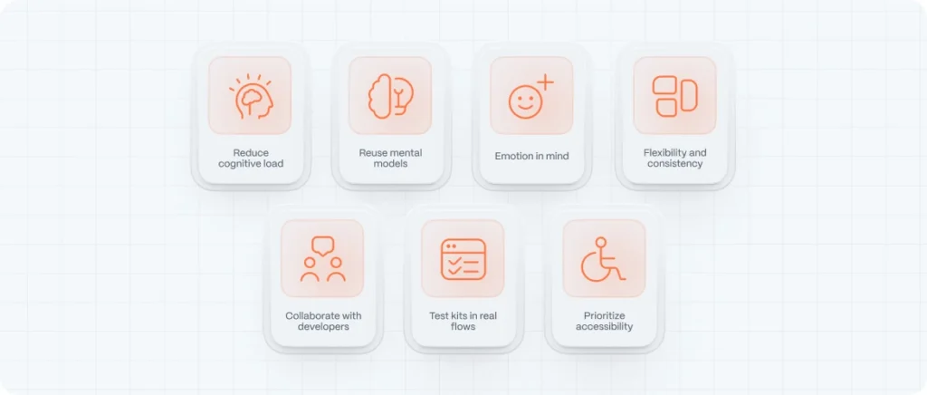
1. Understand the Cognitive Load Behind Each Component
Every button, toggle, or text field you create introduces cognitive demand. As Jeff Johnson explains in Designing with the Mind in Mind, users aren’t reading — they’re scanning. Their short-term memory is limited, so your UI kit components must support fast, error-free decisions.
Practical Tip:
Limit variation. A kit with 12 types of buttons or 5 variants of dropdowns creates unnecessary complexity. Align choices with Fitts’s Law and Hick’s Law: minimize effort, reduce the number of actions, and simplify visual decision-making.
2. Don’t Just Reuse Styles — Reuse Mental Models
In The Design of Everyday Things, Don Norman stresses that usability depends on aligning design with users’ expectations. Your UI kit should honor familiar patterns. Users bring prior experiences (from apps like Google, Apple, and Instagram) into every interface. Deviate too far and you risk confusion.
A great UI kit isn’t about novelty — it’s about clarity. Use iconography and layout rules that align with standard conventions (left-aligned labels, top-aligned form fields, circular buttons for actions, etc.).
3. Design with Emotional Triggers in Mind
Humans respond to emotion far more than logic. Susan Weinschenk, in 100 Things Every Designer Needs to Know About People, emphasizes the role of emotion in attention and memory. Your UI kit should account for visual hierarchy, contrast, color psychology, and micro-interactions that make users feel in control and safe.
Include emotional micro-patterns in your UI kit — success checkmarks, warning labels, error states, tooltips. Don’t make them an afterthought. These influence how people feel while using your product.
4. Build for Flexibility Without Breaking Consistency
A common UI kit mistake is over-engineering it for every possible case. Instead, follow the advice in Designing Interfaces: focus on essential components that adapt well to various contexts without fragmenting the system.
Examples:
- Design one input field with size variants (small, medium, large), not three separate input components.
- Use a consistent 8px spacing system across all layouts.
- Apply atomic design principles: atoms (buttons), molecules (forms), and organisms (modals) all built from a shared base.
5. Think Like a Developer — or Better Yet, Talk to One
Many designers forget that a UI kit is not just a visual system — it’s a collaboration tool. When poorly documented, it causes friction during handoff. Use systems like Figma’s component libraries and link UI states with behavior guidelines.
In each component frame, include notes on states (hover, disabled, active), behavior (what happens on click?), and logic (does this input allow special characters?). This reduces guesswork, rework, and delays.
6. Test Your UI Kit in Real-World Flows
This is where most kits fail. They work perfectly in isolation but fall apart in live flows. Borrowing from Lean UX and The Lean Startup, treat your UI kit like a product: prototype it, test it, and revise it.
Before publishing your kit, create 3–5 real pages (dashboard, form page, mobile list, error page, etc.) using only components from the kit. Share with your team and get real feedback.
7. Add Accessibility as a First-Class Feature
You don’t need to be a WCAG expert to make your UI kit inclusive. Follow basic rules:
- Contrast ratio ≥ 4.5:1 for text
- Clear focus states for keyboard navigation
- Logical tab orders
- Label every form element
Building accessibility into your kit will save you (and your dev team) countless hours later.
FAQ
What is a UI kit?
A UI kit is a collection of reusable design components (like buttons, inputs, modals) that form the visual language of a digital product. It ensures consistency and speeds up the design-to-development process.
What makes a UI kit “good”?
A great UI kit balances usability, flexibility, and consistency. It’s informed by cognitive science, aligns with user expectations, and performs well across real user flows.
What tools should I use to build a UI kit?
Figma, Sketch, and Adobe XD are the most popular tools. For scalability, use Figma’s components and shared libraries.
How do I test if my UI kit works?
Apply it to real interface pages (like login forms or dashboards), review usability with peers or test users, and get feedback from developers during implementation.
Where can I find examples of the best UI kits?
Some standout resources include Google’s Material Design, Apple’s Human Interface Guidelines, and Carbon by IBM. For inspiration, check out UI8, Envato Elements, or Dribbble UI kits — but always customize them to your brand and users.
What’s the difference between a UI kit and a design system?
A UI kit is a subset of a design system. It includes components. A design system includes principles, tokens, and rules for using them.
How often should I update a UI kit?
Ideally, iterate continuously. But set formal review cycles every quarter to align with product evolution.
Should developers use the UI kit too?
Absolutely. Make sure the dev team has access to specs, tokens, and implementation guidance. Check out our blog evodesign for more information