

Flat design might have started as a trend back in the early 2010s but it’s long outgrown that label. It’s no longer just a visual style. It’s a design philosophy. And in 2025, it’s proving to be one of the most practical, scalable, and user-friendly approaches out there.
If you’re building a product—whether it’s a SaaS platform, a mobile app, or a landing page—you can’t afford to ignore the principles of flat design. Because at its core, it’s not about looking minimal for the sake of aesthetics. It’s about clarity, speed, and creating a digital experience that helps users get where they need to go—fast.
In this article, we’re unpacking what flat design really means today, why it’s such a good fit for startups, and how you can apply it to craft clean, focused, high-converting user interfaces that don’t just look great—but actually work.
What Is Flat Design, Really?
At its core, flat design is a minimalist UI style that emphasizes two-dimensional elements, clean layouts, and bold, purposeful use of color and typography. It avoids visual embellishments like drop shadows, gradients, or textures that try to mimic real-world objects.
In a flat design system you will see:
Simple icons
Icons with minimal details, 1–2 color tones, no gradients or shadows. Each icon serves a clear function and blends with the UI seamlessly.
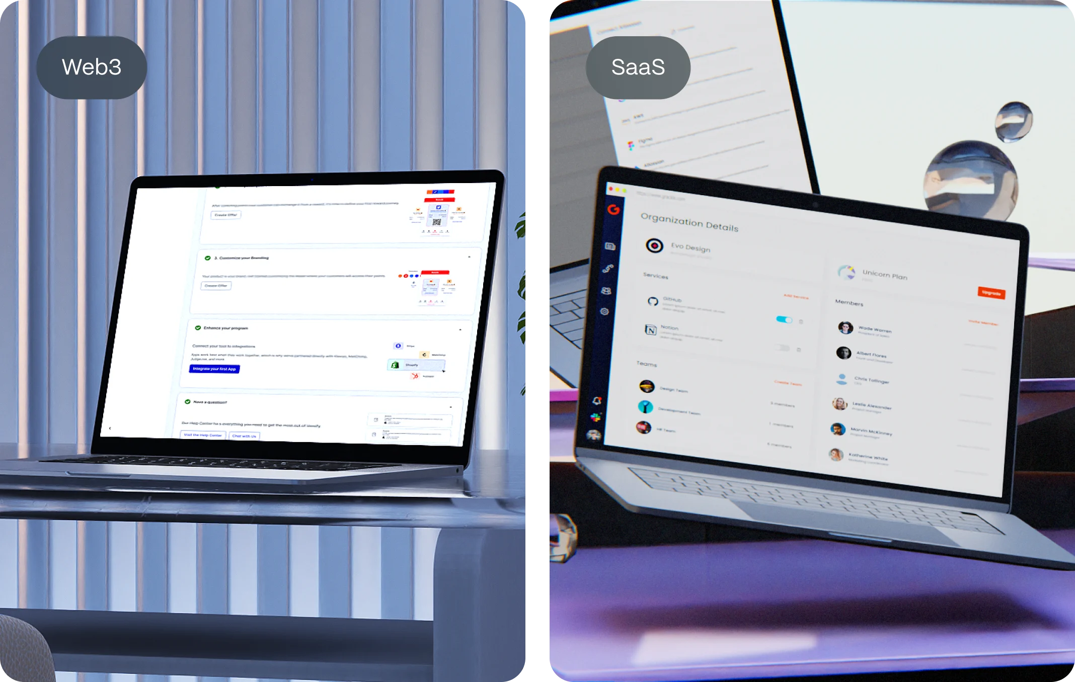
Linear’s sidebar and task list use ultra-minimal line icons with uniform stroke weight and consistent styling—perfect for flat design.
Linear’s sidebar and task list use ultra-minimal line icons with uniform stroke weight and consistent styling—perfect for flat design.
Clear buttons
Buttons with solid fill (often primary color), bold readable text, no bevels or complex shadows, and strong contrast with the background.
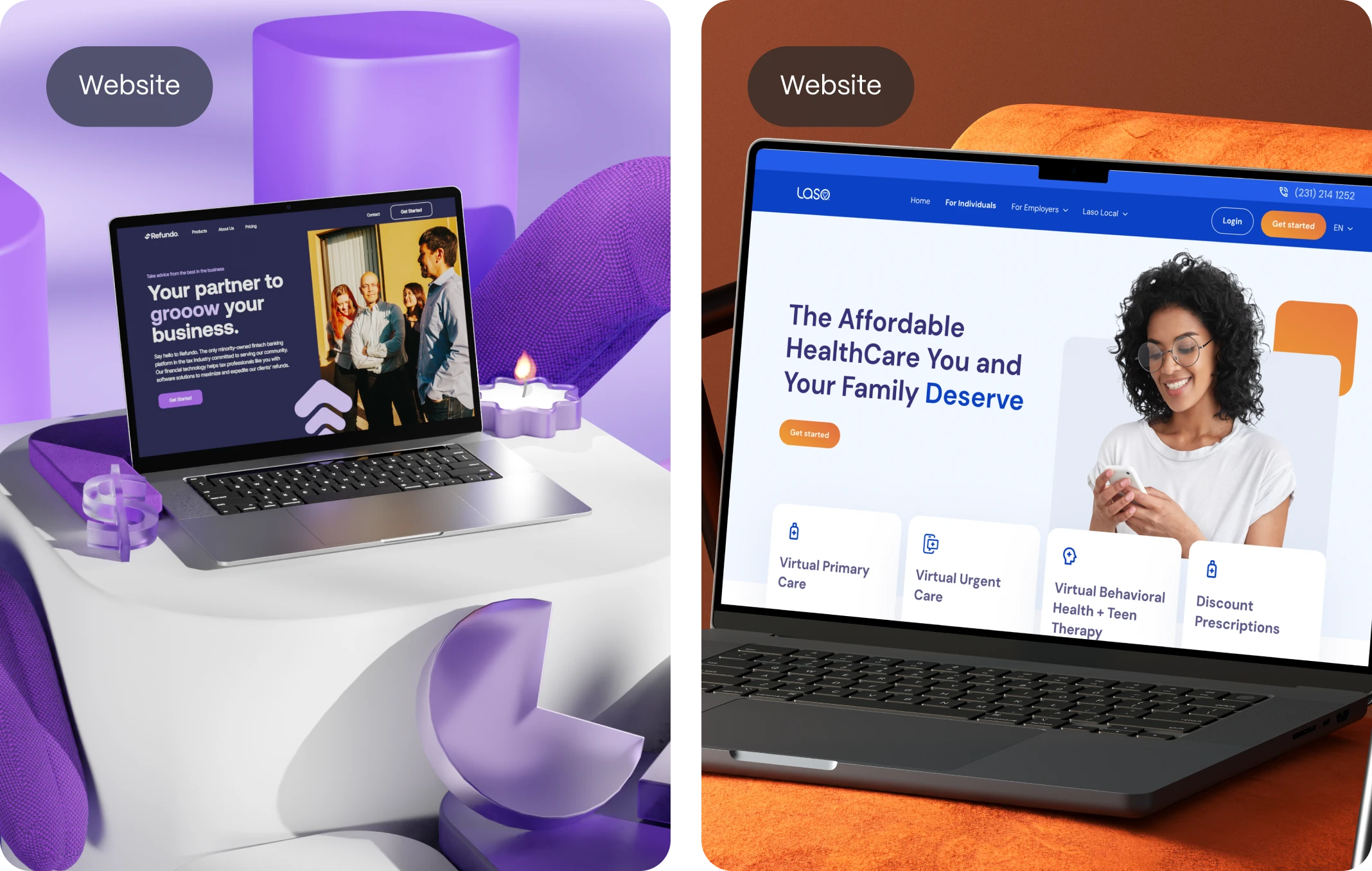
At calm.com the “Try Calm” button is simple, vibrant, and focused. It stands out on a clean background and invites action without distraction.
Solid colors
Flat, vibrant, or muted solid color blocks. No gradients, no textures. Usually applied to backgrounds, CTAs, and layout containers.
Mailchimp’s website is a great example of solid color usage in flat design. It features bold, vibrant blocks of yellow, pink, and green that create strong visual contrast and reinforce a playful brand identity.
Mailchimp’s website is a great example of solid color usage in flat design. It features bold, vibrant blocks of yellow, pink, and green that create strong visual contrast and reinforce a playful brand identity.
Generous whitespace
Clear breathing room between sections, wide margins and padding, clean separation between elements.
Pitch uses whitespace like a pro: every section feels light, scannable, and easy to navigate, enhancing overall clarity and focus.
Pitch uses whitespace like a pro: every section feels light, scannable, and easy to navigate, enhancing overall clarity and focus.
Focused hierarchy
One dominant element per screen (usually a headline or CTA), supported by subheads and secondary actions clearly distinguished by size, color, or position.
Craft’s homepage flows smoothly from headline → benefit → CTA. Typography and spacing guide your eye without needing any special effects.
Craft’s homepage flows smoothly from headline → benefit → CTA. Typography and spacing guide your eye without needing any special effects.
What you won’t see:
3D effects
Flat design rejects the depth and dimensionality of 3D visuals. You won’t find realistic textures, drop shadows that mimic elevation, or skeuomorphic elements that try to imitate physical objects. Instead, flat design embraces a two-dimensional aesthetic that keeps interfaces clean, fast, and distraction-free—allowing users to focus on content and functionality rather than decorative depth.
Beveled edges
Beveled or embossed edges are a hallmark of older design styles, especially those trying to simulate tactile buttons or raised surfaces. Flat design does away with all that. Buttons and UI elements have crisp, sharp edges with no illusion of being “pressable.” This reinforces the minimalist nature of the style, relying on contrast and spacing—not simulated depth—to guide interaction.
Complex illustrations
In flat design, illustrations are intentionally simple. You won’t see detailed linework, excessive shading, or hyperrealistic elements. Instead, visuals are clean, geometric, and purposeful. Whether it’s icons, avatars, or banners, they serve a clear function without overwhelming the user or competing with the core message of the interface.
Over-the-top animations
Flashy, heavy animations with long transitions or elaborate effects are completely at odds with the flat design philosophy. In flat design, motion is used sparingly—and strategically—to support clarity and usability. Microinteractions, subtle fades, and swift transitions take the place of dramatic effects, ensuring that the interface feels smooth, responsive, and modern.
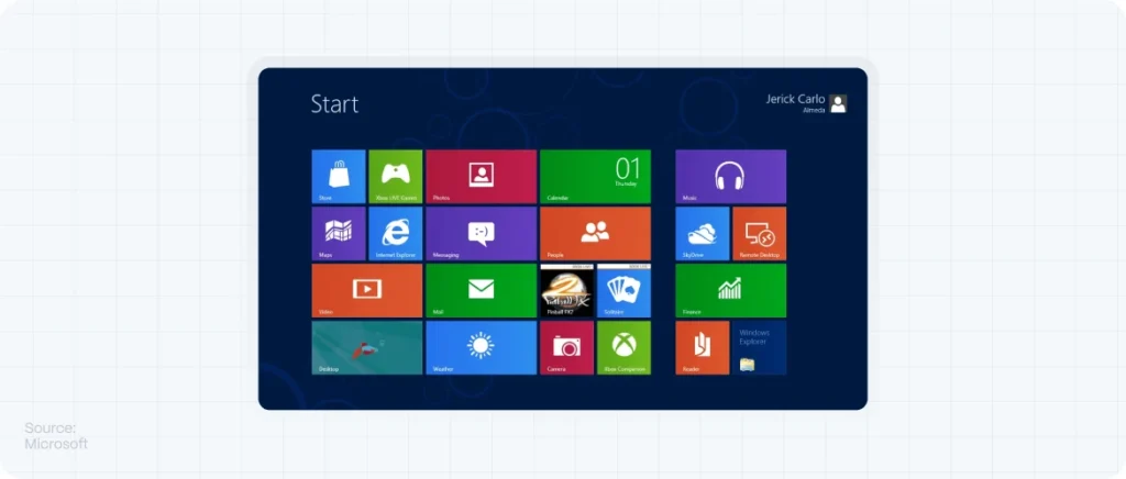
Originally popularized by Microsoft’s Metro design and Apple’s iOS 7, flat design has since become a core style for countless startups, SaaS tools, and mobile apps. And for good reason—it makes digital experiences faster, clearer, and more scalable.
Why Flat Design Works (Especially for Startups)
Flat design aligns beautifully with the priorities of early-stage companies and product teams. Here’s why:
1. It Forces Clarity
When you remove ornamental details, what’s left is the essence: the message, the action, the value. This helps users focus on what really matters. Flat design reduces cognitive load, which is critical for startups that need to explain their product quickly.
2. It Improves Performance
Without heavy image assets, 3D renders, or layered visuals, flat design loads faster. That’s not just good UX—it’s good SEO. Page speed is a ranking factor in Google’s algorithm and a major factor in bounce rate reduction.
3. It’s Scalable Across Devices
Flat UI adapts naturally to responsive design. Whether you’re on mobile, tablet, or widescreen desktop, flat elements resize and reflow elegantly—no distortion or visual noise.
4. It Converts Better
A clean interface is a confident interface. Flat design leads to higher conversion rates because it:
- Makes buttons more noticeable
- Supports strong call-to-action placement
- Keeps distractions to a minimum
For a startup trying to drive signups, demos, or purchases, this is gold.
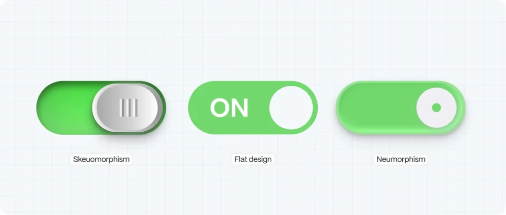
Flat Design vs. Skeuomorphism vs. Neumorphism
Let’s clear up a common misconception: flat design doesn’t mean basic. It means intentional.
|
Style |
Description |
Use Case |
|
Skeuomorphism |
Mimics real-world textures and depth |
Familiarity, retro design |
|
Flat Design |
2D, minimal, bold, clear |
Modern UI, mobile-first design |
|
Neumorphism |
Soft shadows, glassy realism |
Niche apps, aesthetic portfolios |
Flat design sits at the sweet spot: functional, modern, and user-first. And with the right color choices, typography, and motion, it can be anything but boring.
Key Principles of Flat Design in UI
1. Typography Takes Center Stage
With fewer images and effects, your text has to do more heavy lifting. Choose web-safe, readable fonts. Use size, weight, and spacing to create hierarchy.
Tip: Use Google Fonts like Inter, Roboto, or Poppins for great balance between function and personality.
2. Color as a Functional Element
In flat design, color isn’t just decorative—it directs attention. Use vibrant hues for CTAs, soft tones for backgrounds, and neutral palettes for structure.
Pro Tip: Stick to a 60-30-10 rule—60% base color, 30% secondary, 10% accent.
3. Icons Should Be Simple and Recognizable
Avoid overly detailed or decorative icons. Use flat, geometric icon sets that are universally understood. Bonus if they’re line-based for versatility.
Resources: Feather Icons, Tabler Icons, Phosphor.
4. Whitespace Is Your Best Friend
Flat design thrives on breathing room. Generous whitespace separates elements, helps with scannability, and makes interactions feel effortless.
5. Grid-Based Layouts
Structure is everything. Use a modular grid to keep spacing consistent. Align everything—buttons, text blocks, cards—so the page feels intentional and intuitive.
How to Build a Flat UI from Scratch (Step-by-Step)
- Start with Wireframes
Focus on layout before color or visual assets. Outline content blocks, CTA areas, and navigation flow.
- Define Your Color System
Choose a limited palette of 3–5 colors. Make sure they’re accessible (test for contrast) and work across light/dark modes.
- Pick a Font Pairing
One for headings, one for body. Make sure both render well at small sizes.
- Create Components
Buttons, input fields, cards, nav bars—all should be reusable and consistent.
- Prototype Interactions
Add micro-interactions like hover states, click feedback, or toggle animations. Keep them subtle.
- Test Responsiveness
Use tools like Figma’s auto-layout or Webflow’s breakpoints to preview your UI across devices.
- Launch and Iterate
Collect user feedback. Track clicks. Use heatmaps. Refine based on real behavior.
Flat Design in the Wild: Real-World Examples
- Stripe
Stripe’s dashboard UI is a flat design masterpiece: clear typography, thoughtful color hierarchy, minimal icons, and frictionless forms.
- Notion
Flat icons, muted tones, ultra-clean grid system. Notion’s interface stays out of your way so you can focus on content.
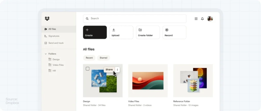
- Dropbox Paper
A blank canvas UI that puts simplicity front and center. Their mobile and desktop experiences are both built around clarity and speed.
- Linear
Project management with a lightning-fast, dark-mode-first flat UI. Buttons and input fields are minimal but precise.
- Framer
A design tool with an interface built for designers. Their flat aesthetic shows off the product while keeping performance high.
SEO Meets UI: Why Google Likes Flat Design
Flat design doesn’t just look good—it performs better, and Google notices. Here’s how it helps your SEO:
- Faster Load Times → Flat UIs require fewer assets and less code.
- Lower Bounce Rates → Clean design reduces overwhelm and confusion.
- Better Mobile Experience → Flat design adapts easily to responsive layouts.
- Clearer Hierarchy → Search engines understand structured content better.
Plus, flat design forces content clarity—which is key for both user engagement and keyword relevance.
Flat Doesn’t Mean Boring: Add Personality Without Clutter
Just because your interface is flat doesn’t mean it has to feel sterile. Here are ways to add brand character:
- Use illustrations that match your tone (think Mailchimp, Slack)
- Add motion through micro-animations (hover, scroll effects)
- Play with unexpected typography (just don’t hurt readability)
- Use bold color accents strategically (to guide attention)
Simplicity doesn’t mean sameness. A good flat design feels alive, not empty.
When Flat Design Isn’t the Best Fit
Flat design is powerful—but not for everything.
- Highly immersive experiences (like VR platforms or games) may need more dimensionality.
- Older demographics might benefit from more skeuomorphic cues.
- Luxury brands often require tactile textures to evoke sophistication.
Know your user. Then decide if flat is the right move—or if a hybrid approach would serve them better.
FAQ: Flat Design for Startups
What is flat design in UI/UX?
Flat design is a minimalist design style that uses two-dimensional elements, bold color, clean typography, and simplified icons to create intuitive interfaces.
Is flat design still relevant in 2025?
Absolutely. While it’s evolved, flat design remains a powerful approach for clean, responsive, and high-performing interfaces—especially in mobile-first and SaaS products.
Does flat design improve SEO?
Yes. Flat UIs typically lead to faster load times, better mobile performance, and clearer content hierarchy—all of which improve SEO signals.
How can I make flat design feel less generic?
Use unique typography, branded color palettes, custom illustrations, and interactive micro-animations to add personality and emotion.
What tools are best for building flat UIs?
Figma, Sketch, and Webflow are all excellent for designing and prototyping flat interfaces. For development, modern frameworks like Tailwind CSS support flat styling out of the box.