


In today’s digital landscape, user experience (UX) stands as a pivotal factor determining the success of websites and applications. Ensuring that your digital platforms are intuitive, efficient, and user-friendly is paramount. One effective method to achieve this is through heuristic evaluations—a systematic approach to identifying usability issues.
Understanding Heuristic Evaluation
Heuristic evaluation is a usability inspection method where experts assess a user interface against established usability principles, known as heuristics. Developed by Jakob Nielsen and Rolf Molich, this method aims to uncover usability problems in a design so they can be addressed early in the development process.
The 10 Usability Heuristics by Jakob Nielsen
Nielsen’s heuristics serve as a foundational guideline for evaluating user interfaces:

Visibility of System Status: Keep users informed about what is going on through appropriate feedback.
This principle is rooted in the idea that users need to be aware of the system’s current state to make informed decisions and feel in control. For instance, when driving a car, a functioning speedometer provides real-time feedback, allowing the driver to adjust speed accordingly. Without such feedback, users may feel uncertain and disconnected from the system’s operations.
Implementing this heuristic involves providing clear indicators of system status, such as progress bars during file uploads, confirmation messages after form submissions, or visual cues like button state changes upon interaction. These feedback mechanisms reassure users that their actions have been recognized and are being processed, reducing confusion and preventing repetitive inputs. For example, a loading spinner indicates that a process is ongoing, helping users understand that the system is working and they need to wait.
Incorporating visibility of system status into design not only enhances usability but also builds trust between the user and the system. By consistently communicating system states, users are less likely to encounter surprises or feel frustrated by unexpected outcomes. This transparency fosters a more intuitive and satisfying user experience, aligning with the overarching goals of user-centered design.

Match Between System and the Real World: Use language and concepts familiar to the user.
By mirroring real-world conventions, interfaces become more intuitive, allowing users to navigate and interact with systems more naturally. For instance, employing a trash can icon for deleting files leverages a universally understood symbol, making the action immediately recognizable.
To apply this heuristic in a meaningful way, it’s crucial to start by truly understanding how your users think and what they’re familiar with. Rather than relying on our own assumptions or internal knowledge, designers need to step into the shoes of their audience. That means doing the work—talking to users, observing their behavior, and learning the language and concepts they naturally use. When we align the design with real-world expectations, we make things feel easier, more intuitive, and ultimately more enjoyable to use. It’s not just about usability—it’s about connection.
User Control and Freedom: Provide users with options to undo and redo actions.
In digital product design, granting users control over their actions is not a luxury—it’s a fundamental principle of usability. Interfaces must accommodate the reality that users may act impulsively, make errors, or change their minds. Providing clearly visible options such as “undo,” “redo,” “cancel,” or “back” empowers users to recover from unintended actions without friction. This sense of control reinforces confidence, encourages deeper engagement, and positions the system as a supportive environment rather than a rigid one.
To implement this principle effectively, designers must ensure that exit points and recovery mechanisms are both intuitive and contextually appropriate. A prominent “cancel” button in a multi-step form, for instance, offers users a straightforward way to disengage from a process. An “undo” option—whether applied to content editing, settings adjustments, or data input—can significantly mitigate frustration by enabling seamless error recovery. These interface elements not only reduce cognitive strain but also convey a thoughtful understanding of user behavior under varying levels of attention and stress.
Equally important is the system’s adherence to expected behavior. If a user clicks the browser’s “back” button, they anticipate a return to the previous screen—not a loss of data or a broken flow. Disabling standard navigation controls or introducing unexpected behaviors can compromise trust and lead to user abandonment. Instead, designers should preserve established interaction patterns and offer graceful recovery paths that align with user mental models. By doing so, digital products become more resilient, predictable, and user-friendly—qualities that directly contribute to retention and satisfaction.

Consistency and Standards: Follow platform conventions and maintain consistency.
When interfaces follow established conventions—such as placing the site logo in the top-left corner or using a magnifying glass icon for search—users can predict outcomes and navigate with confidence. This predictability reduces the learning curve and minimizes confusion, allowing users to focus on their tasks rather than deciphering the interface.
There are two primary types of consistency to consider: internal and external. Internal consistency refers to uniformity within a single product or a suite of products, encompassing elements like color schemes, typography, and layout structures. For example, maintaining the same navigation menu across all pages of a website ensures that users don’t have to relearn navigation patterns on each page. External consistency involves aligning with industry standards and user expectations established by other products and platforms. By adhering to these conventions, designers leverage users’ existing knowledge, facilitating a more seamless and intuitive user experience.
Designing with consistency in mind plays a vital role in shaping a smooth and trustworthy user experience. When users recognize familiar patterns—like a predictable navigation structure or standard button behavior—they naturally feel more confident as they interact with the product. This comfort reduces the effort required to learn how the system works, allowing them to focus on their goals instead of figuring out the interface. On the other hand, when a product breaks with established norms or behaves unpredictably, users may hesitate, make mistakes, or even abandon the experience altogether. That’s why following industry conventions and maintaining internal coherence isn’t just about aesthetics—it’s a practical foundation for usability, clarity, and user retention.

Error Prevention: Design to prevent errors from occurring in the first place.
In the realm of user experience design, errors are an inevitable part of human-computer interaction. These errors are generally categorized into two types: slips and mistakes. Slips occur when users have the correct intention but execute an incorrect action, often due to inattention or distraction. For instance, selecting the wrong item from a dropdown menu or clicking the wrong button are common examples. Mistakes, on the other hand, happen when users have an incorrect understanding or mental model of the system, leading them to make decisions that don’t align with the intended functionality. An example would be misinterpreting an icon’s function due to ambiguous design.
To mitigate slips, designers can implement constraints that prevent users from making invalid selections. For example, disabling the ‘Submit’ button until all required fields are correctly filled can prevent premature submissions. Additionally, providing real-time feedback, such as highlighting errors as they occur, helps users correct mistakes promptly. For mistakes, it’s crucial to design interfaces that align with users’ expectations and mental models. This involves using familiar icons, consistent layouts, and clear instructions to guide users effectively.
Ultimately, the goal is to create a user interface that anticipates potential errors and guides users towards successful interactions. By understanding the differences between slips and mistakes, designers can implement strategies that address both, leading to a more intuitive and error-resistant user experience. This proactive approach not only enhances usability but also builds user confidence and satisfaction.

Recognition Rather Than Recall: Minimize the user’s memory load by making elements visible.
In user interface design, the distinction between recognition and recall is pivotal. Recognition involves identifying information as familiar when it’s presented, such as selecting an option from a dropdown menu. Recall, conversely, requires retrieving information from memory without cues, like typing a previously used password. Designing interfaces that favor recognition over recall reduces cognitive load, making interactions more intuitive and efficient.
It emphasizes minimizing the user’s memory burden by making elements, actions, and options visible. For instance, displaying a list of recently used files allows users to quickly identify and access them, rather than recalling file names or locations. This approach not only streamlines user tasks but also enhances overall satisfaction with the system.
To implement this heuristic designers must provide clear visual cues and consistent navigation paths. Features like autocomplete suggestions, recognizable icons, and consistent menu structures support recognition, enabling users to interact with the interface more confidently. By aligning design with users’ natural cognitive processes, we create more accessible and user-friendly digital experiences.
Flexibility and Efficiency of Use: Accommodate both novice and experienced users.
Novice users benefit from clear, guided interactions, such as step-by-step wizards or well-labeled menus, which help them build an understanding of the system. In contrast, experienced users often seek faster methods to accomplish tasks, utilizing shortcuts or gestures that streamline their workflow. By incorporating multiple methods to achieve the same outcome, designers can accommodate varying user preferences and proficiency levels, enhancing overall usability.
Implementing accelerators—features like keyboard shortcuts or customizable toolbars—allows expert users to perform frequent actions more efficiently without hindering the experience for beginners. These accelerators should be unobtrusive, ensuring they don’t overwhelm new users while still providing value to those familiar with the system. Balancing guided interactions with advanced options creates a flexible interface that supports users as they become more proficient, ultimately leading to increased satisfaction and productivity.

Aesthetic and Minimalist Design: Avoid unnecessary information and elements.
By eliminating unnecessary elements, designers can reduce cognitive load and help users focus on their primary tasks. This approach not only enhances usability but also contributes to a more visually appealing interface, which can positively influence users’ perceptions and interactions with the system.
However, it’s crucial to strike a balance between simplicity and functionality. An overly minimalist design that omits necessary information can hinder usability and frustrate users. Therefore, designers should ensure that all essential elements are present and easily accessible, while avoiding the inclusion of extraneous content that could distract or confuse users. By thoughtfully applying aesthetic and minimalist principles, interfaces can achieve clarity, efficiency, and a more satisfying user experience.
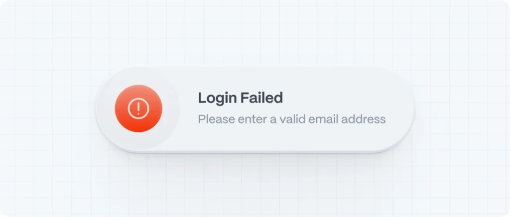
Help Users Recognize, Diagnose, and Recover from Errors: Provide clear error messages and solutions.
According to the Nielsen Norman Group, well-designed error messages should be highly visible, using clear indicators like bold text, high-contrast colors, and intuitive icons to draw attention. Placing these messages close to the source of the error helps users quickly identify and address the problem without unnecessary confusion. For instance, highlighting a form field in red and providing an adjacent message clarifies where the user’s attention is needed. Additionally, it’s important to avoid displaying error messages prematurely; users should be given the opportunity to complete their input before being alerted to potential issues.
Beyond visibility, the language used in error messages plays a significant role in user experience. Messages should be written in plain, human-readable language, avoiding technical jargon that could confuse users. They should clearly state what went wrong, why it happened, and how the user can fix it. For example, instead of a vague “Error 404,” a more helpful message would be, “The page you’re looking for can’t be found. Please check the URL or return to the homepage.” Providing constructive guidance not only aids in error recovery but also builds trust in the system, making users feel supported rather than blamed.
Efficiency in error messaging also involves respecting the user’s effort and time. Designers should ensure that error messages do not disrupt the user’s workflow more than necessary. Allowing users to correct errors without having to re-enter all their information can significantly enhance the user experience. Moreover, tailoring the severity of the error message to the impact of the error helps users prioritize their actions. Minor issues might warrant a gentle nudge, while more critical errors could require immediate attention with more prominent messaging. This nuanced approach ensures that users remain engaged and can efficiently navigate and correct issues within the system.

Help and Documentation: Offer accessible help and documentation when needed.
Incorporating effective help and documentation within digital interfaces is crucial for enhancing user experience. These resources should be easy to search, task-focused, concise, and offer clear, actionable steps to aid users in achieving their goals.
Help can be categorized into proactive and reactive forms. Proactive help aims to familiarize users with the interface before issues arise, often through tutorials, tooltips, or onboarding guides. This approach is particularly beneficial for new users or when introducing significant updates. Conversely, reactive help addresses problems as they occur, offering solutions like searchable documentation, FAQs, or support channels to assist users in troubleshooting and resolving issues effectively.
The effectiveness of help resources hinges on their relevance and timing. Proactive assistance should be context-sensitive, providing information pertinent to the user’s current task without causing unnecessary interruptions. Reactive support must be readily accessible, guiding users through problem-solving processes with clarity and efficiency. By thoughtfully integrating these support mechanisms, designers can create user-centric systems that empower users and enhance overall satisfaction.
Benefits of Conducting Heuristic Evaluations
- Early Detection of Usability Issues: Identifies problems before they escalate.
- Cost-Effective: Requires fewer resources compared to extensive user testing.
- Improved User Satisfaction: Enhances the overall user experience by addressing pain points.
- Informed Design Decisions: Provides actionable insights for design improvements.
Implementing Heuristic Evaluations in Your Workflow
- Preparation: Define the scope and objectives of the evaluation.
- Selection of Evaluators: Choose usability experts familiar with heuristic principles.
- Conducting the Evaluation: Evaluators independently review the interface, noting any issues.
- Analysis and Reporting: Compile findings, prioritize issues, and recommend solutions.
- Iterative Improvements: Implement changes and re-evaluate as necessary.