


Color is one of the first things people notice when they land on your website. Before they read a single word, they’re already feeling something—drawn in, turned off, or maybe just… confused. That’s the power of a good (or not-so-good) palette.
And if you’re building a brand in 2025, color choices go way beyond making things “look nice.” They tell people who you are, what you stand for, and whether they should trust you. Whether you’re running a startup, launching a new product, or redesigning your site from scratch, color sets the tone—literally.
At Evo, we geek out over this kind of stuff. We spend way too much time tweaking shades, testing gradients, and figuring out which combos actually move the needle. So in this post, we’re sharing the color trends we’re already seeing everywhere—and loving. Use them to freshen up your brand, get inspired, or just see what’s next in the world of web design.
Why Color Matters More Than Ever in 2025
As digital platforms become more immersive—with the rise of AI, augmented reality, and interactive design—color must do more than look good. It has to guide emotion, improve UX, and align with evolving cultural signals.
Recent studies from Adobe and Nielsen Norman Group show that:
- Users form a first impression of a site within 0.05 seconds—color being the strongest visual element.
- 85% of consumers say color influences purchase decisions.
- Color improves brand recognition by up to 80%.
In 2025, brands will shift away from safe, neutral palettes and lean into intentional, expressive color use. Let’s explore what that looks like.
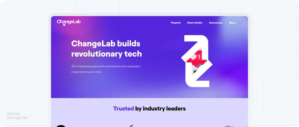
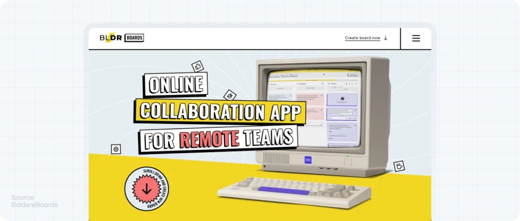
1. Hyper-Real Neons and Digital Glow
What’s the trend?
In a world increasingly shaped by screens, the visual language of digital becomes a core part of branding. Neon gradients, glowing borders, and hyper-saturated colors are no longer reserved for gaming or tech—they’re entering mainstream startup branding.
Think of Figma’s community UI, or Stripe’s evolving dashboard visuals. These colors suggest innovation, disruption, and bold thinking.
Why it works:
Bright, glowing tones signal modernity and energy. When combined with dark backgrounds, they create contrast and evoke focus and excitement.
How to use it:
- Pair neons with black or deep navy backgrounds for high contrast.
- Use sparingly to highlight CTAs or microinteractions.
- Ideal for tech startups, SaaS platforms, or creative tools.
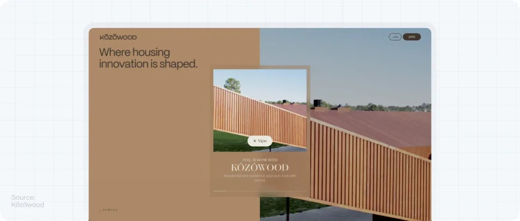
2. Muted Earth Tones with Futuristic Accents
What’s the trend?
Sustainability continues to shape not just materials but moods. Soft greens, clay beiges, washed-out terracottas—these are the new emotional neutrals. But in 2025, designers are contrasting these organic tones with metallic blues or chrome gradients, creating a future-meets-nature vibe.
Why it works:
This contrast reflects how we live now: we want to feel grounded while staying connected. It’s also highly effective for wellness, architecture, and eco-tech startups.
How to use it:
- Use the earthy palette as your base UI colors.
- Add digital accents in hover states, buttons, or transitions.
- Great for health startups, interior-focused products, or biohacking brands.
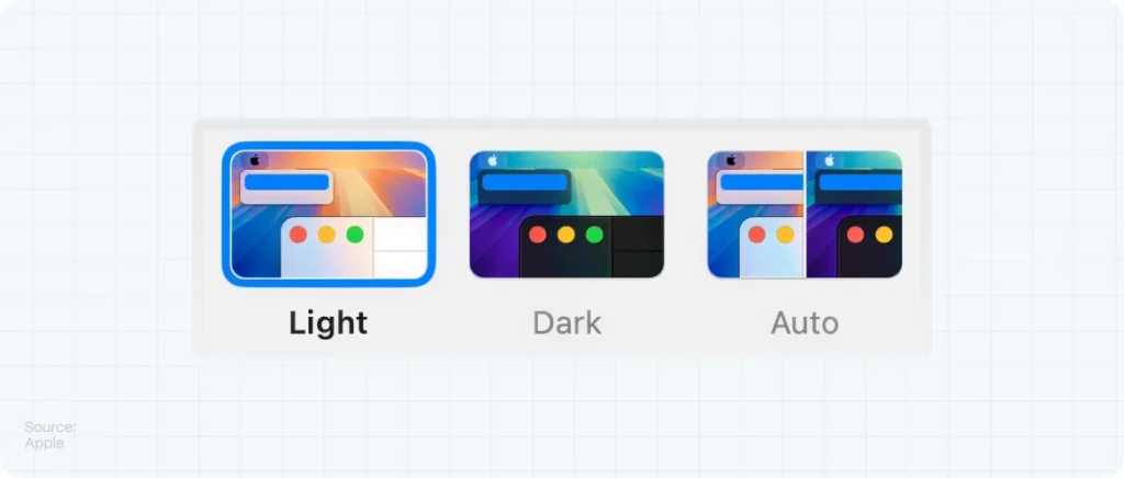
3. Color-Changing UI States
What’s the trend?
Color no longer has to be static. In 2025, we’ll see morphing color schemes based on user behavior, time of day, or even ambient light. This dynamic shift personalizes the experience and brings a new layer of UX sophistication.
Why it works:
It creates novelty, improves accessibility, and shows a deeper level of UI care. It also mirrors human emotion and makes the interface feel alive.
How to use it:
- Light-to-dark transitions based on time (day/night mode with emotion).
- Gradual hue changes on scroll or interaction.
- Best applied to digital products, mindfulness apps, or premium portfolios.
4. Retro Color Blocking: 70s, 80s and Y2K Mashups
What’s the trend?
Nostalgia in web design is evolving. Instead of just one era, we’re seeing hybrid references—bold 70s oranges with pastel Y2K purples, 80s electric teal mixed with 90s gradients. The result? Playful, layered, and highly scrollable visuals.
Why it works:
These palettes feel familiar but unexpected. They tap into emotional memory while offering room for creativity and surprise.
How to use it:
- Use retro palettes to create visual segmentation in long-scroll pages.
- Combine with pixel fonts or analog textures for full effect.
- Perfect for creative startups, e-commerce, or youth-centered brands.
5. Black & White as the New Bold
What’s the trend?
After years of color explosions, some of the boldest brands are going back to high-contrast black and white. The twist? They pair it with oversized typography, motion, and immersive interaction—turning minimalism into a power move.
Why it works:
It strips away noise and focuses user attention. It also signals confidence: “Our product speaks for itself.”
How to use it:
- Use black & white as the core of your layout, adding one single accent color.
- Embrace dynamic typography and scroll animations.
- Ideal for high-end digital agencies, fintech, or B2B platforms.
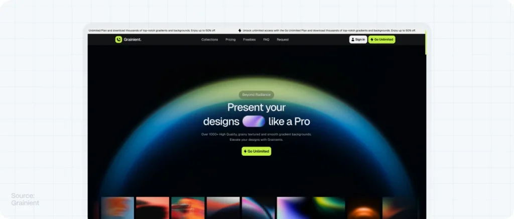
6. AI-Generated Gradient Systems
What’s the trend?
Thanks to tools like Midjourney and Adobe Firefly, designers now generate non-repeating, AI-driven gradients. These color blends feel more organic, more fluid—and they signal a brand’s future-forward mindset.
Why it works:
Unique gradients create brand distinction. No more flat linear fades—these gradients are multidimensional and deeply expressive.
How to use it:
- Apply to hero backgrounds or feature sections.
- Combine with glassmorphism or subtle motion for a more immersive feel.
- Ideal for startups in the AI, data, or creative tech space.
7. Cultural Color Stories
What’s the trend?
Color is becoming more contextual and inclusive. Designers are using color palettes that reflect specific cultural narratives—African heritage colors, Japanese Wabi-Sabi tones, Latin vibrancy—telling deeper stories through chromatic choices.
Why it works:
It invites users into a more human, grounded experience. And for global startups, it creates authentic connections with local audiences.
How to use it:
- Research cultural associations before applying.
- Use color as part of storytelling, not decoration.
- Works beautifully for D2C brands, social impact startups, or community platforms.
How to Choose the Right Color Trend for Your Startup
Not every trend is right for every business. Use these strategic questions to guide your palette choices:
- What emotional state do you want to evoke? (calm, excitement, trust, energy?)
- What does your target audience associate with “innovation”?
- What’s the story behind your product—and how can color tell it without words?
- Where will users most interact with your brand? (desktop, mobile, dark mode, etc.)
FAQs About Color Trends in Web Design
What is the biggest web design color trend for 2025?
One of the most dominant trends is the use of AI-generated gradients and hyper-neon accents. These signal innovation and capture visual attention quickly.
Do color trends affect SEO or conversions?
Indirectly, yes. Color impacts user engagement, bounce rate, and readability—all of which influence SEO. The right color choices can also improve CTA performance and brand trust, boosting conversions.
To understand how color impacts user engagement, consider its influence on website usability.
Should startups follow color trends or create their own identity?
Trends can inspire, but your palette should be timeless enough to evolve with your brand. It’s better to adapt trends strategically than to follow them blindly.
Consider your brand identity when choosing color palletes.
How can I test if my website colors are effective?
Use A/B testing on CTAs, analyze heatmaps for attention flow, and run accessibility checks. Always validate with real user behavior.
Ensure your website meets accessibility standards when choosing colors.