


Open any great website and you’ll feel something before you read a single word.
Maybe it’s trust. Maybe excitement. Maybe elegance. But what you’re really experiencing—consciously or not—is color doing its job.
Color isn’t just decoration. It’s communication. It’s psychology. And when applied with intention, it becomes one of the most powerful tools a web designer can master. For startups, understanding these principles is crucial; learn more about branding for startups.
In this comprehensive guide to Color Theory in Web Design, you’ll learn how to move beyond guesswork and use color schemes, palettes, and emotion-driven strategies to create digital experiences that engage, convert, and elevate your brand.
What Is Color Theory and Why It Matters in Web Design
At its core, color theory is a practical framework that helps us understand how colors relate to one another and how they influence perception.
In web design, color theory isn’t just about making things pretty—it’s about:
- Establishing brand identity
- Guiding user behavior
- Enhancing readability and UX
- Boosting emotional connection
- Driving conversions
Your color choices don’t just reflect your brand—they define how users feel and interact with it. For a deeper dive, explore our brand identity guide.
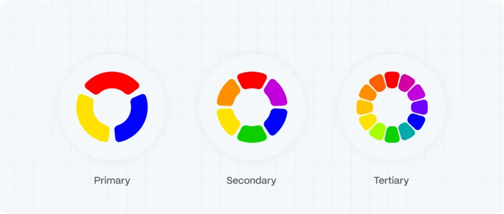
Understanding the Basics: Primary, Secondary and Tertiary Colors
Primary Colors
Red, Blue, Yellow
These are the foundation. You can’t create them by mixing other colors.
primary colors
Secondary Colors
Green, Orange, Purple
Made by combining two primary colors.
secondary colors
Tertiary Colors
Red-orange, Blue-green, Yellow-purple, etc.
These are created by mixing a primary and a neighboring secondary color.
tertiary colors
This hierarchy is the starting point for building strategic and balanced color palettes in web design.
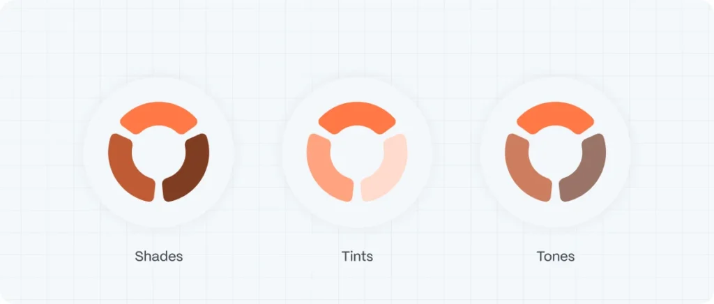
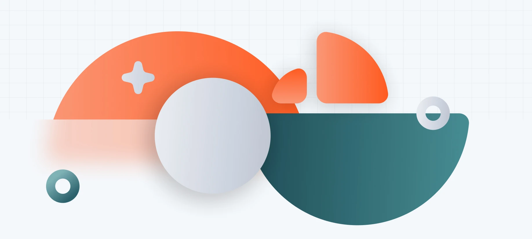
Shades, Tints, and Tones: The Secret Ingredients of Sophisticated Color Design
Choosing the right base color is only the beginning. Master-level web design comes from knowing how to modulate that color—using shades, tints, and tones to create depth, contrast, hierarchy, and visual balance.
Shades – Adding Black for Boldness
A shade is created by adding black to a base color, making it darker and more intense. Shades are often used to create strong contrast, give weight to key elements like headlines or buttons, or add drama to sections of a page.
Example: A shade of blue can convey strength, confidence, and professionalism—perfect for corporate or financial brands.
Tints – Adding White for Softness
A tint is formed by mixing a color with white, resulting in a lighter, airier version. Tints are ideal for creating a clean, open feel and work beautifully for backgrounds, cards, or UI sections that need to feel welcoming and non-intrusive.
Example: A tint of green might evoke freshness and simplicity, which is great for wellness or lifestyle brands.
Tones – Adding Gray for Subtlety
Tones are made by adding gray to a color, which reduces its saturation and intensity. This creates a more neutral, refined variation of the color—great for sophisticated, understated design systems.
Example: A tone of purple feels more mature and balanced than a highly saturated version—ideal for premium branding or editorial layouts.
Pro Tip: Using shades, tints, and tones helps you create visual hierarchy and color variation without straying from your brand’s core palette.
shades, tones and tints
The Psychology of Color: How Colors Trigger Emotion and Behavior
Colors speak. They evoke emotion. They guide action. Understanding this is crucial for anyone designing user interfaces or digital experiences.
Here’s a quick overview of how common colors are perceived:
| Color | Emotion/Message | Common Uses |
|---|---|---|
| Red | Passion, urgency, energy | Sale buttons, alerts |
| Blue | Trust, security, calm | Finance, tech, healthcare |
| Green | Growth, freshness, balance | Wellness, eco brands |
| Yellow | Optimism, youthfulness, attention | Startups, promotions |
| Black | Luxury, power, authority | Fashion, high-end branding |
| White | Simplicity, purity, cleanliness | Tech, minimalist brands |
| Purple | Creativity, royalty, wisdom | Beauty, innovation |
color psychology
Pro tip: Choose colors that align not just with your brand, but with your audience’s feelings and expectations.
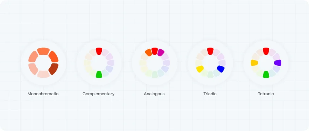
Color Schemes Explained: The Blueprint of Color Harmony
Creating the right color scheme ensures that your design feels cohesive—not chaotic.
1. Monochromatic Color Scheme
Uses various shades, tints, and tones of a single hue.
Great for minimalist or clean designs. Consider minimalist web design for startups.
Easy to manage and accessible.
Monochromatic Color Scheme
2. Complementary Color Scheme
Pairs colors opposite each other on the color wheel (e.g., blue and orange).
Creates contrast and high energy.
Ideal for CTAs or visual punch.
Complementary Color Scheme
3. Analogous Color Scheme
Uses colors that sit next to each other on the wheel (e.g., green, blue-green, blue).
Soft and natural.
Excellent for smooth visual flow.
Analogous Color Scheme
4. Triadic Color Scheme
Uses three colors evenly spaced on the wheel (e.g., red, yellow, blue).
Offers balance and vibrancy.
Works well for bold, dynamic designs.
Triadic Color Scheme
5. Tetradic (Double Complementary) Color Scheme
Combines two complementary pairs.
Offers rich, vibrant palettes.
Demands careful balance to avoid clashing.
Tetradic (Double Complementary) Color Scheme
How to Build a Strategic Color Palette
A successful color palette does more than look good—it guides your design system.
Your palette should include:
- Primary color – The main brand identifier.
- Secondary color(s) – Support and variation.
- Neutral tones – Backgrounds, text, UI elements.
- Accent color – Used sparingly for emphasis (CTAs, links, alerts).
color palette
Accessibility tip: Always test your color combinations for contrast. Use WebAIM’s Contrast Checker to ensure readability across devices and for users with visual impairments.
Colors and Conversion: Why Color Is a UX Decision
Color affects:
- Where users look first (attention flow)
- How users interpret messages
- Whether or not users trust your brand
For example: Changing a CTA button from gray to red or green can dramatically improve conversion rates—but only if it fits your brand and stands out from the surrounding UI. See how SEO and web design can work together to boost traffic.
At Evo Design, we don’t guess. We test, we refine, and we align color with user psychology and UX strategy. Check out the UX design trends for 2024.
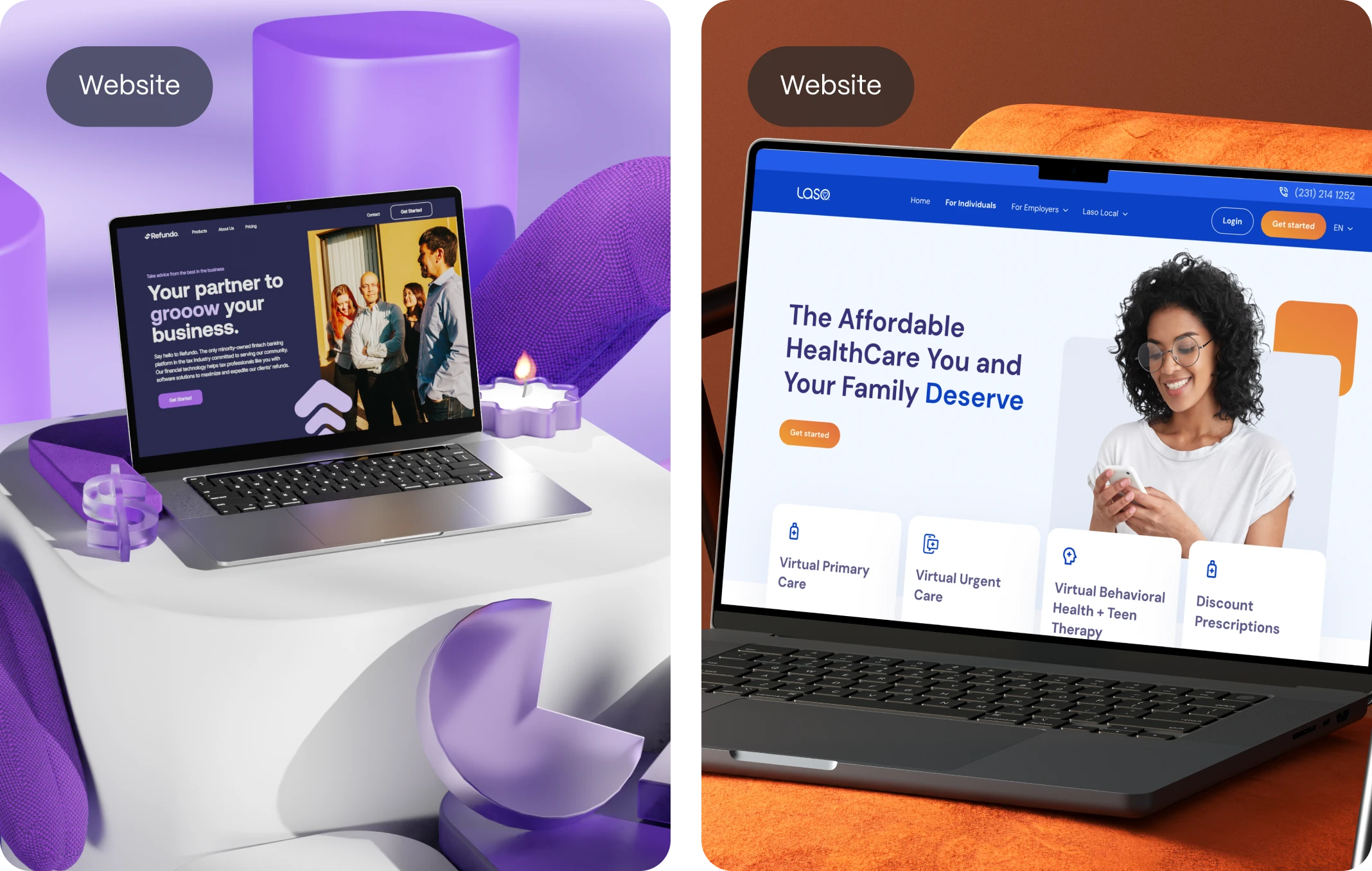
Web Design Case Study: Evo’s Color Approach in Action
When building a new brand or website, we start with strategy, not style.
We evaluate:
- The brand’s purpose and positioning
- The emotions the experience should evoke
- The action we want users to take
Then, we translate that into a color strategy—mapped to emotional response, optimized for readability, and tailored to each platform. If you’re considering a web app, here’s the web app design process explained.
Because color theory isn’t decoration—it’s direction. To see where design is headed, take a look at the future of web design.