


Close your eyes and think of Coca-Cola. What color popped into your mind first?
Red, right?
That’s not a coincidence—it’s color psychology in action. And it’s not just a trick for big brands. Every color you choose in your website or brand identity has the power to trigger emotion, influence behavior, and even increase conversions.
In this article, we’ll explore the Psychology of Color in the context of web design—what it is, why it matters, and how to apply it strategically to build trust, engagement, and stronger connections with your audience.
What Is Color Psychology?
Color psychology is the study of how colors influence human perception and behavior. It draws from neuroscience, marketing, and behavioral science to explain how certain colors can spark specific emotional or cognitive responses.
In the world of web design, this means that the colors you use on your website—whether in your logo, buttons, backgrounds, or typography—aren’t just visual choices. They’re psychological tools.
Why Color Psychology Matters in Web Design
Your website isn’t just a collection of pages—it’s a branded experience. And color plays a major role in how users feel, think, and act while navigating it.
Here’s why color is a crucial UX and branding element:
- First impressions happen in less than 1 second, and color plays a dominant role.
- People decide whether they like a product within 90 seconds—and up to 90% of that judgment is based on color.
- Color influences readability, clarity, and emotional trust.
When used strategically, color can:
- Increase conversion rates
- Improve user retention
- Enhance brand recognition
- Reduce bounce rate
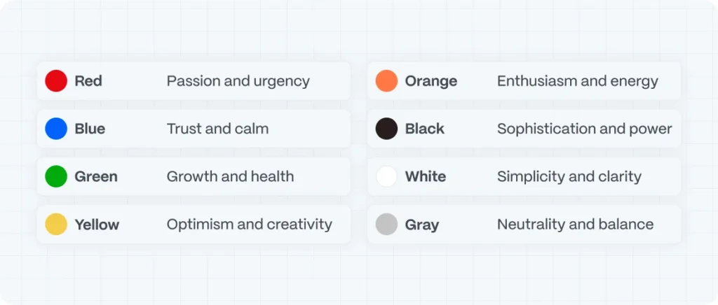
Emotional Associations of Common Colors
Let’s break down some of the most commonly used colors in branding and their psychological meanings:
| Color | Primary Emotions | Best For |
|---|---|---|
| Red | Passion, urgency, energy | CTAs, promotions, fast-paced brands |
| Blue | Trust, calm, security | Tech, finance, healthcare |
| Green | Growth, health, stability | Eco brands, wellness, fintech |
| Yellow | Optimism, creativity, attention | Startups, lifestyle, playful interfaces |
| Orange | Enthusiasm, energy, friendliness | SaaS, entertainment, education |
| Purple | Luxury, creativity, mystery | Beauty, innovation, premium services |
| Black | Sophistication, power, modernity | Fashion, luxury, tech |
| White | Simplicity, clarity, purity | Minimalist brands, design portfolios, SaaS |
| Gray | Neutrality, balance, calm | Corporate, editorial, tech |
Color Psychology
Note: Cultural differences affect color interpretation. Red can symbolize love in the West but danger or luck in other cultures.
How to Apply Color Psychology to Your Website
1. Align Color with Brand Personality
Are you playful or serious? Cutting-edge or traditional? Use colors that visually match the tone of your messaging and core values.
- Startup SaaS? Try light blues and greens.
- Luxury service provider? Think deep blacks and golds.
- Creative studio? Explore vibrant purples or warm oranges.
2. Define Emotional Goals for Each Page
Not every page should feel the same.
- A landing page should drive action (use high-contrast colors and bold CTAs).
- An About page may benefit from soothing tones that build trust.
- A blog page can use neutral backgrounds to reduce cognitive load.
3. Use Color to Guide Attention and Interaction
Buttons, forms, and CTAs should stand out. Use contrasting accent colors that draw the eye without overwhelming the layout.
Tip: Run A/B tests on CTA button colors—tiny tweaks here can lead to big lifts in conversions.
4. Consider Accessibility and Color Contrast
A beautiful design is meaningless if users can’t read or interpret it. Use tools like WebAIM Contrast Checker to ensure sufficient color contrast between foreground and background elements.
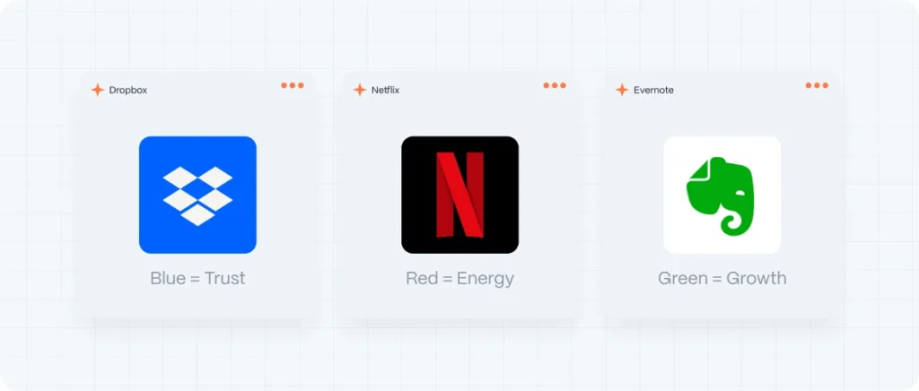
Real-World Example: Color Psychology Done Right
Dropbox uses soft blues to evoke trust and simplicity.
dropbox brand
Netflix leans on high-contrast red and black for energy and drama.
dropbox brand
Evernote’s green represents growth and productivity.
dropbox brand
These choices aren’t random—they’re rooted in deep psychological strategy.
Evo Design’s Approach to Color Psychology
At Evo Design, we go beyond surface-level aesthetics. When we define a color strategy for a client, we ask:
- What emotion do we want users to feel at every stage?
- How can we use color to support those feelings?
- How will this palette support long-term brand growth and consistency?
We blend design expertise with behavioral insight to ensure that every color on your site works with your message—not against it.