Why the Best Logos Are More Than Just Symbols
A great logo is more than just a visual mark—it’s the face of a brand. The most successful logos don’t just look good; they create instant recognition, evoke emotions, and communicate brand values.
But what makes a logo truly iconic? How have the top 5 best logos in the world helped shape billion-dollar brands? In this article, we’ll break down:
- What defines a successful logo.
- The top 5 most recognizable logos in the world.
- The strategic design choices that made them powerful.
- Lessons for businesses looking to create an unforgettable brand identity.
If you want to craft a logo that stands the test of time, keep reading.
What Makes a Logo the Best?
A logo’s success isn’t about complexity or flashy design—it’s about how well it aligns with the brand’s mission, values, and audience. The best logos in the world share five key characteristics:
- Simplicity – Easily recognizable at a glance.
- Memorability – Instantly sticks in the audience’s mind.
- Timelessness – Doesn’t feel outdated over time.
- Versatility – Works across all media and platforms.
- Relevance – Reflects the brand’s core identity.
Now, let’s dive into the top 5 most successful logos and what makes them legendary.
The 5 Best Logos in the World & Why They Work

1. Apple: The Power of Simplicity & Symbolism
Why It’s Iconic:
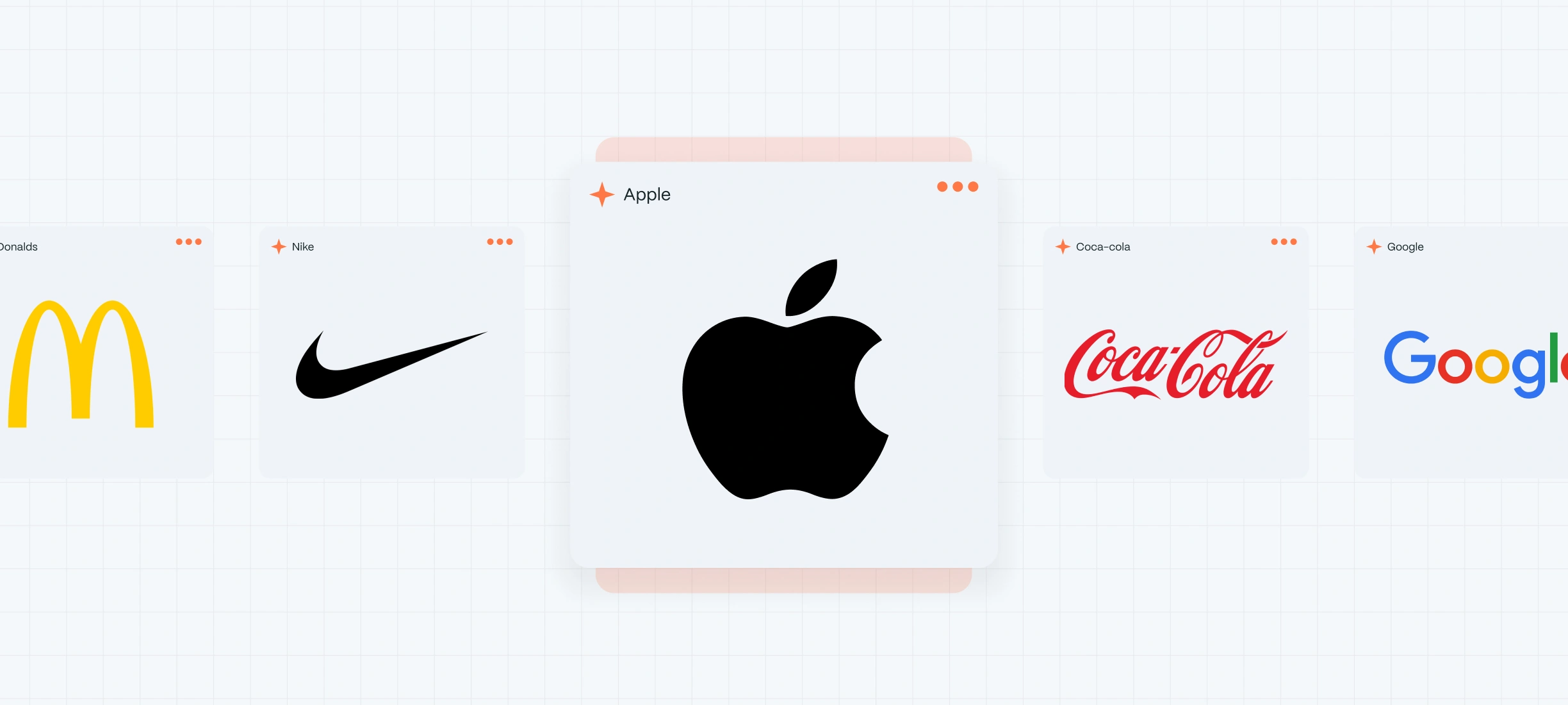
Apple’s minimalist bitten apple is one of the most recognized logos globally. The logo embodies simplicity, elegance, and innovation, perfectly reflecting Apple’s brand identity.
Key Design Elements:
- Simple, clean shape – Instantly recognizable.
- No text needed – A strong symbol-only logo.
- Monochrome design – Works in any format.
Lesson for Businesses:
Less is more. A logo should be effortlessly recognizable, even without words.

2. Nike: The Swoosh That Represents Motion & Confidence
Why It’s Iconic:
The Nike Swoosh is a perfect example of symbolism and motion. Designed in 1971, it represents speed, movement, and energy, aligning with Nike’s athletic and performance-driven brand.
Key Design Elements:
- Dynamic, flowing shape – Symbolizes movement and progress.
- Minimalist execution – No extra details to distract.
- Psychological impact – The upward curve suggests success and achievement.
Lesson for Businesses:
Your logo should tell a story and evoke the right emotions in your audience.

3. McDonald’s: The Golden Arches That Define Fast Food
Why It’s Iconic:
McDonald’s Golden Arches are synonymous with fast food culture worldwide. The bright yellow “M” is universally recognizable, and its warm, inviting feel triggers hunger and nostalgia.
Key Design Elements:
- Bold color psychology – Yellow & red create excitement and appetite.
- Typography-based symbol – A strong, unique letter design.
- Instant familiarity – Recognizable even from a distance.
Lesson for Businesses:
Colors matter. Choose a color palette that aligns with your brand personality.

4. Coca-Cola: The Most Timeless Logo in History
Why It’s Iconic:
Since 1886, Coca-Cola’s script logo has remained one of the most consistent and timeless designs in history. Unlike brands that rebrand frequently, Coca-Cola has stuck to its classic typography, reinforcing its heritage and brand trust.
Key Design Elements:
- Elegant cursive typography – Feels personal and nostalgic.
- Consistent branding – Over a century of unchanged core identity.
- Strong emotional connection – Evokes happiness and togetherness.
Lesson for Businesses:
Consistency builds brand equity. Avoid unnecessary logo changes that might confuse loyal customers.

5. Google: The Evolving Yet Familiar Wordmark
Why It’s Iconic:
Google’s logo evolution showcases how a brand can modernize without losing recognition. The colorful sans-serif typeface represents playfulness, innovation, and approachability.
Key Design Elements:
- Bright, engaging colors – Reflects creativity and fun.
- Simplicity – No unnecessary elements.
- Adaptive branding – Works across search, apps, and products.
Lesson for Businesses:
A logo should be versatile and adapt to digital platforms without losing identity.
How a Strong Logo Impacts Business Success
- ✔ Increases Brand Recognition – Customers instantly recall a business with a distinctive logo.
- ✔ Boosts Consumer Trust – A professional, polished logo signals credibility.
- ✔ Enhances Marketing Efforts – A well-designed logo makes advertising more effective.
- ✔ Drives Customer Loyalty – A recognizable logo fosters long-term brand relationships.
Example: Studies show that 75% of consumers recognize a brand by its logo alone (Lucidpress).
How to Create a Logo That Stands Out
If you want your logo to be as impactful as the world’s best, follow these principles:
- Know Your Brand Personality – Define what your logo should communicate.
- Keep It Simple – Avoid overcomplicated elements.
- Use Timeless Design – Trends fade, but strong branding lasts.
- Test for Versatility – Ensure your logo works in digital and print formats.
- Get Professional Help – Design agencies like Evo Design Studio specialize in creating unique, scalable brand identities.
Need a logo that stands out? Let’s build your brand identity today.

