In the fast-paced world of digital products, having a solid app idea is no longer enough. Execution is everything. And that execution starts with design—not just how your app looks, but how it behaves, how users feel while interacting with it, and how easily it adapts to real-world needs.
This guide is your deep dive into app design and development, built specifically for startup teams who want to launch products that don’t just work—but win.
Designing an app is part science, part strategy, part soul. At Evo Design, we’ve partnered with founders from early concept to full-scale launch. Along the way, we’ve refined a process that blends UX thinking, technical feasibility, and business goals into one coherent product journey.
In this article, we’ll walk you through every critical step of how to design an app—so your team can build confidently, avoid costly mistakes, and deliver something people genuinely love.
1. Clarify the Why
The biggest mistake startups make? Jumping into screens before defining purpose. Before a single wireframe is drawn or a prototype built, you need to clarify the “why” behind your app. This goes beyond describing features. It means articulating:
- The problem your app solves
- Who your primary users are
- What success looks like (for them and for you)
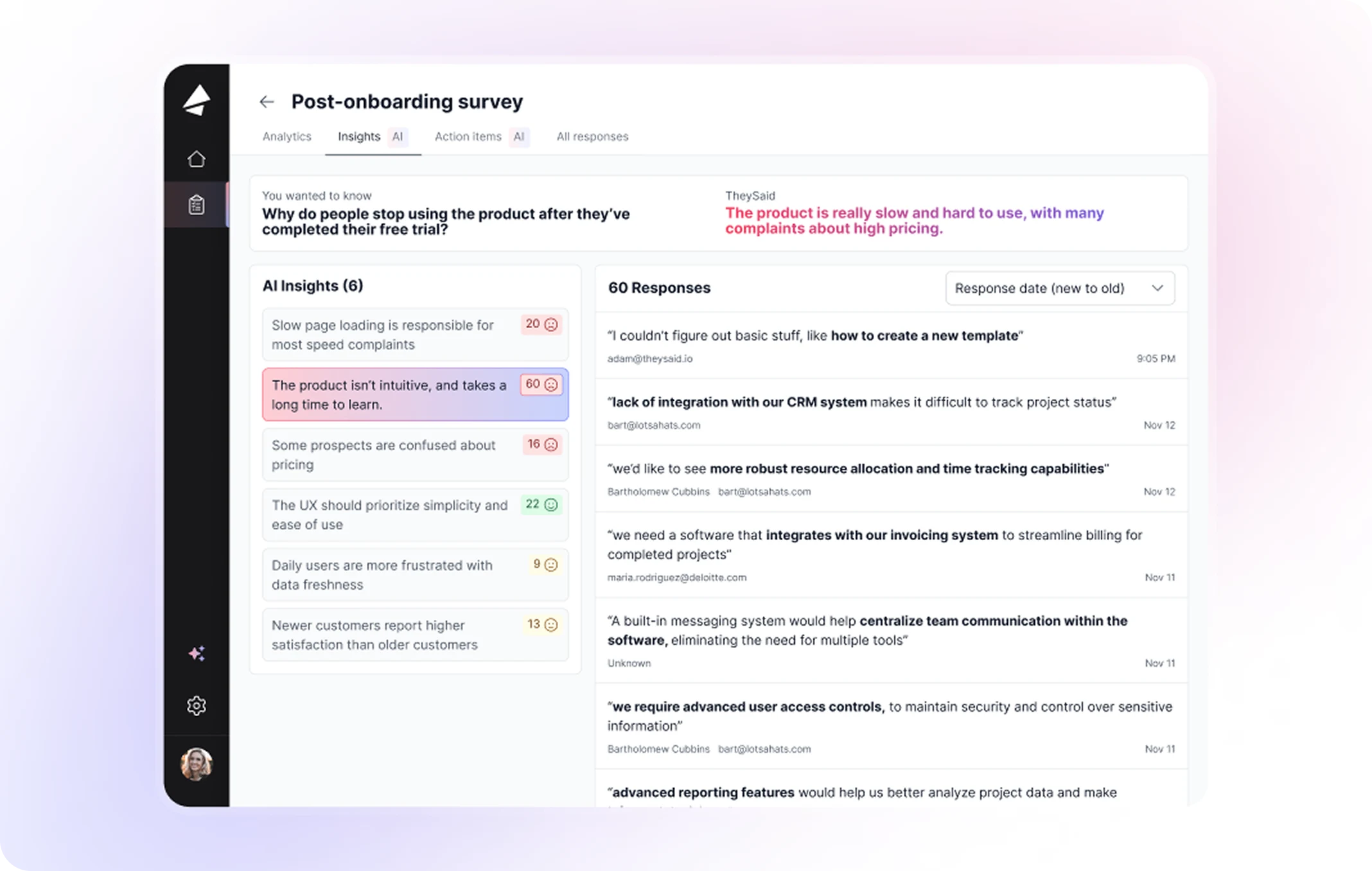
Think of this as your Product North Star. Everything that follows—user flows, branding, development decisions—will orbit around this clarity. Use tools like the Value Proposition Canvas or Lean UX Canvas to map assumptions early. The goal is to reduce risk, not just to move fast.
2. Map Your Users: Personas, Journeys, and Jobs to Be Done
Great app design starts with empathy. The more you understand your user’s context, goals, fears, and frustrations, the more your product will resonate. This is where design meets behavioral science.
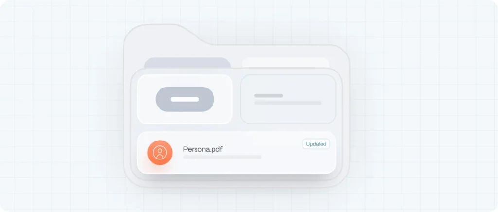
Start with personas—not fluffy demographics, but behaviorally rooted models. Then build user journeys that trace how those personas discover, evaluate, and interact with your app. Include offline moments too. What motivates them to download your app? What triggers usage? Where might they drop off?
Layering in the Jobs To Be Done (JTBD) framework gives your design team even more clarity. JTBD shifts the focus from user types to user goals. Your user isn’t just “ordering food”—they’re “getting dinner fast without stress.” Your app needs to serve that emotional and functional need seamlessly.
3. Information Architecture
Before you think in terms of screens, think in terms of structure. Information Architecture (IA) is how you organize the content and functions in your app to mirror how users think.
This is the bridge between strategy and interface. Poor IA leads to confusion, abandonment, and rework. Strong IA helps users feel instantly oriented—even in complex systems.
Use card sorting, tree testing, and site maps to validate your assumptions. Whether your app has five screens or fifty, each interaction should feel like a natural next step in the user’s mental model.
4. Wireframing and Prototyping
Once your IA is mapped, it’s time to sketch. Wireframes are not for looking pretty—they’re for figuring things out. Low-fidelity wireframes allow your team to experiment quickly, gather feedback, and align before investing in design polish or development.
Great wireframes:
- Focus on layout and flow, not colors
- Highlight content hierarchy and interaction points
- Help stakeholders and developers see how the app will work
After wireframes, move into prototyping—interactive mockups that simulate real use. Tools like Figma, InVision, or Axure make this fast and powerful.
Test your prototype early and often with real users to uncover usability issues before they become expensive.
5. UI Design: Form, Function, and Emotional Resonance
Now that the foundation is solid, you can bring your brand to life. The UI layer is where your app starts to “feel” real. But beautiful interfaces are not enough—they must be purposeful.
At Evo, we design UI systems that:
- Reflect brand personality through typography, color, and motion
- Use visual hierarchy to guide attention
- Maintain accessibility and responsiveness across devices
- Scale with modular components for future updates
We apply principles from Don Norman, Alan Cooper, and the Universal Principles of Design to every pixel. UI is the translation of UX strategy into visual language. It should delight, but never distract.
6. UX Writing and Microcopy
Often overlooked, UX writing is the invisible layer that makes or breaks clarity. Buttons, error messages, onboarding tips—these are moments where tone, timing, and precision matter. Clear microcopy:
- Reduces cognitive load
- Builds trust
- Guides users with confidence
Never let a designer write “Lorem Ipsum” into your prototype. Every word counts, and they should all serve a purpose. Good UX writing feels like a conversation, not a manual.
7. Design Systems: Scale
As your app grows, inconsistency becomes a silent killer. That’s where design systems come in. These are reusable components, guidelines, and assets that ensure your product evolves without losing coherence.
A well-built design system:
- Saves time across teams
- Reduces bugs and rework
- Creates a unified user experience
- Bridges design and development seamlessly
Whether you use Google’s Material Design, Apple’s Human Interface Guidelines, or a custom-built system—standardization is your friend.
8. Collaborate With Developers: The Real World
A design that can’t be built is just decoration. Involve developers from the beginning. Share wireframes, explain user goals, and align on technical constraints early.
Use tools like Figma Dev Mode, Storybook, and Zeplin to hand off designs efficiently. Ensure your design system translates into code components. Good app design isn’t just user-friendly—it’s developer-friendly too.
9. Testing and Validation
Once your prototype is functional, it’s time to test—rigorously and often. There’s no substitute for putting your app in the hands of real users.
Use:
- Usability testing (moderated or remote)
- A/B tests for competing features or flows
- Heatmaps and session recordings
- Surveys and interviews for qualitative insights
Watch where users hesitate. Measure what they ignore. Iterate not just to fix—but to evolve. The best apps are always in beta, always learning.
10. From Design to Launch: Ship Strategically
Design doesn’t stop at the App Store. Launching a successful app requires marketing alignment, analytics setup, onboarding flows, retention loops, and feedback channels.
Before you go live:
- Define KPIs and set up tracking (Firebase, Mixpanel, GA4)
- Craft launch campaigns that resonate with your audience
- Prepare ASO (App Store Optimization) strategies
- Build customer support and feedback pipelines
Remember: the best growth strategy is a great product. Let design lead the way.
11. Post-Launch: Learn, Optimize, Scale
After launch, everything you measure becomes your next roadmap. Look at feature adoption, retention curves, churn signals, and in-app behavior.
Use insights to:
- Optimize onboarding
- Personalize experiences
- Improve performance and UX
- Plan future updates
At Evo, we don’t disappear after launch—we partner for growth. Design is never done. It evolves with your users, your market, and your mission.

