


As a startup founder, you’re constantly making decisions. About your product, your design, your messaging—every click, every headline, every button. And often, those decisions are based on gut feelings or internal opinions. But what if you could validate each decision with real user behavior—before committing resources or risking conversions?
That’s where A/B testing becomes one of the most powerful, accessible, and data-driven tools in your UX arsenal.
Whether you’re fine-tuning a landing page, comparing onboarding flows, or optimizing your email CTAs, A/B testing gives you real answers to real user questions, grounded in measurable behavior rather than opinion.
This article dives deep into what A/B testing really is, when to use it, how to design impactful experiments, and what mistakes to avoid. Along the way, we’ll explore examples from real-world startups, and how we at Evo Design incorporate testing into our UX design strategy to help our clients scale smarter.
What is A/B Testing in UX Design?
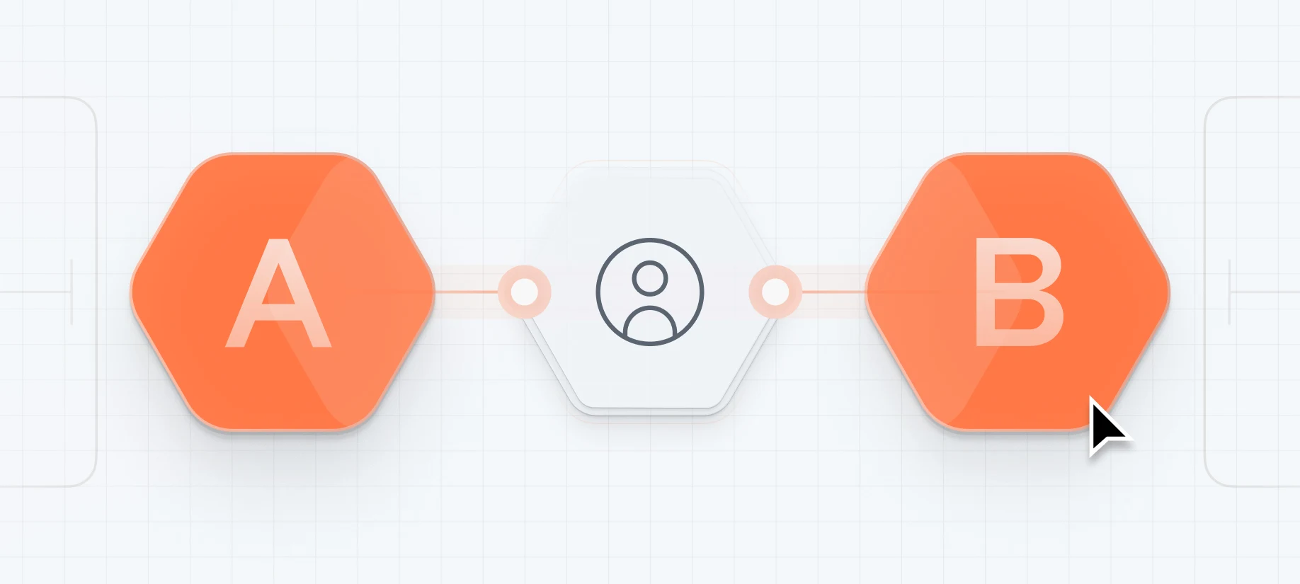
In its simplest form, A/B testing is an experiment. You present two (or more) variations of a digital interface element—say, a CTA button or a homepage hero copy—to two separate user groups, and you measure which version performs better based on a defined metric.
But A/B testing isn’t just about testing button colors.
At its core, it’s a structured way to ask:
“What changes in our design lead to better user outcomes?”
And then prove it, with evidence.
It’s a method grounded in the scientific process—form a hypothesis, run a test, collect data, and iterate. For startups navigating ambiguity and limited budgets, A/B testing offers clarity without guesswork.
Why A/B Testing Is Essential for Startups
Startups operate under intense pressure to perform—and fast. Your runway is short. Your market is competitive. Every percentage point in conversion rate could be the difference between scale and struggle.
Here’s why A/B testing is a game-changer for founders:
-
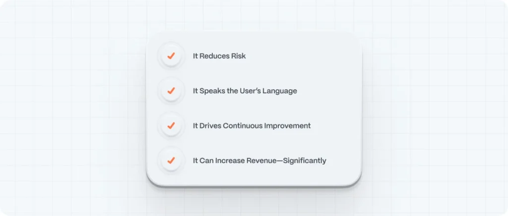
- ✅ It Reduces Risk
Instead of launching full redesigns based on hunches, you can make incremental improvements backed by real user behavior.
-
- ✅ It Speaks the User’s Language
By testing copy, headlines, or product descriptions, you can find out how users naturally respond to different tones, terms, and ideas.
-
- ✅ It Drives Continuous Improvement
A/B testing creates a culture of experimentation and learning—essential for companies that want to remain agile and customer-focused.
-
- ✅ It Can Increase Revenue—Significantly
Small improvements compound. Increasing your CTA click-through rate by 20% might mean 200 more sign-ups a month. Over a year? That’s transformational.
How A/B Testing Works: Step-by-Step
Let’s break it down. A successful A/B test follows a clear process:
1. Identify a Goal
Start with a specific objective tied to a business or user metric.
Examples:
- Increase email sign-ups
- Improve checkout completion rate
- Reduce bounce on a landing page
- Boost click-through on homepage CTA
The clearer the goal, the more useful your test results.
2. Form a Hypothesis
Based on user behavior, feedback, or intuition, form a statement like:
“If we simplify the headline, users will be more likely to sign up.”
Good hypotheses are testable and measurable. They focus on user behavior, not aesthetics.
3. Create Variations
Design two or more variants: the original (A) and the modified version (B). You can test:
- Headlines
- CTA buttons
- Navigation structure
- Product images
- Form fields
- Email subject lines
- Layout order
Tip: Avoid changing multiple elements at once. If you do, you won’t know what caused the difference in performance.
4. Split Your Audience
Randomly divide your audience so that each group experiences only one version of the interface. Keep it consistent—if a user sees version A, they shouldn’t suddenly see version B.
Tools like Google Optimize, Optimizely, VWO, or Hotjar can automate this.
5. Measure and Analyze Results
After a statistically significant sample is reached, evaluate performance against your goal.
Ask:
- Which version performed better?
- Is the result statistically significant?
- What behavior can we infer from this?
Then, apply the insights or run a new test.
What Can You A/B Test? (Real Startup Examples)
The beauty of A/B testing is its versatility. Let’s explore some high-impact areas to experiment—especially for digital startups:
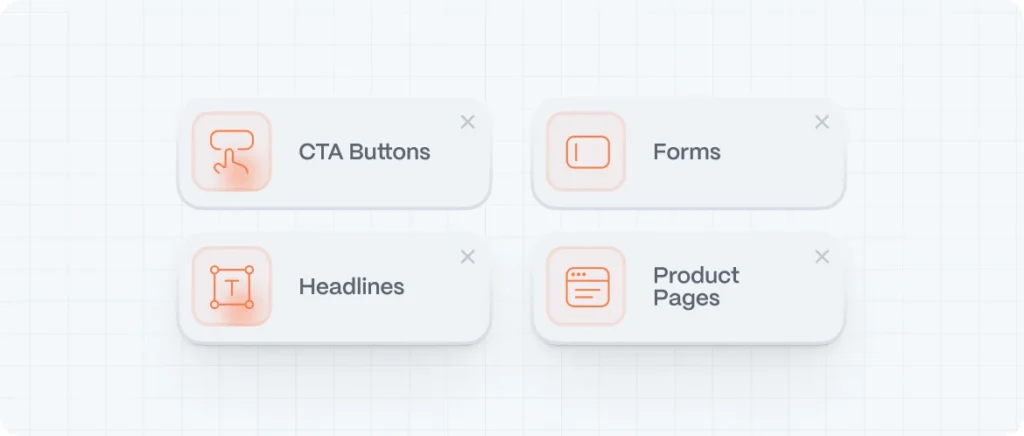
1. CTA Buttons
Tested Elements:
- Text (“Start Now” vs. “Get My Free Trial”)
- Color (green vs. blue)
- Size and placement
2. Headlines
Tested Elements:
- Value proposition clarity
- Emotional triggers vs. functional benefits
- Tone of voice
3. Forms
Tested Elements:
- Number of fields
- Field labels
- Placeholder text
- Progress indicators
4. Product Pages
Tested Elements:
- Image order
- Video vs. static images
- Feature highlights
- User testimonials
How Long Should an A/B Test Run?
This depends on your traffic volume and desired confidence level. Here are some general rules:
- Minimum test duration: 7–14 days (to capture weekday/weekend variation)
- Sample size: Use a calculator like Optimizely’s sample size calculator to determine how many visitors you need
- Confidence level: 95% or higher for valid results
Pro tip: Don’t stop a test the moment it looks “done.” Results can fluctuate. Always wait for statistical significance.
Best Practices for A/B Testing in UX Design
Here are some battle-tested principles:
-
- ✅ Test One Variable at a Time
It’s tempting to test three things at once—but clarity beats speed. If the CTA and headline both change, which one influenced behavior?
-
- ✅ Test on Mobile AND Desktop
User behavior differs drastically between platforms. A/B testing should respect that.
-
- ✅ Let the Data Surprise You
Sometimes, what “feels” right doesn’t win. That’s the point. One of our clients expected that a minimalist design would perform best. A more colorful, crowded version won by a landslide.
-
- ✅ Use Qualitative Data to Inform Your Hypotheses
A/B testing tells you what worked. Interviews, heatmaps, and surveys tell you why. Combine methods for deeper insight.
Common Mistakes to Avoid
- ❌ Stopping tests too early
- ❌ Not accounting for statistical significance
- ❌ Testing without a clear hypothesis
- ❌ Ignoring device or browser differences
- ❌ Using small, biased samples
- ❌ Treating A/B testing like a one-time project instead of an ongoing practice
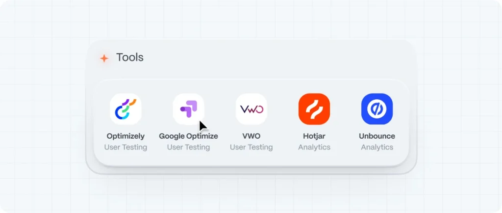
Tools for A/B Testing (Recommended by Evo Design)
| Tool | Purpose | Ideal For |
|---|---|---|
| Google Optimize | Free and simple split testing | Startups with basic needs |
| Optimizely | Advanced experimentation platform | Mid-large teams |
| VWO | A/B + multivariate testing | UX-focused teams |
| Hotjar | Heatmaps + feedback tools | Supporting research |
| Unbounce | A/B testing landing pages | Marketing campaigns |
Want to test without engineering involvement? No-code tools like Convert.com or AB Tasty are great options.
How Evo Design Studio Uses A/B Testing to Guide UX
At Evo, we don’t rely on guesswork or design by committee. We believe in a test-and-learn mindset that brings UX design closer to user truth.
Some ways we incorporate A/B testing into client projects:
- Running A/B tests on homepage messaging during brand repositioning
- Testing navigation label changes to improve click depth and reduce bounce
- A/B testing checkout flows for mobile-first eCommerce clients
- Validating tone of voice before launching new brand guidelines
In every case, data trumps ego. We design for outcomes, not opinions.
Final Thoughts: Data as a Compass, Not a Crutch
A/B testing won’t magically tell you what to build next—but it will help you build smarter. It’s one of the few UX tools that democratizes insight: even the leanest startup can start testing today.
By building a culture of experimentation, founders stop guessing and start listening—with numbers, not noise.
Good design is not just beautiful. It’s evidence-based.