


Designing a website for your startup is a crucial step in establishing your online presence. However, many startups make common website design mistakes that can negatively impact user experience and conversions. In this guide, we’ll explore the top 5 website design mistakes startups should avoid and provide solutions to enhance your website’s performance.
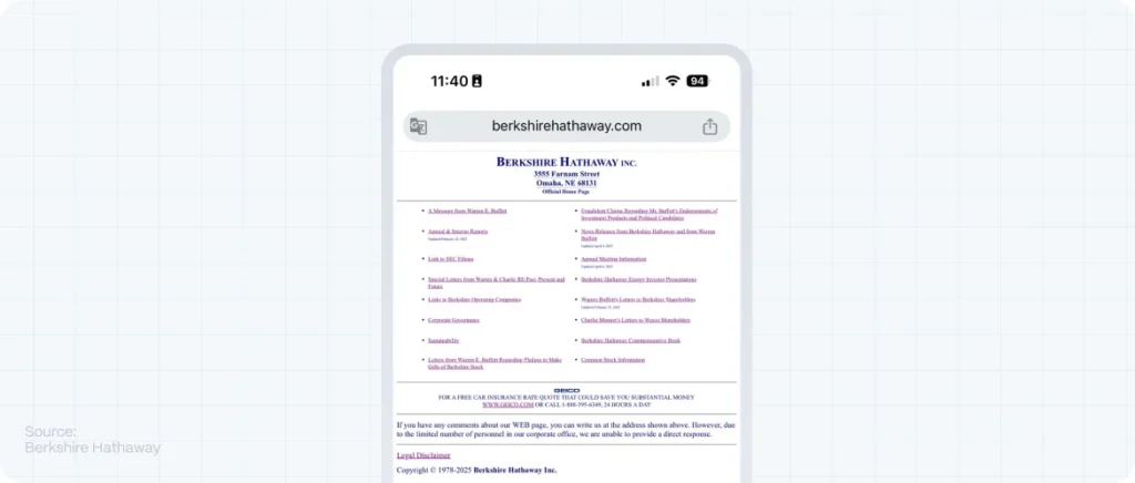
1. Unclear Communication and Navigation
A website should convey its purpose and offerings within seconds. Ambiguous messaging and convoluted navigation can confuse visitors, leading to high bounce rates.
Solution:
- Clear Messaging: Ensure that your value proposition is prominently displayed on the homepage.
- Intuitive Navigation: Design a straightforward menu structure, allowing users to find information effortlessly.
According to Hotjar, unclear communication and navigation are among the top web design mistakes businesses make.

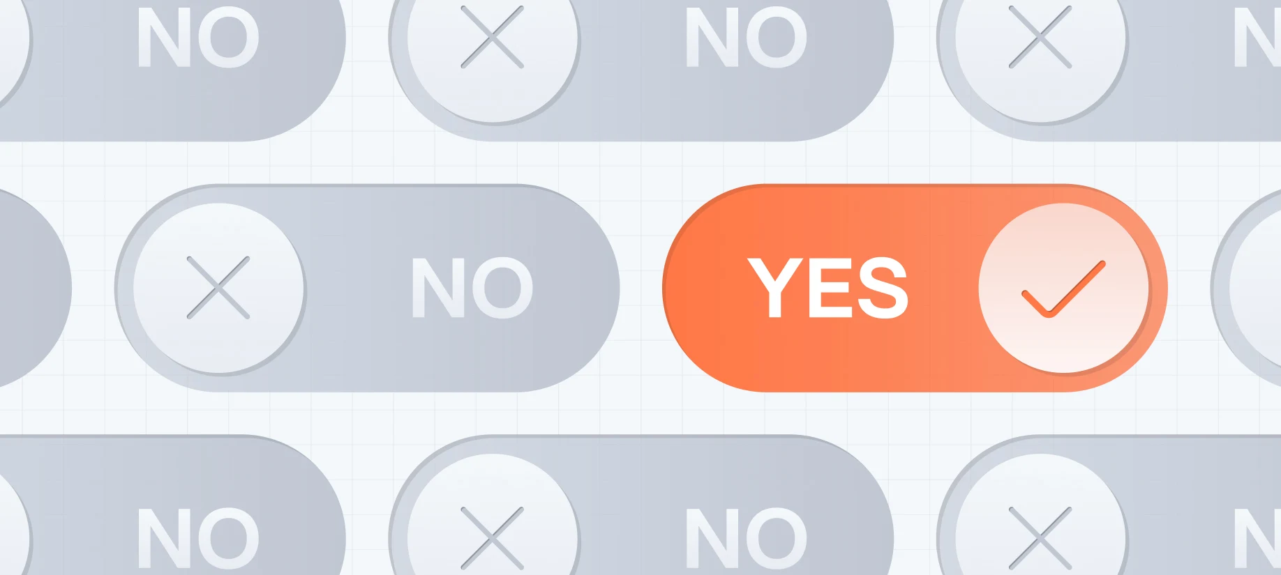
2. Weak Calls-to-Action (CTAs)
CTAs guide users toward desired actions, such as signing up for a newsletter or making a purchase. Ineffective or obscure CTAs can result in missed conversion opportunities.
Solution:
- Action-Oriented Language: Use compelling verbs that encourage immediate action, like “Get Started Now” or “Learn More.”
- Strategic Placement: Position CTAs prominently on pages where users are most likely to take action.
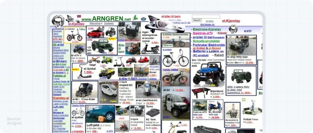
3. Overloading with Website Elements
An abundance of images, videos, and text can overwhelm visitors, making it challenging to focus on essential information.
Solution:
- Simplify Design: Embrace minimalism by using ample white space and focusing on key content.
- Prioritize Content: Highlight the most critical information and reduce distractions.
4. Neglecting Mobile Optimization
With a significant number of users accessing websites via mobile devices, a non-responsive design can alienate a large audience.
Solution:
- Responsive Design: Ensure your website adapts seamlessly to various screen sizes and devices.
- Mobile-Friendly Features: Optimize buttons, images, and text for mobile usability.
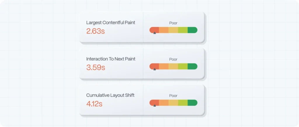
5. Slow Load Times
Websites that load slowly frustrate users and can lead to higher abandonment rates.
Solution:
- Optimize Images: Compress images without compromising quality to reduce load times.
- Efficient Coding: Minimize code bloat and leverage browser caching.
Avoid more website design mistakes
By avoiding these common website design mistakes, startups can create a user-friendly and conversion-focused website. At Evo Design Studio, we specialize in creating user-centric websites that prioritize clear communication, effective CTAs, streamlined designs, mobile optimization, and fast load times. Contact us today to learn how we can help your startup succeed online.
FAQ
How can I improve my website's navigation for better user experience?
Simplify your menu structure by using descriptive labels and ensuring that essential pages are easily accessible from the homepage. This enhances user experience and helps visitors find information quickly.
What makes a call-to-action (CTA) effective in boosting conversions?
An effective CTA uses compelling language, stands out visually, and is strategically placed where users are likely to take action. This encourages user engagement and boosts conversion rates.
Why is mobile optimization crucial for my website's success?
With a significant number of users accessing websites via mobile devices, ensuring your site is mobile-friendly enhances user experience and broadens your audience reach. Mobile optimization is crucial for modern web design.
How can I reduce my website's load time for better performance?
Optimize images by compressing them without compromising quality, minimize code, leverage browser caching, and consider using a content delivery network (CDN) to improve load times and overall website performance.
What role does whitespace play in modern web design?
Whitespace, or negative space, helps to declutter your design, making content more readable and guiding user focus to essential elements. It is a key component of modern web design that enhances user experience.